

 let’s connect


What Is Website Design and Why Does It Matter in 2026?
Website design is the strategic process of creating visually appealing, highly functional, and user-centered digital experiences that balance aesthetics, performance, and business goals. Understanding why it matters starts with a few direct answers:
- Website design combines visual design, user experience (UX), user interface (UI), information architecture, and performance optimization into one unified discipline.
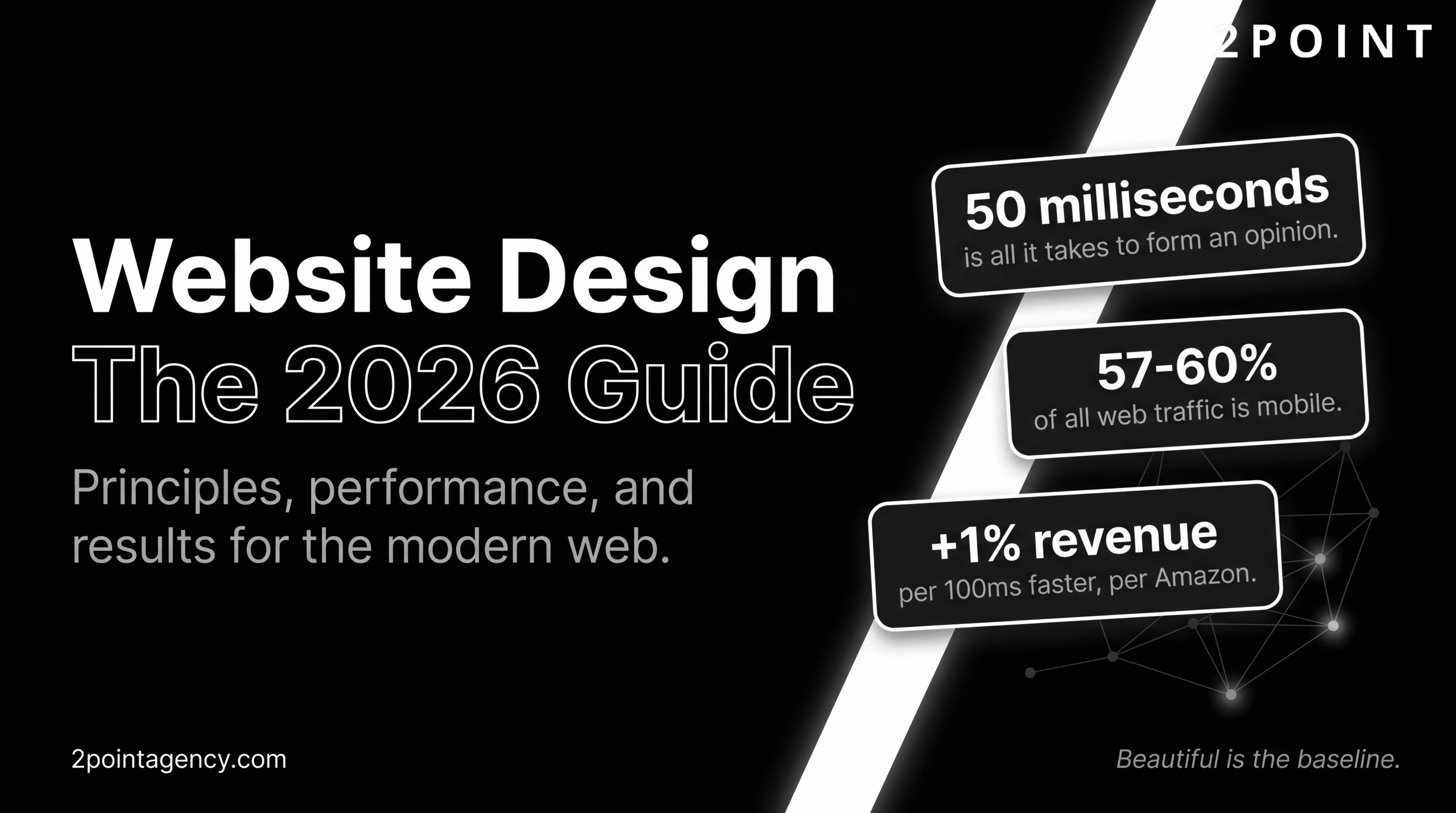
- Between 57% and 60% of all web traffic now comes from mobile devices, making responsive design a baseline requirement, not a bonus feature.
- Amazon reports a 1% revenue increase for every 100 milliseconds of load time improvement, proving that performance is a direct profit lever.
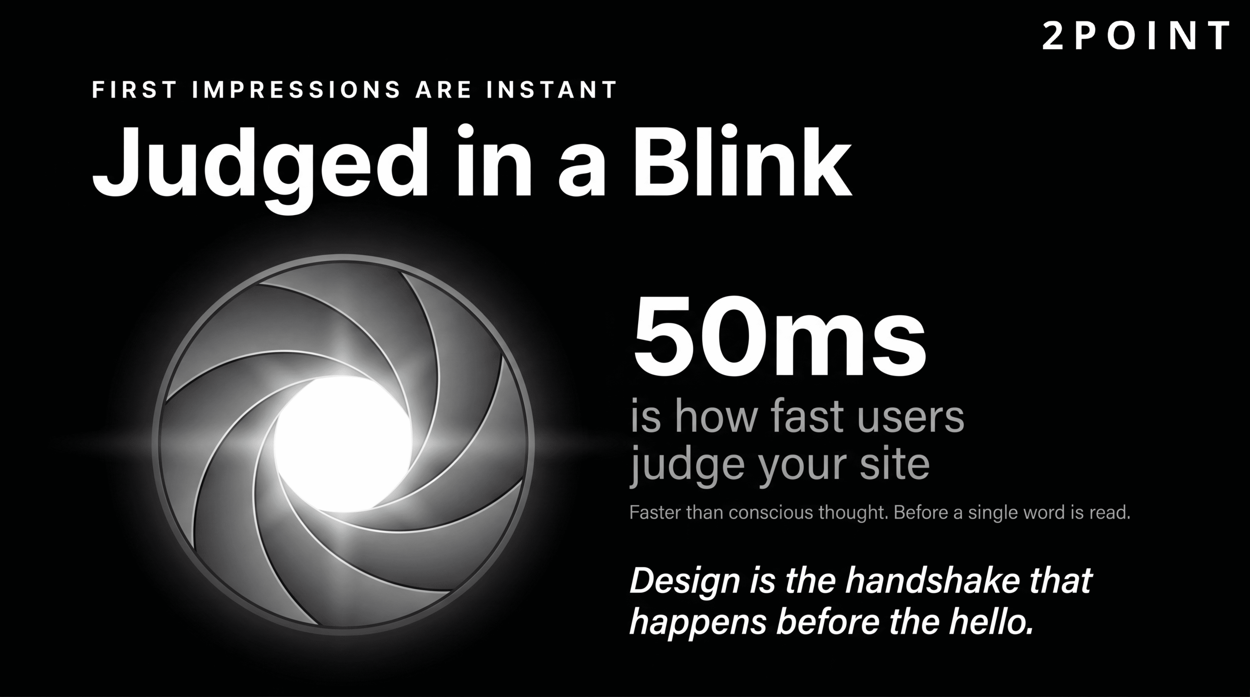
- Poor website design costs businesses customers: users form opinions about a site within 50 milliseconds of landing on it.
- Modern web design has evolved beyond visual trends to prioritize accessibility, AI integration, and purpose-driven experiences.
- Effective website design is a critical business asset, not simply a visual exercise.
- In 2026, the best-performing websites are faster, smarter, more inclusive, and more intentionally human than at any point in the web's history.
The sections below walk through every dimension of modern website design: from foundational principles and responsive standards to the latest trends, conversion strategies, and technical excellence. Whether you are building a new site from scratch or auditing an existing one, this guide gives you the framework to make decisions that drive real results.
Core Website Design Principles That Drive Results
Successful website design does not begin with a color palette or a font choice. It begins with principles: the foundational rules that determine whether a site earns user trust, sustains engagement, and ultimately converts visitors into customers. Visual trends come and go, but these principles create the structural framework that makes every design decision purposeful.
Understanding these principles is especially critical in 2026 because the tools available to designers have never been more powerful or more accessible. AI-assisted design, component libraries, and no-code platforms can produce visually polished results quickly. But polished is not the same as effective. Without a grounding in core principles, even a technically impressive site can fail its users and its business goals. The following sections break down the four principles that consistently separate websites that perform from websites that simply exist.
User-Centered Design as the Foundation
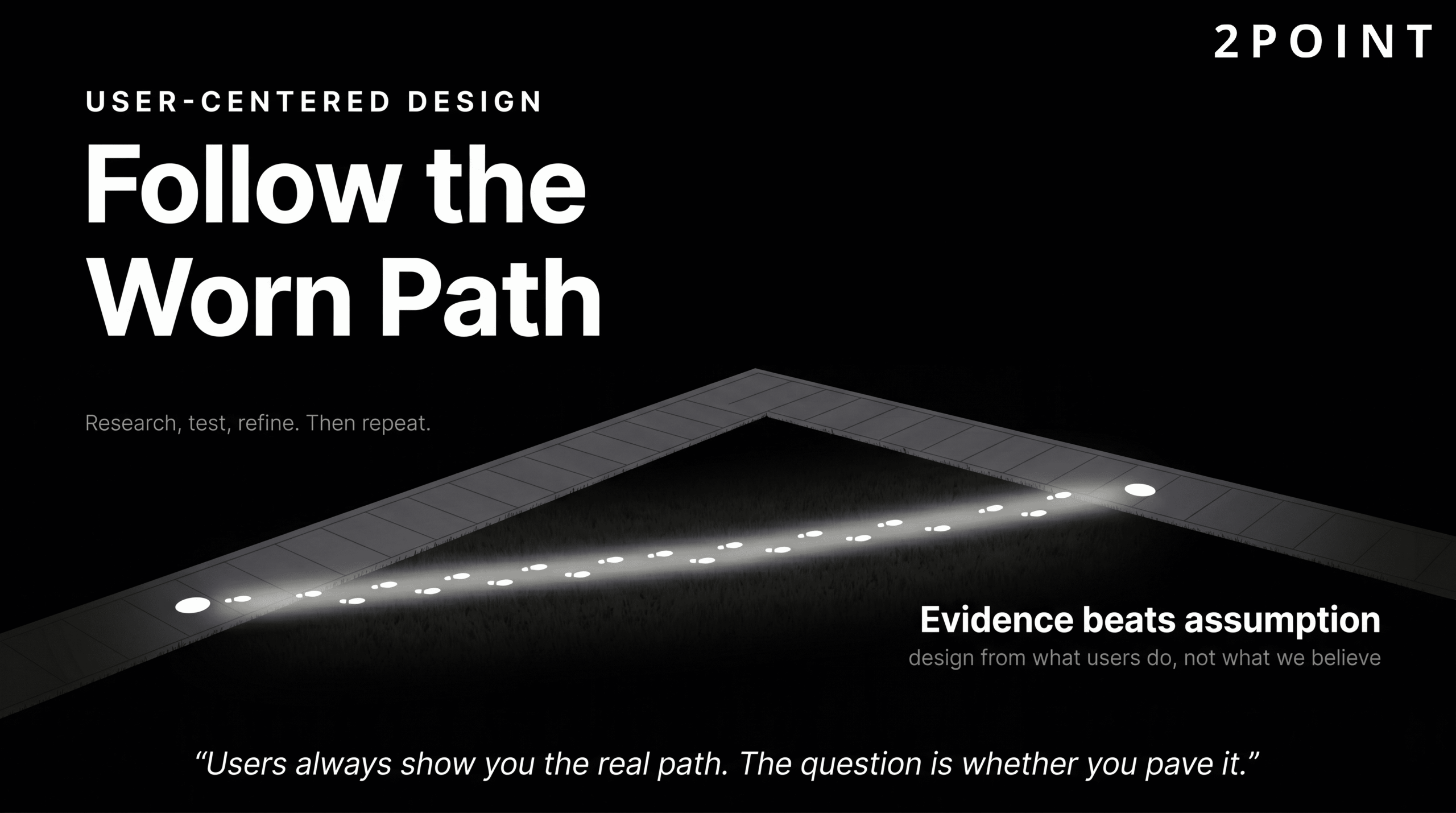
User-centered design (UCD) is the philosophy and practice of placing users at the center of the creative process to build websites that are easy to use and genuinely enjoyable to interact with. According to Elementor's web design best practices guide, this approach requires designers to understand who their users actually are, what those users are trying to accomplish, and what barriers currently exist between them and their goals. The result is a design shaped by evidence rather than assumption.
The core framework of user-centered design follows a clear cycle: understand user needs through research, design solutions based on those findings, test those solutions with real users, and refine the design based on what the testing reveals. This cycle repeats continuously. As iSync Evolution notes in their UI/UX design principles resource, UCD requires ongoing user research and iterative testing rather than a single round of feedback before launch. A site that felt intuitive at launch may develop friction as user expectations, device capabilities, and content needs evolve.
The contrast with assumption-based design is stark. Assumption-based design relies on what the designer, developer, or stakeholder believes users want. User-centered design relies on what users actually demonstrate through their behavior, feedback, and task completion rates. The former often produces sites that look impressive in presentations but confuse real users at critical moments. The latter produces sites that feel effortless, even when considerable complexity lives beneath the surface. Building a user-friendly website for success always starts with this research-first, human-first orientation.
Information Architecture and Intuitive Navigation
Information architecture (IA) is the discipline of organizing and structuring content logically so that users can find what they need with minimal effort. A strong IA reduces the cognitive work required to navigate a site, which directly supports both user satisfaction and conversion. When content is poorly organized, users do not typically work harder to find it. They leave.

Navigation best practices, as outlined in Elementor's design best practices resource, include limiting top-level menu items to seven or fewer options, using descriptive and literal labels rather than clever or abstract ones, and maintaining navigational consistency across every page. Descriptive labels work because they match the mental models users already carry: "Services" is immediately understood; "What We Do" requires a small but unnecessary translation step that accumulates into friction over an entire visit.
Cognitive load reduction is the underlying goal. Every navigation click, every label that requires interpretation, and every structural inconsistency adds to the mental effort a user must expend. Figma's 2026 web design trends report notes an emerging interest in experimental navigation patterns including radial menus, hidden drawers, and nonlinear user journeys. These approaches can create memorable, differentiated experiences for portfolio sites, editorial platforms, and brand storytelling projects. However, for conversion-focused websites where a user's primary task is to find information, request a service, or complete a purchase, traditional hierarchical navigation continues to outperform experimental structures. Innovation in navigation is best applied when it serves the user's task, not when it signals the designer's creativity.
Visual Hierarchy and Typography Strategy
Visual hierarchy is the practice of using size, color, contrast, weight, and spacing to guide a user's eye toward the most important elements first. A well-constructed visual hierarchy allows a user to scan a page in seconds and extract the key message without reading every word. According to Figma's UI design principles library, effective hierarchy relies on deliberate contrast, purposeful font weight variation, and generous whitespace that gives primary elements room to breathe.
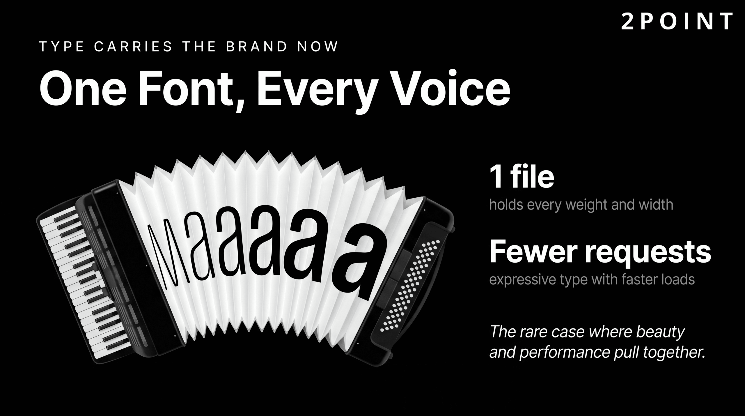
Typography has taken on a significantly elevated role in 2026. As layouts have become cleaner and more minimal, the font choices a brand makes carry more of the emotional and identity weight. NWS Digital's 2026 design trends analysis describes typography as the primary carrier of brand identity when visual clutter is stripped away. This means font selection is no longer a detail that can be decided late in the design process. It is a strategic brand decision made early and applied with discipline.
Variable fonts have become a technically significant development in this space. A variable font contains an entire range of weights and widths within a single file, reducing the number of HTTP requests required to load multiple font weights and improving page load performance. Lovable's 2026 design trends guide highlights variable fonts as enabling both expressive typographic design and faster load times simultaneously: a rare case where aesthetic and performance goals align perfectly. For designers looking to push type as a visual element without paying a performance penalty, variable fonts are the current best-in-class solution.
Consistency Through Design Systems
Consistency is one of the most undervalued principles in website design. When a site looks and behaves predictably, users develop confidence in it quickly. Buttons behave the same way across every page. Colors carry the same meaning throughout. Navigation patterns do not shift unexpectedly. This familiarity reduces anxiety, builds trust, and allows users to focus their attention on the content and tasks at hand rather than on figuring out how the site works.
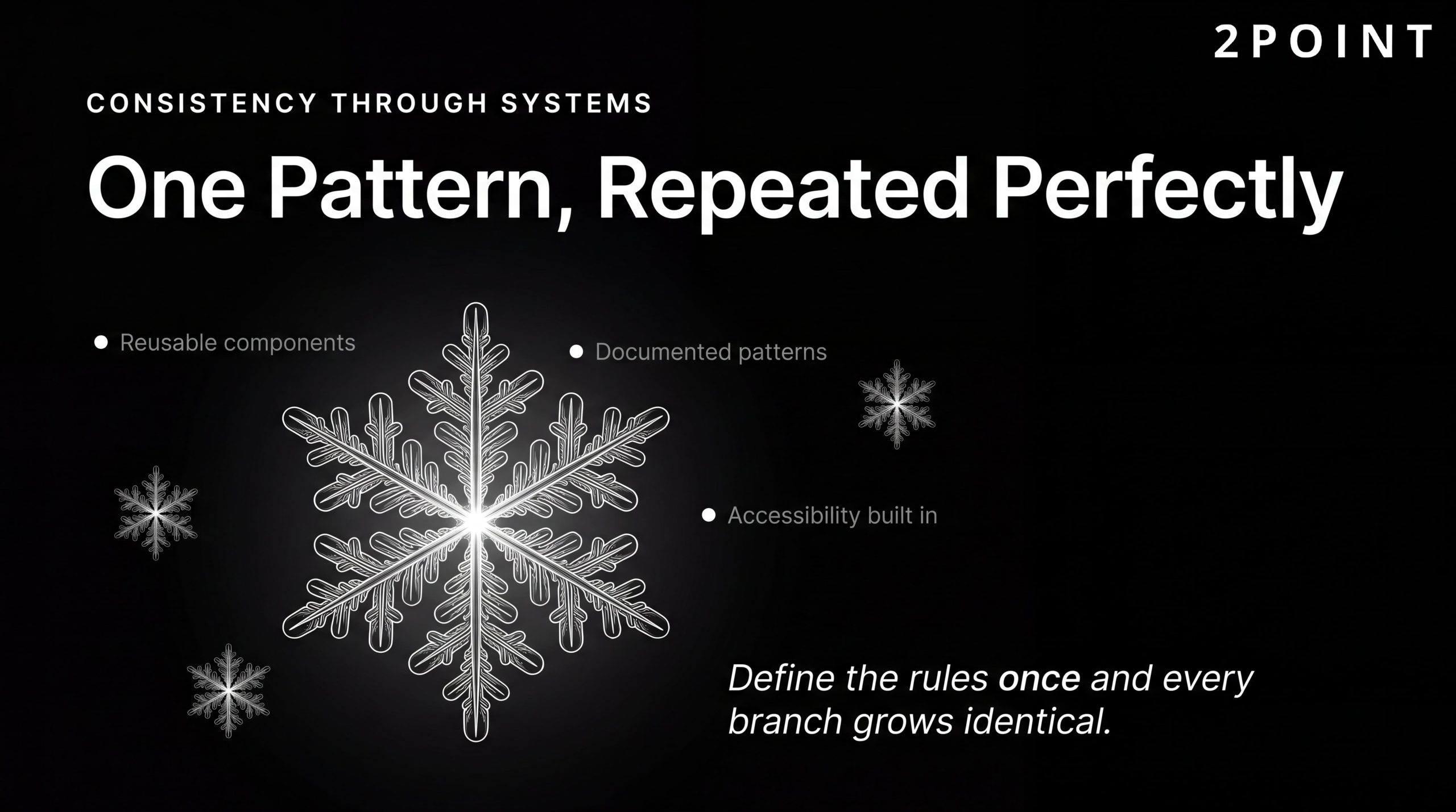
Modern design systems formalize this consistency. iSync Evolution's design principles resource identifies the key components of a contemporary design system as reusable component libraries, pattern documentation, brand guidelines, and built-in accessibility requirements. These systems ensure that every team member, whether designer, developer, or content creator, is working from the same visual and behavioral language. DesignRush's web design best practices overview notes that design systems maintain quality across large applications, accelerate development timelines, and ensure brand coherence at scale.
The practical implementation advice for teams new to design systems is to start small. Begin with the core components that appear on nearly every page: buttons, form inputs, typography scales, color tokens, and navigation elements. Document usage patterns clearly and make the system easy for developers to implement correctly. Then iterate as real usage reveals gaps. A design system that is 70% complete and actively maintained is far more valuable than a comprehensive system that is never updated. Teams that commit to this approach find that the upfront investment pays dividends in consistency, speed, and scalability for the life of the product.
Mobile-First Responsive Design: The Non-Negotiable Standard
There was a period when mobile-friendly design was presented as a thoughtful enhancement, an acknowledgment that some users might access a site on their phones. That framing is now completely obsolete. Mobile-first design is the baseline. It is the starting point from which desktop and large-screen experiences are built, not the other way around. Any organization that still treats mobile as a secondary concern is, statistically speaking, disappointing the majority of its audience before a single word of content is read.
The shift to mobile-first thinking requires a genuine change in design process, not just a technical adjustment. Designing for mobile first means making every structural decision in the context of a small screen, limited bandwidth, and touch-based interaction. When those constraints are resolved well, the desktop experience almost always benefits too: cleaner layouts, prioritized content, and faster load times translate across every screen size. This section covers why the business case for mobile-first design is overwhelming, how responsive web design actually works in practice, and how to test across the device ecosystem effectively.
Why Mobile-First Design Matters for Your Bottom Line
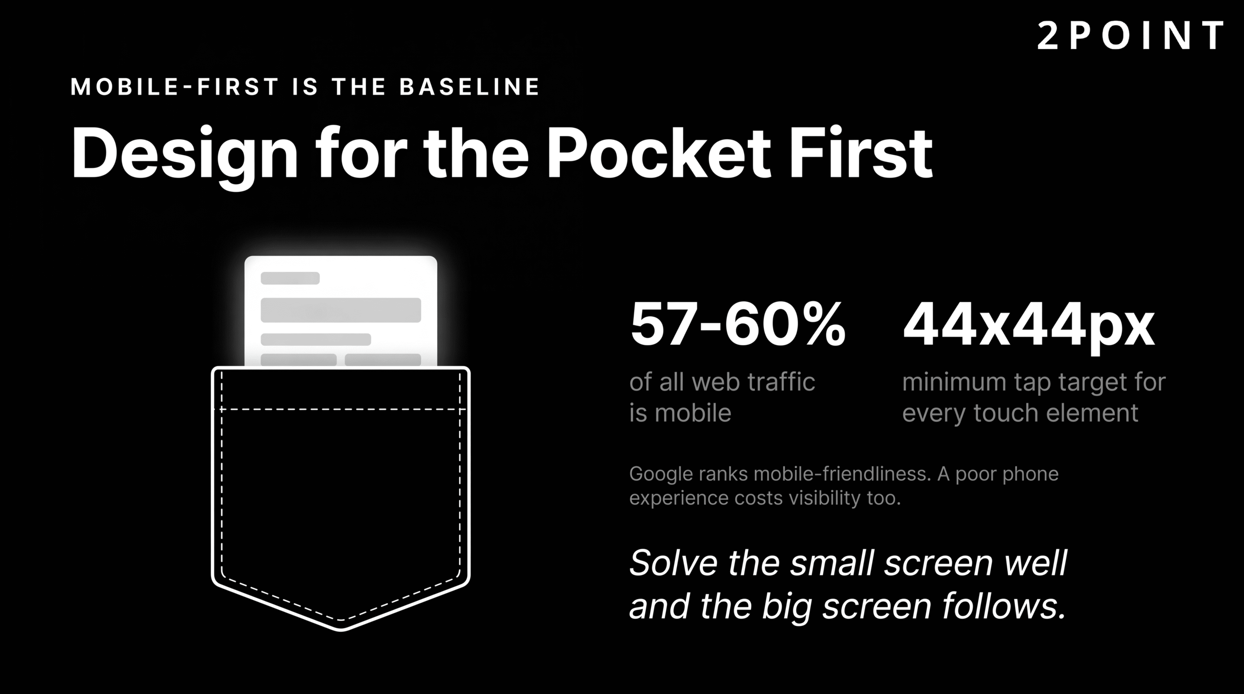
The raw numbers are unambiguous. Between 57% and 59% of all global e-commerce transactions now happen on mobile devices, and more than 60% of overall web traffic originates from mobile devices according to Sugar Pixels' web design best practices analysis. A site that delivers a degraded experience on mobile is not just missing an opportunity; it is actively alienating its largest audience segment at the exact moment those users are ready to engage or purchase.
The SEO implications compound the business case. Google uses mobile-friendliness as a ranking factor in its search algorithm, meaning that a poor mobile experience does not just cost you conversions from the users who arrive on your site. It costs you the visibility that would have brought those users to your site in the first place. The cascade effect of ignoring mobile is therefore: lower search rankings, fewer organic visitors, reduced conversions, and weakened brand perception among the visitors who do arrive and encounter a frustrating experience.
The most instructive examples come from the organizations that have made mobile-first a core design philosophy. Amazon's entire product experience is engineered around the assumption that a significant portion of any given user session will happen on a phone. Airbnb's booking flow prioritizes simplicity and touch-friendly interaction that translates across every device. These are not accidents of good taste. They are strategic decisions with measurable revenue consequences. The importance of mobile-friendly web design extends far beyond meeting a technical standard. It is about meeting your users where they are, with the experience quality they expect.
Core Principles of Responsive Web Design
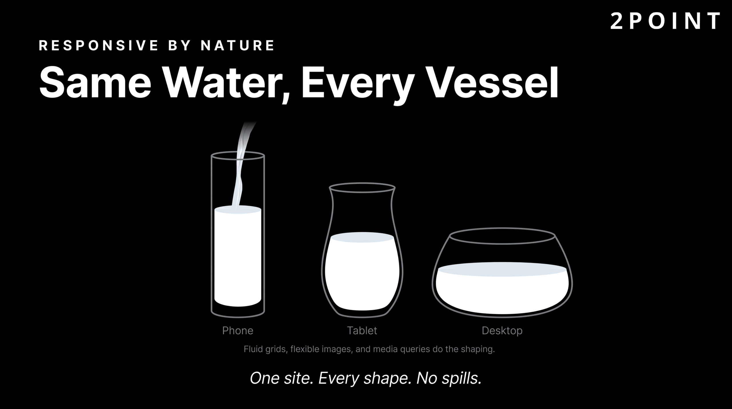
Responsive web design is the technical framework that makes mobile-first design possible at scale. At its core, responsive design uses fluid grids, flexible images, and CSS media queries to create layouts that adapt gracefully to any screen size. Rather than building separate sites for mobile and desktop, responsive design creates a single site whose layout intelligently reorganizes itself based on the available viewport width.
Fluid grids use percentage-based column widths instead of fixed pixel values, allowing content areas to expand and contract proportionally as the screen size changes. Flexible images use CSS rules that prevent images from exceeding their container width, ensuring that a large product photograph does not overflow or stretch on a small screen. Media queries then provide precise control over layout changes at specific breakpoints: the points at which the layout needs to fundamentally reorganize itself to remain readable and usable.
Touch-friendly interaction design is a critical component that is often underaddressed. Responsive UI/UX principles for modern web apps specify a minimum tap target size of 44 by 44 pixels for any interactive element. Buttons, links, form inputs, and navigation items that are smaller than this create genuine usability failures for mobile users, particularly those with larger fingers or motor impairments. Adequate spacing between tap targets is equally important, preventing accidental activations that frustrate users and damage trust. The progressive enhancement approach builds from this solid mobile foundation and layers in additional capabilities for larger screens and more capable browsers, ensuring every user receives a functional experience regardless of their device. For a comprehensive walkthrough of this process, the guide on how to design responsive websites offers detailed technical guidance.
Testing and Optimization Across Devices
Designing responsively is only half the work. Validating that the responsive design actually performs well across the real device landscape requires deliberate testing methodology. Browser developer tools provide an accessible starting point: every modern browser includes responsive design emulation that simulates different screen sizes and device pixel ratios. However, emulators have real limitations. They do not replicate the actual rendering engine of a specific device, the performance characteristics of mobile hardware, or the behavioral quirks of touch interaction on glass screens.
Real device testing remains the gold standard, particularly for high-traffic sites and critical user flows. Covering the most common device categories used by your actual audience, as identified through analytics data, is a practical way to prioritize real-device testing resources. Common responsive design failures to watch for include content that is hidden behind overflow-hidden rules, horizontal scrolling caused by fixed-width elements, and text that is technically readable but too small for comfortable mobile consumption.
Performance testing on actual mobile network conditions is equally essential. A site that loads in two seconds on a fast office Wi-Fi connection may take six or seven seconds on a real-world 4G connection with typical latency and packet loss. Tools that simulate 3G, 4G, and 5G network conditions during performance testing expose these gaps before they reach real users. The goal is not just a layout that fits every screen, but a complete experience that feels fast, functional, and easy to use on every screen.
Website Performance Optimization: Speed as a Design Principle
Speed is not a technical feature added after design is complete. It is a design principle that shapes every decision from the first wireframe through final deployment. When performance is treated as a downstream technical concern, it arrives too late to influence the decisions that matter most: image strategy, animation scope, font loading behavior, and third-party script integration. By the time those decisions have been implemented, the cost of reversing them is high. The organizations that consistently build fast sites treat speed as a design constraint from day one.
The business case for this mindset is exceptionally well-documented. Load time has a direct, quantifiable relationship with revenue, conversion rates, and user retention. Understanding the specific data behind this relationship helps designers and stakeholders make the case for performance investments when competing priorities push speed down the priority list.
The Business Impact of Load Time
The Amazon case study is the most frequently cited in this space, and for good reason. Amazon has reported a 1% increase in revenue for every 100 milliseconds of load time improvement. At Amazon's scale, that percentage represents enormous dollar amounts, but the principle scales down to every business with an online presence. A small local service business losing 1% of its revenue to slow load times is losing real clients and real income.
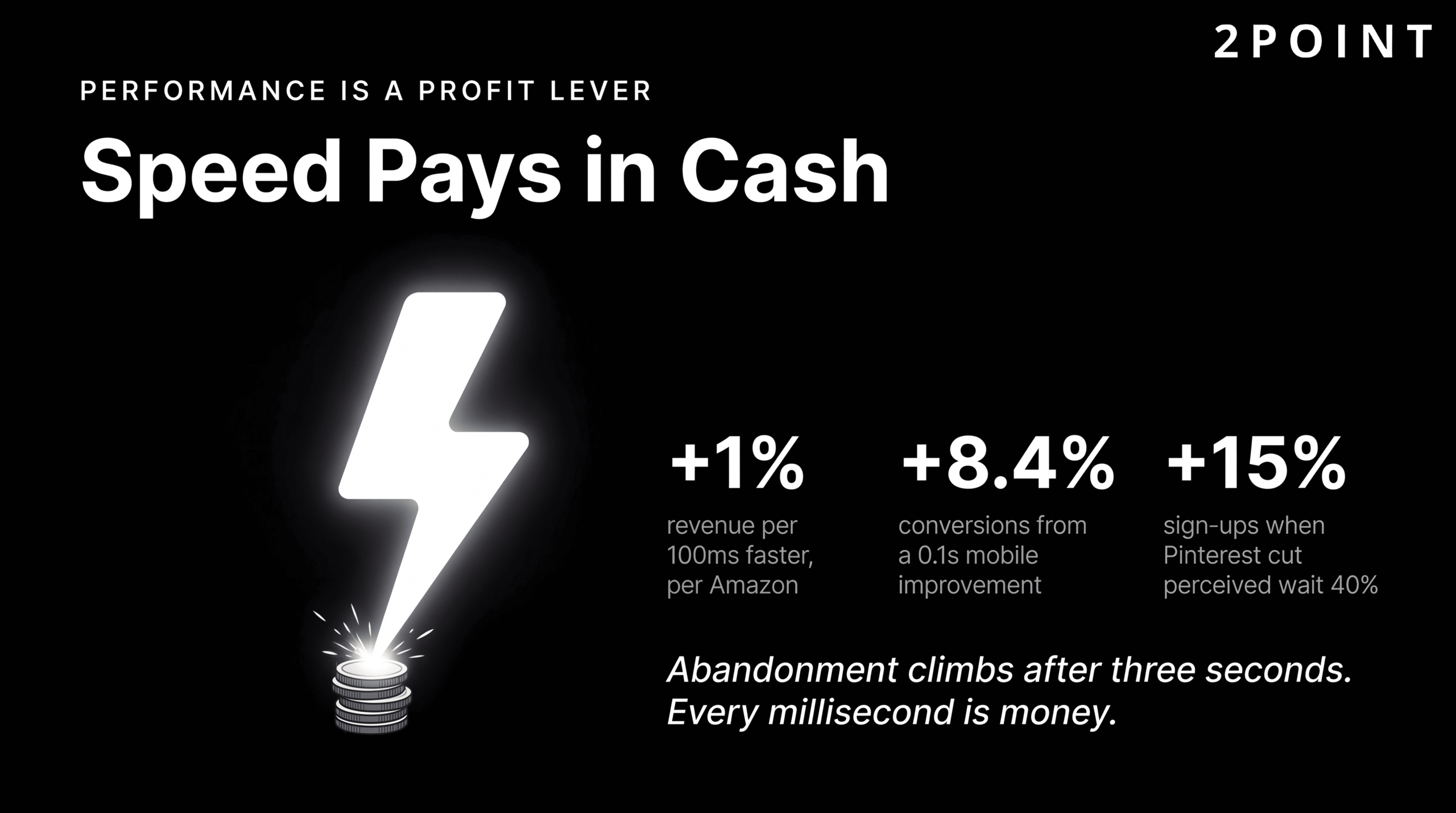
The Pinterest example offers a different angle on the same principle. Pinterest achieved a 15% increase in sign-ups after reducing perceived wait times by 40%. This case is particularly instructive because it demonstrates that performance optimization is not just about raw speed but about perceived speed: the experience of waiting. Design techniques like skeleton screens, progressive loading, and optimistic UI updates can make an application feel faster without changing its actual load time. Deloitte's research, published alongside Google, found that a 0.1 second improvement in mobile load time resulted in an 8.4% conversion increase for retail sites. These are not marginal gains. They represent meaningful, measurable business impact from technical decisions that are entirely within a design team's control.
User behavior data reinforces these statistics. Abandonment rates begin climbing significantly after three seconds of load time. By five seconds, a substantial portion of the audience that would have converted has already navigated away. The best practices for optimizing website speed therefore constitute not just a technical checklist, but a direct contribution to revenue generation and competitive positioning.
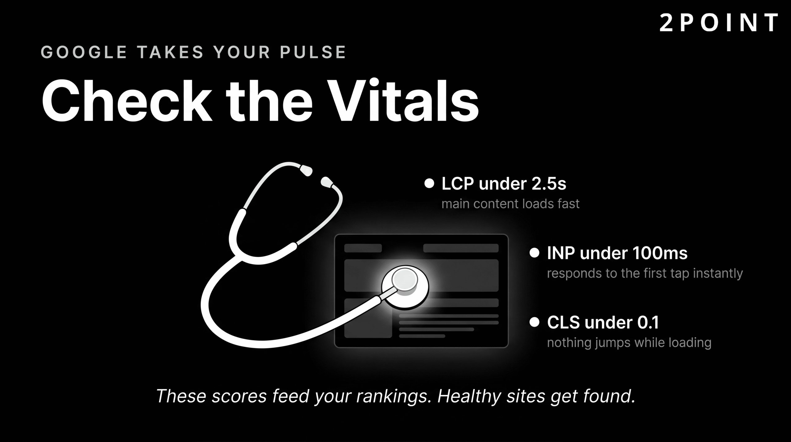
Core Web Vitals and Performance Metrics
Google formalized its performance measurement framework through Core Web Vitals: a set of metrics that quantify the real-world user experience of loading, interactivity, and visual stability. Core Web Vitals are integrated into Google's search ranking algorithm, meaning that poor performance scores can directly suppress a site's visibility in search results.
| Core Web Vital Metric | What It Measures | "Good" Threshold | Primary Design Impact |
|---|---|---|---|
| Largest Contentful Paint (LCP) | How quickly the main content loads and becomes visible | Under 2.5 seconds | Image optimization, server response time, render-blocking resources |
| First Input Delay (FID) / Interaction to Next Paint (INP) | How quickly the page responds to the first user interaction | Under 100 milliseconds | JavaScript execution, third-party scripts, main thread blocking |
| Cumulative Layout Shift (CLS) | How much the page layout shifts unexpectedly during loading | Under 0.1 | Image dimensions, dynamic content insertion, font loading behavior |
Core Web Vitals are the primary lens through which Google evaluates page experience, making them a shared responsibility between design and development teams.
Each metric maps directly to design decisions. LCP is heavily influenced by the size and loading strategy of hero images and above-the-fold content. CLS is caused by design elements that shift other content when they load: images without declared dimensions, ads that expand after load, and web fonts that swap in after the fallback font has already rendered. Understanding these relationships means that a designer who knows their Core Web Vitals is better equipped to make choices that do not create performance debt for the development team to address later.
Practical Performance Optimization Techniques

Image optimization is typically the highest-impact performance intervention available on most websites. Images account for the majority of page weight on the average website, and they are often the primary driver of poor LCP scores. Using modern image formats like WebP and AVIF reduces file sizes significantly compared to JPEG and PNG without visible quality loss. Implementing responsive images through the srcset attribute ensures that mobile users download a smaller, appropriately sized image rather than the full-resolution desktop version. Lazy loading defers the loading of below-the-fold images until the user scrolls toward them, reducing the initial page load cost substantially.
Code optimization techniques including CSS and JavaScript minification, code splitting, and tree shaking remove unused code from the files delivered to users. Critical CSS inlining places the styles needed to render above-the-fold content directly in the HTML document, eliminating render-blocking stylesheet requests and accelerating perceived load time. Browser caching and CDN (Content Delivery Network) deployment reduce latency by serving assets from locations geographically closer to the user.
For sites incorporating 3D elements or complex animations, performance budgets become critical planning tools. Figma's web design trends research highlights the importance of lazy loading 3D content and compressing 3D models to prevent immersive design experiences from becoming performance liabilities. A performance budget sets explicit limits on page weight, script size, and load time targets before design work begins, ensuring that creative ambition does not outrun technical capacity. The goal of all these techniques is the same: to apply website optimization techniques that make every user's experience feel fast, responsive, and effortless regardless of their device or connection speed.
Accessibility in Website Design: Designing for Everyone
Web accessibility is the practice of designing and building websites that can be used by people of all abilities, including those with visual, auditory, motor, and cognitive disabilities. In 2026, the conversation around accessibility has shifted meaningfully. It is no longer framed primarily as a compliance obligation, though the legal landscape is real and growing. It is framed as a design quality standard: a demonstration that a site has been built thoughtfully, with the full range of human diversity in mind.
This framing matters because it changes the conversation within design teams and with clients. When accessibility is treated as a legal checkbox, it is addressed minimally and often retrofitted after the fact at considerable cost. When it is treated as a design quality standard, it is embedded into the design process from the beginning, where it is far easier and cheaper to implement correctly. The following sections present the current state of accessibility on the web, the specific requirements that matter most, and the business case for treating accessible design as a competitive advantage.
The Current State of Web Accessibility
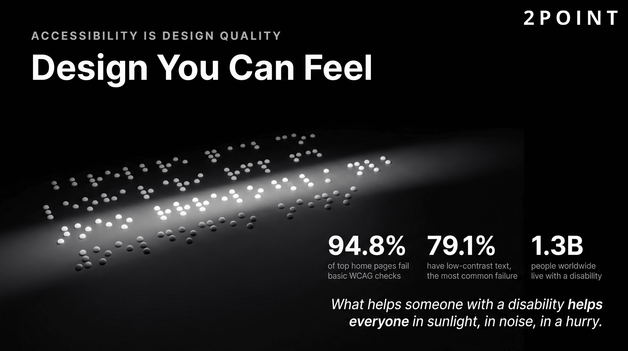
The statistics describing the current state of web accessibility are genuinely sobering. According to recent research, 94.8% of the top one million home pages contain at least one WCAG 2 A/AA failure. The Web Content Accessibility Guidelines (WCAG) represent the internationally accepted standard for web accessibility, and the fact that nearly 95% of high-traffic home pages fail to meet even baseline compliance tells a clear story: accessibility has been systematically deprioritized across the web industry.
The most prevalent specific failure is illuminating. Low-contrast text appears on 79.1% of home pages, making it the single most common accessibility barrier on the web. This is a failure that is entirely preventable with basic color contrast checking tools, most of which are free. The prevalence of this issue suggests that it is not a lack of tools or knowledge that drives accessibility failures, but a lack of process: no one has made contrast checking a required step in the design review process.
The legal landscape around accessibility is evolving rapidly and in the direction of greater enforcement. Accessibility lawsuits have increased consistently year over year in the United States and Europe. Regulatory requirements are expanding. For organizations concerned about legal risk, the business case for accessible design is becoming impossible to ignore. For organizations motivated by broader values, the ethical case has always been clear: the web was conceived as a universal resource, and design decisions that exclude people with disabilities betray that founding principle. Learning to ensure website accessibility for all users is therefore both a legal and a moral imperative for modern web design teams.
Essential Accessibility Requirements
Understanding the specific technical requirements of accessible web design allows designers and developers to build accessibility into their workflow rather than audit for it after the fact. The requirements below represent the highest-impact areas, where failures are most common and where getting it right makes the largest difference for users with disabilities.
| Accessibility Area | WCAG Requirement | Implementation Approach | Common Failure Mode |
|---|---|---|---|
| Color Contrast (Normal Text) | Minimum 4.5:1 contrast ratio | Use a contrast checker during design; apply to all body text | Light gray text on white backgrounds |
| Color Contrast (Large Text) | Minimum 3:1 contrast ratio | Large text defined as 18pt regular or 14pt bold | Decorative headings with insufficient contrast |
| Keyboard Navigation | All interactive elements operable via keyboard | Test with Tab, Enter, Space, and arrow keys; visible focus states | Custom components without keyboard event handlers |
| Screen Reader Support | Semantic HTML, ARIA labels, proper heading structure | Use native HTML elements; supplement with ARIA only as needed | Div-based buttons without role or label attributes |
| Image Alternative Text | All informative images have descriptive alt text | Describe the content and function; empty alt for decorative images | Generic alt text like "image1.jpg" or missing alt attributes |
| Form Accessibility | Labels associated with inputs; error messages clear and specific | Use label elements; associate with for/id pairs; provide inline validation | Placeholder text used as the only label |
| Tap Target Size | Minimum 44x44 pixels for touch targets | Pad small interactive elements; increase spacing between targets | Inline text links or small icon buttons without padding |
Meeting these essential accessibility requirements, as outlined in 2026 default accessibility standards, addresses the vast majority of the failures found on most websites today and forms the foundation of genuinely inclusive design.
Accessibility as Universal Design Advantage
One of the most compelling arguments for accessibility is that almost every improvement made for users with disabilities produces a better experience for all users. Good color contrast makes text easier to read in bright sunlight on a mobile device. Clear heading structure makes content easier to scan for busy users skimming before committing to read. Keyboard navigation support benefits power users who prefer keyboard shortcuts over mouse interaction. The UX Design Institute's 2026 principles analysis frames accessibility as creating genuinely easier experiences for every user, not just those with permanent disabilities.
The concept of temporary and situational disability makes this even more concrete. A user holding a baby cannot use both hands. A user in a bright outdoor environment has the equivalent of a visual impairment due to screen glare. A user in a loud environment cannot use audio-dependent features. The mobile context itself, with its small screen, intermittent connectivity, and divided attention, creates conditions that mirror disability scenarios. Designing for accessibility under these conditions means designing for reality.
The business value compounds these arguments with measurable outcomes. Accessible sites rank better in search engines because the semantic structure that screen readers rely on is the same structure that search engine crawlers use to understand content. They reach a larger market, including an estimated 1.3 billion people globally who live with some form of disability. They face reduced legal risk. And they demonstrate a level of care and quality that builds brand trust with every user who experiences them. Tools for testing accessibility range from automated checkers like Axe and Lighthouse to manual screen reader testing with NVDA or VoiceOver, and the combination of both approaches produces the most thorough results. The starting point for teams new to this area is the resource on enhancing customer experience through UX design, which covers the intersection of accessibility and user experience in practical terms.
Website Design Trends Shaping 2026
Trends in website design are tools, not mandates. A trend that serves user needs and advances business goals is worth considering seriously. A trend adopted because it is fashionable, without examining whether it fits the specific context, product, or audience, is almost always a liability. The trends defining 2026 share a common characteristic: they are driven by genuine capability advances in technology, shifts in user expectations, and responses to the failures of previous design approaches. Understanding what is driving each trend helps distinguish between the ones worth adopting and the ones worth watching from a distance.
The 2026 design landscape is particularly interesting because it contains simultaneous movements in opposite directions. AI and technology are making the web smarter and more responsive. At the same time, many of the most compelling visual directions are a reaction against technology's coldness: earthy color palettes, organic shapes, and human irregularity that resist algorithmic perfection. The tension between these forces is producing some of the most intentional and interesting design work the web has seen.
AI Integration and Intelligent Interfaces
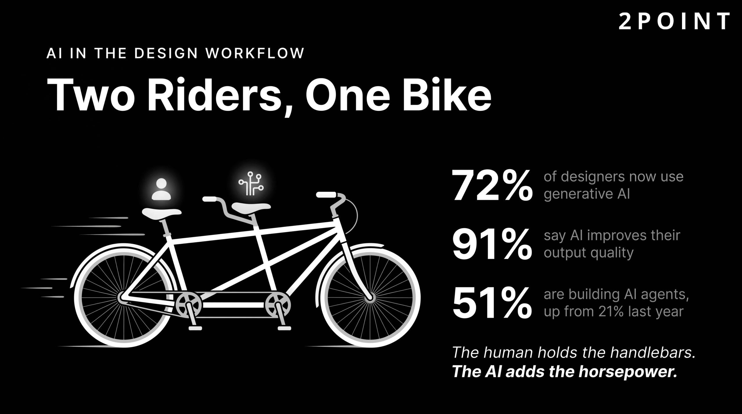
Artificial intelligence has moved from a speculative design element to a practical everyday tool for the majority of working designers. Figma's 2026 design trends research found that 72% of designers now incorporate generative AI into their workflows, with 91% reporting that AI improves the quality of their output. These numbers represent a fundamental shift in how design work gets done: AI accelerates ideation, automates repetitive production tasks, and enables designers to explore a wider solution space in less time.
The emergence of agentic AI is the next frontier. 51% of AI product designers are now building agents, compared to just 21% last year, reflecting rapid growth in AI systems that can perform multi-step tasks autonomously rather than simply responding to individual prompts. For website design, this translates to interfaces that do things for users rather than simply presenting options. Proactive chatbots that anticipate user needs, handle complex multi-step tasks, and provide personalized responses are becoming a standard component of the user experience on sophisticated websites.
Voice navigation represents another dimension of this shift. Figma's research highlights major brands including Walmart, Domino's, Nike, ASOS, H&M, and Sephora as leaders in voice-enabled web experiences that go beyond simple search queries to allow users to navigate product catalogs, customize orders, and complete purchases using natural spoken language. This is not science fiction. It is the current leading edge of interface design for consumer-facing websites. Perhaps most telling for design teams considering AI adoption: designers who are increasing their use of AI tools are 25% more likely to report high job satisfaction than those who are not. The tool is not threatening the profession. It is, for many designers, making the work more enjoyable and the results more ambitious.
Immersive 3D Experiences and WebGL
The movement from static image galleries to 3D-driven interactive experiences represents one of the most technically significant shifts in web design in recent years. WebGL, the browser-native graphics API, now enables hardware-accelerated 3D rendering directly in the browser without plugins. Figma's trend research documents the growth of WebGL and 3D experiences in commercial web design, particularly for product visualization, brand storytelling, and interactive marketing campaigns.
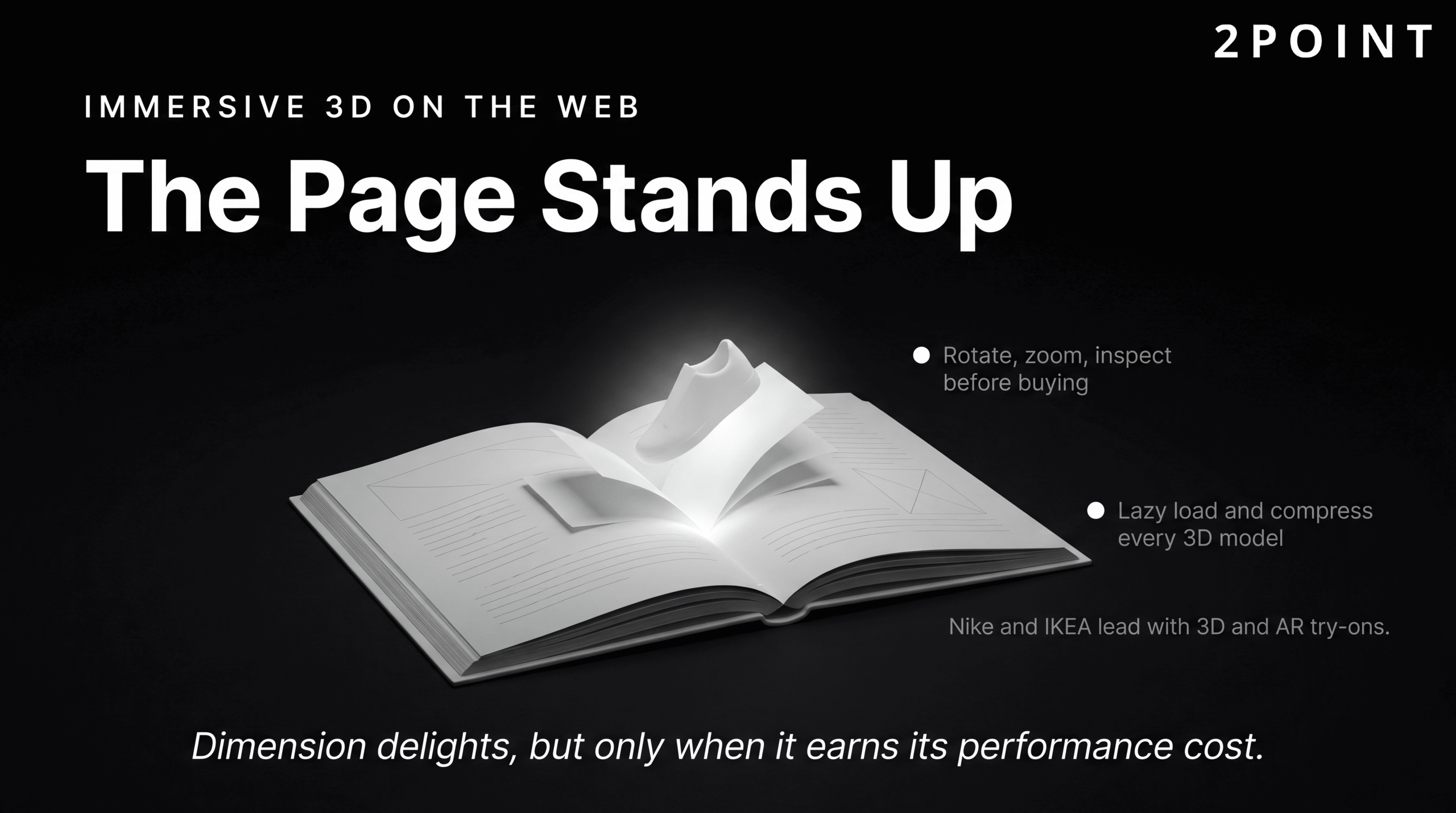
The practical applications are compelling. Interactive product models allow e-commerce shoppers to rotate, zoom, and inspect products from every angle before purchasing. Scroll-triggered animations create experiences where the user's navigation through a page unfolds like a story. Augmented reality previews, when coupled with mobile cameras, allow users to see products in their own physical spaces before committing to a purchase. Nike and IKEA are the most frequently cited examples of brands using 3D and AR effectively for product visualization and virtual try-ons, with measurable impacts on purchase confidence and return rates.
The critical caveat for teams considering 3D and WebGL is performance. Three-dimensional assets are significantly heavier than their two-dimensional equivalents, and complex WebGL scenes can consume substantial CPU and GPU resources, particularly on mobile devices. Lazy loading 3D content and aggressively compressing 3D models are essential practices for any team pursuing these experiences. The design question to ask before committing to a 3D approach is always: does this experience justify its performance cost for this specific user and this specific context? When the answer is yes, the results can be extraordinary. When the answer is maybe, static images with excellent photography often serve users better and load faster.
Bold Typography and Kinetic Text
Typography has become one of the defining visual statements in contemporary web design. As layouts have simplified and visual clutter has been stripped away, the font choices a brand makes, the scale at which type is displayed, and the way type moves on screen carry more expressive weight than ever. Squareboat's web design trends analysis identifies bold typography as one of the most prominent visual directions in current design, with oversized display fonts, generous line spacing, and highly variable font weights creating layouts where type itself functions as visual design rather than just content delivery.
Kinetic typography, meaning type that animates in response to scroll position, cursor interaction, or time, has moved from experimental to mainstream in the portfolio and brand storytelling contexts where visual impact is the primary goal. Headline treatments that assemble word by word, characters that respond to mouse position, and text that morphs between states create memorable interactive moments that differentiate brand experiences from commodity websites.
Variable fonts continue to enable this expressive typographic direction while maintaining or improving performance. The ability to animate between font weights using a single variable font file means that kinetic text effects that would previously have required multiple font files, or been avoided entirely for performance reasons, are now achievable within a reasonable performance budget. The balance to maintain is personality versus readability. Bold typography and kinetic effects should amplify the message, not compete with it. When type becomes so expressive that it obscures content, the design has served itself rather than the user.
Color and Visual Aesthetic Shifts
The color landscape in 2026 website design is characterized by two strong but opposite movements that coexist because they serve different contexts and audiences. Figma's research identifies a trend toward bright, highly saturated palettes driven by Y2K nostalgia, "dopamine design" principles, and the visual language of neon gradients. This direction is particularly prevalent in consumer technology, gaming, entertainment, and brands targeting younger demographics where energy and immediacy are primary brand values.
The counter-trend is equally strong. Wix's 2026 design analysis describes a "nature distilled" aesthetic characterized by earthy, muted tones, warm neutrals, and palettes drawn from natural materials rather than digital sources. This direction is dominant in wellness, food, lifestyle, sustainability, and luxury sectors where calm, authenticity, and trust are the primary brand emotions. The two movements are not in conflict; they are a healthy indicator of a design landscape mature enough to accommodate diverse visual strategies for diverse audiences.
At the component level, glassmorphism has experienced a significant resurgence following Apple's introduction of its Liquid Glass design system. Envato's design trends resource describes this as a maturation of glassmorphism, moving from the early implementations that felt novelty-driven to a more sophisticated application of blur, transparency, and layering that creates genuine depth and hierarchy. Organic shapes and soft gradients are replacing the rigid geometric minimalism that dominated for several years, introducing visual warmth and human irregularity. Elementor's 2026 trends guide highlights anti-grid layouts as an emerging direction, where intentional departures from rigid alignment grids suggest handcrafted, human decision-making rather than algorithmic layout generation.
Animation and Micro-Interactions: Movement with Purpose
Animation in website design occupies a uniquely contested space. Done well, it is one of the most powerful tools available for communicating system state, guiding user attention, and creating experiences that feel alive and responsive. Done poorly, it is one of the most reliable ways to annoy users, slow down a site, and obscure the content people came to find. The key distinction is purpose: animation that serves usability belongs in the design; animation that serves the designer's desire to create something visually interesting belongs on the cutting-room floor.
The 2026 design conversation around animation reflects a growing sophistication in how teams approach this distinction. On one hand, animation tooling has never been more accessible or more powerful, and the quality of animated experiences at the high end of the market has never been higher. On the other hand, that accessibility has also produced a generation of sites where motion is deployed without discipline, creating experiences that are visually busy but communicatively empty. The following sections address the spectrum from purposeful functional animation through the backlash against excess.
Functional Animation and User Guidance
Functional animation is movement that supports clarity and usability rather than movement that exists for its own sake. Elementor's 2026 design trends analysis frames functional animation as a core component of modern interface design precisely because it reduces the need for users to read instructions or figure out what has happened on screen. When an animation clearly communicates that a file is uploading, that a form field has been validated, or that a navigation drawer is sliding in from the left edge, users understand the system state without conscious effort.
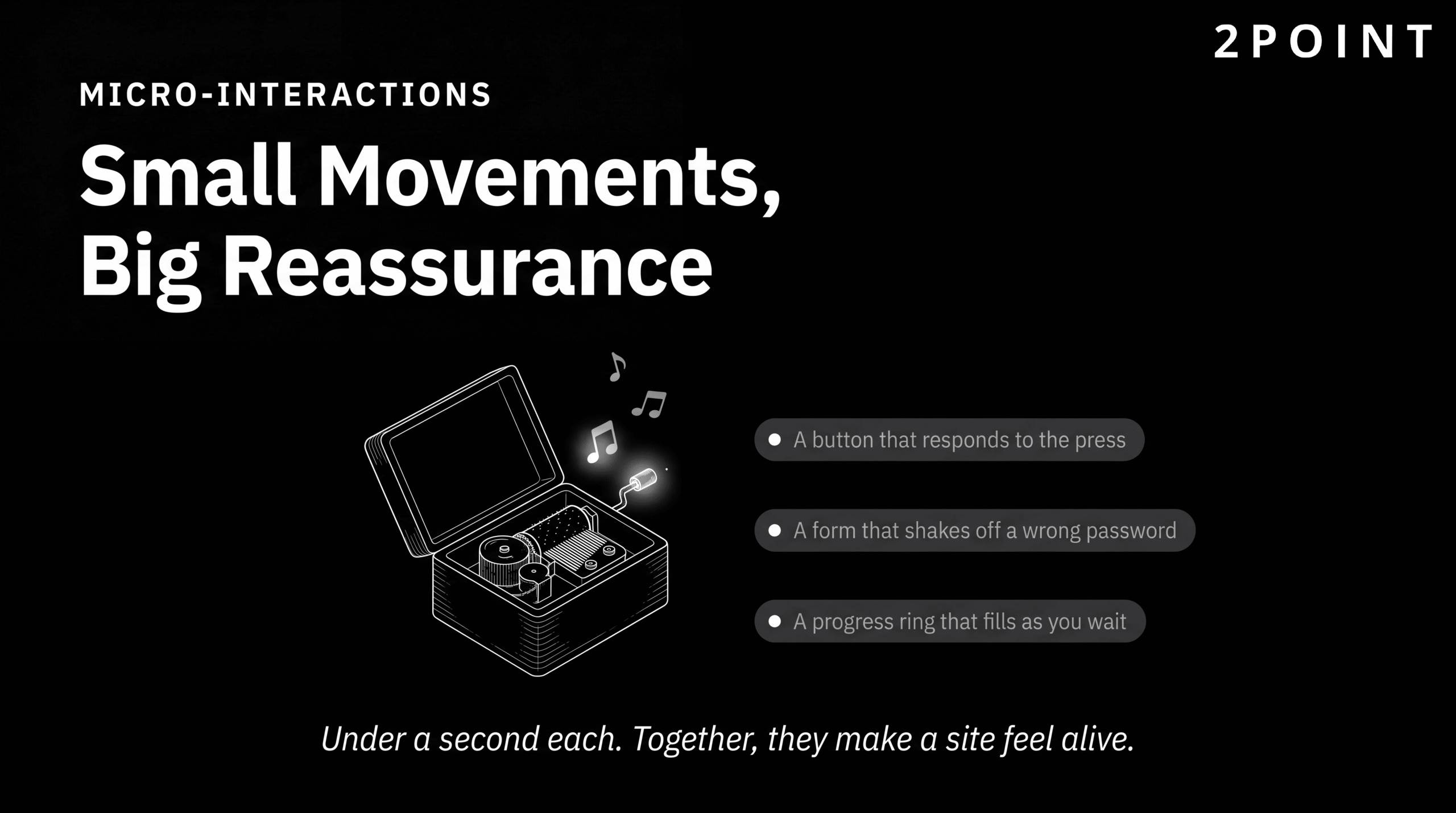
Micro-interactions are the most granular expression of functional animation. These are small, focused animations that acknowledge user actions and communicate system response: the brief color change when a button is pressed, the subtle shake of a login form when credentials fail, the progress indicator that fills as a file uploads, the toast notification that slides in to confirm an action has been completed. Each of these interactions takes less than a second. Each one, when well-designed, adds measurable reassurance and clarity to the user's experience. The cumulative effect of well-executed micro-interactions is a site that feels attentive and trustworthy, as though it is actively responding to the user's presence. For teams looking to strengthen this dimension of their design, the resources on how to enhance website functionality for better user experience cover the practical implementation of these interaction patterns in depth.
Scroll-Based and Triggered Animations
Scroll-based animation has become one of the signature techniques of ambitious web design, particularly for brand storytelling, product launches, and portfolio sites. Squareboat's design trends analysis identifies scroll-based animation as a driver of narrative user experiences, where the user's progression through a page unfolds a story rather than simply reveals content. When implemented with technical discipline, this approach turns passive reading into active exploration, creating a sense of journey and discovery that static pages cannot replicate.
The technical implementation of scroll-based animation has matured considerably. The Intersection Observer API allows effects to trigger when specific elements enter the viewport, enabling image reveals, counter animations, and section transitions that respond to the user's reading pace. CSS scroll-driven animations, now well-supported in modern browsers, enable complex timeline-synchronized effects without JavaScript overhead. Parallax effects, where layers move at different speeds to create depth, remain popular when applied subtly and can become nauseating and performance-intensive when applied without restraint.
Critical technical considerations for any scroll-based animation implementation include performance impact on mobile devices, where the CPU and GPU resources available are significantly lower than on desktop, and respect for users who have enabled the reduced-motion preference in their operating system settings. The prefers-reduced-motion CSS media query allows designers to provide a graceful non-animated alternative for users who experience motion sickness or other vestibular sensitivities, making scroll animation accessible without abandoning it entirely.
The Backlash Against Excessive Motion
The democratization of animation tools has had a predictable side effect: a proliferation of motion for its own sake. Creative Boom's 2026 trends analysis documents a growing industry backlash against what critics describe as animated brand guidelines and demo reels that "move a great deal while communicating very little." The complaint is not against animation itself but against motion deployed as a signifier of sophistication rather than as a tool for communication. When everything moves, nothing is emphasized.
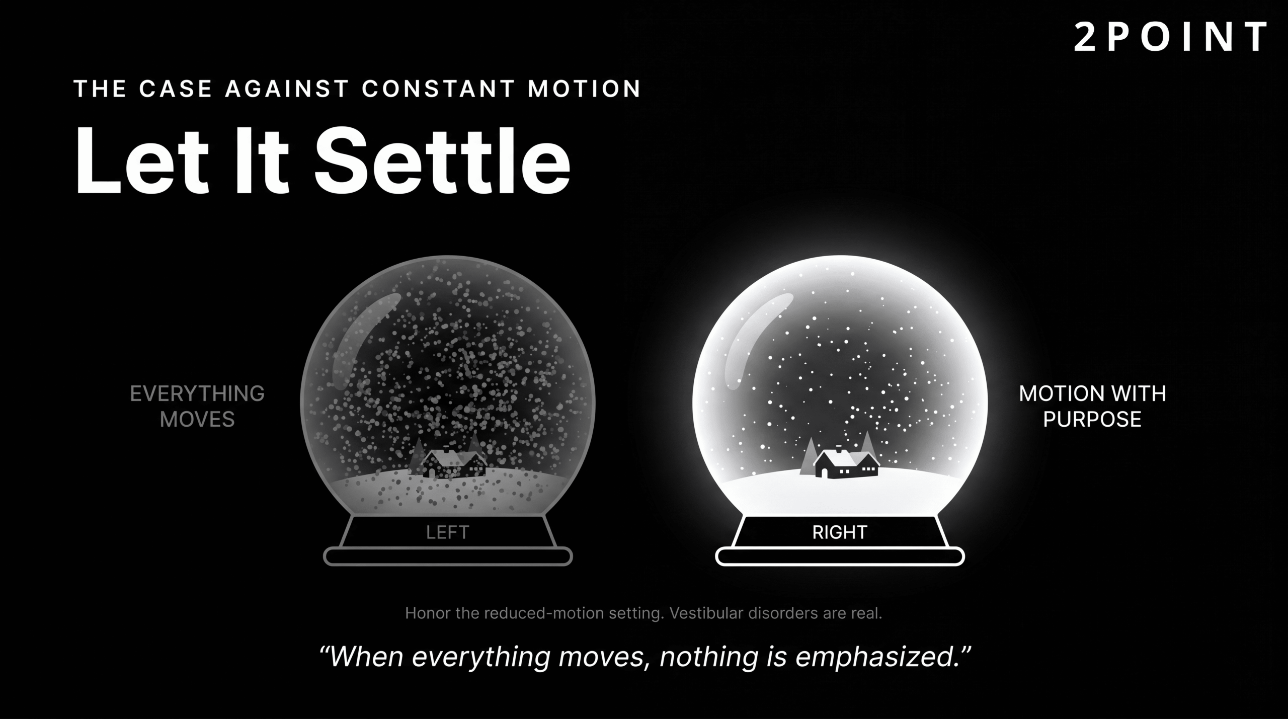
The accessibility concerns around excessive animation are serious and frequently under-addressed. Vestibular disorders affect a significant portion of the population, and certain types of motion, particularly large-scale parallax effects, fast-moving backgrounds, and persistent looping animations, can trigger genuine physical symptoms including dizziness and nausea. Beyond vestibular sensitivities, excessive motion increases cognitive load for all users, making it harder to focus on content and more difficult to complete tasks that require sustained attention.
Respecting the operating system level preference for reduced motion is the baseline technical response. But the deeper design response is to interrogate every animation decision at the point of conception rather than at the point of publication. The right questions are: What does this animation communicate to the user? Does it reduce confusion or add to it? What is the performance cost, and is the user experience value worth that cost? Is there a simpler, equally effective alternative? Animation that can justify clear answers to these questions belongs in the design. Animation that cannot should be removed, regardless of how visually impressive it might be.
Conversion-Focused Website Design Strategies
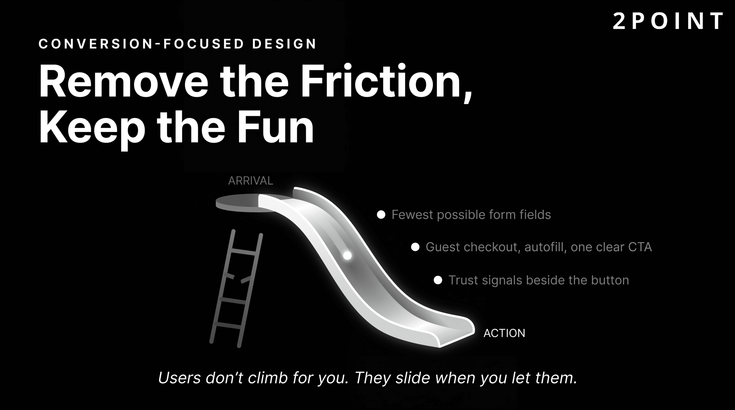
A visually beautiful website that fails to convert visitors into customers, leads, or subscribers has not succeeded at its business mission. Conversion-focused website design is the discipline of integrating visual design, user experience principles, persuasive psychology, and business strategy into a coherent whole that moves users from arrival to action. It is not about making sites manipulative or cheap-looking. The best conversion-focused designs are also the most elegantly designed, because clarity, trust, and ease of use are simultaneously good design and good conversion strategy.
Understanding conversion-focused design requires accepting that design decisions are testable business hypotheses. Every layout choice, every CTA button color, every form field that is included or removed is a decision that affects user behavior in measurable ways. The teams that achieve the best conversion results are not the ones with the best aesthetic instincts, though that matters too. They are the ones with the most rigorous testing culture and the most honest relationship with their data.
Understanding Conversion Rate Optimization
Conversion rate optimization (CRO) is the systematic process of increasing the percentage of website visitors who complete a desired action, whether that action is a purchase, a form submission, a phone call, or a newsletter sign-up. MyTasker's modern web design best practices guide frames CRO as an integration point between website design, digital marketing campaigns, email marketing, and social media, where improvements in the website experience amplify the return on investment from every traffic-driving activity.
The key metrics that define CRO success include conversion rate as the primary indicator, supported by bounce rate, time on page, scroll depth, and click-through rate on specific calls to action. Each metric tells a different part of the story. A high bounce rate on a landing page might indicate that the page content does not match the expectation set by the ad or search result that brought the user there. Low time on page might indicate that content is not compelling or credible enough to hold attention. Understanding what the metrics are actually telling you about user behavior requires combining quantitative data with qualitative user research.
The testing mindset that CRO requires is: form a hypothesis about why a design element is underperforming, create a variant that addresses that hypothesis, expose both versions to real users simultaneously, collect data until statistical significance is achieved, and implement the winner as the new baseline before testing the next hypothesis. This cycle never truly ends. The impact of website design on conversions is not a fixed quantity. It is a function of how well the design serves the specific users arriving on the site at a specific moment in time, and it should be continuously optimized.
Design Elements That Drive Conversions
Certain design elements consistently correlate with higher conversion rates across site types and industries, because they address the psychological barriers that prevent users from taking action. Trust is the most fundamental barrier. NWS Digital's design analysis notes that users determine trust based on design quality within seconds of arriving on a site. Professional visual design, credible imagery, and the absence of design inconsistencies communicate reliability and competence before any content is read.
| Conversion Design Element | Function | Best Practice |
|---|---|---|
| Trust Signals | Reduce purchase anxiety and build credibility | Customer testimonials with photos, security badges near CTAs, recognizable client logos |
| Value Proposition | Communicate the primary benefit immediately | Above-the-fold headline that answers "why should I care" in under ten words |
| Call to Action (CTA) | Guide users to the next step | High-contrast button, action-oriented copy, consistent placement, sufficient white space |
| Form Design | Reduce friction in the conversion moment | Minimum required fields only, inline validation, clear error messages, progress indicators |
| Social Proof | Validate the decision through peer behavior | Review counts, star ratings, recent purchase notifications, user-generated content |
| Scarcity and Urgency | Motivate timely action without pressure tactics | Honest inventory counts, genuine deadline countdowns, used sparingly and truthfully |
| Friction Reduction | Remove obstacles between intent and action | Guest checkout options, autofill support, single-sign-on alternatives, minimal steps |
The most effective conversion-focused designs combine these elements in a coherent system where each component reinforces the others, creating a seamless path from first impression to completed action.
The relationship between visual design quality and perceived trustworthiness cannot be overstated. A site that looks outdated, inconsistent, or visually careless signals to users that the organization behind it may be equally inattentive to quality in its products or services. Investing in professional website design is not a luxury for businesses that care about conversion. It is a prerequisite. The resources on the impact of good website design on customer retention document how these trust signals compound over time, turning first-time visitors into loyal repeat customers.
Testing and Iteration for Continuous Improvement
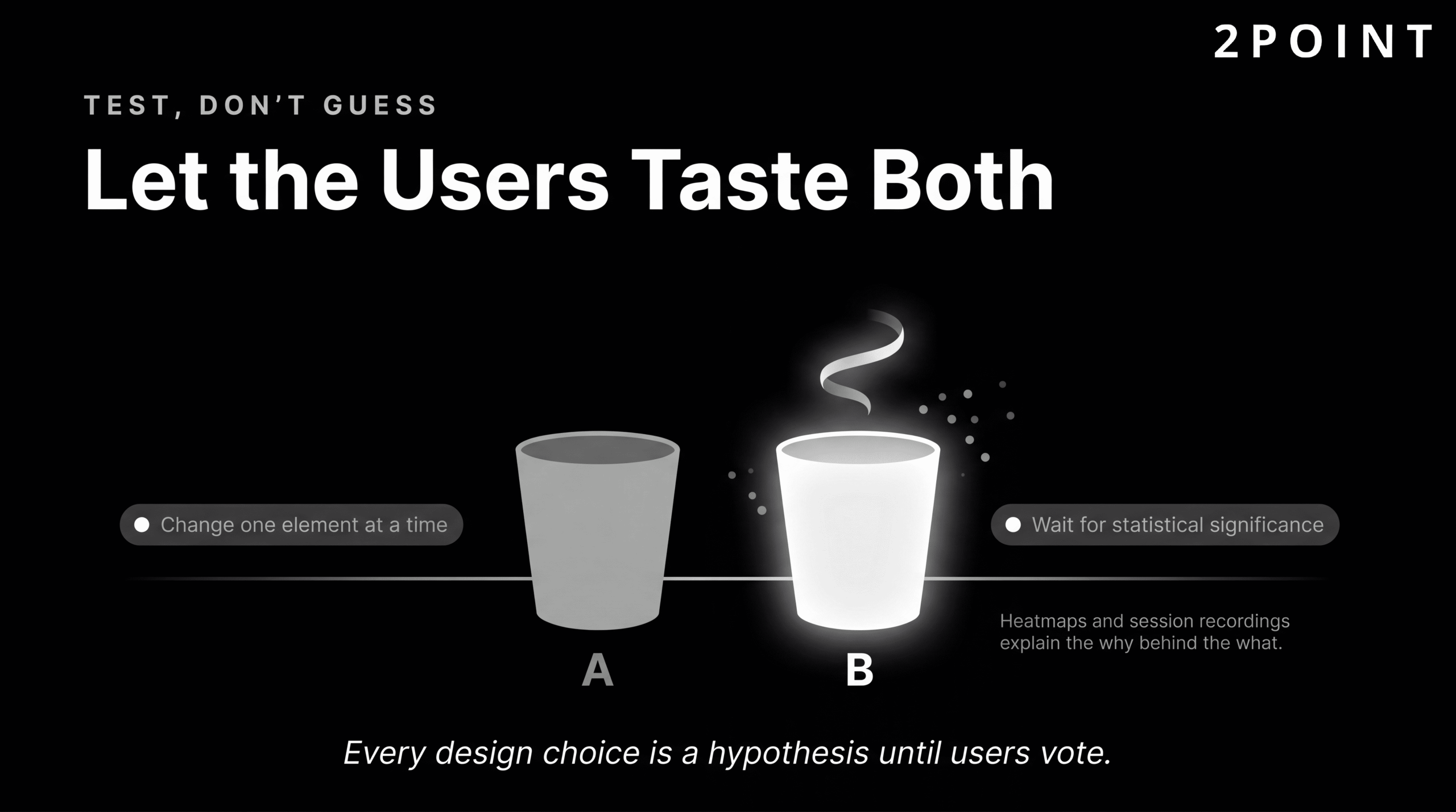
A/B testing is the methodological backbone of conversion rate optimization. The process involves presenting two versions of a page or component to separate segments of real user traffic simultaneously, measuring how each version performs against a defined conversion goal, and implementing the higher-performing version when statistical significance is achieved. The key discipline in A/B testing is isolating variables: changing only one element at a time so that any difference in performance can be attributed to that specific change rather than the interaction of multiple changes.
Multivariate testing extends this approach to pages where multiple elements are being tested simultaneously, using statistical modeling to evaluate the performance of different combinations. This approach requires significantly higher traffic volumes to achieve statistical significance and is most appropriate for high-traffic pages where the efficiency of testing multiple hypotheses simultaneously justifies the complexity.
Quantitative testing answers the question of what users are doing. Qualitative research answers the question of why. GeeksforGeeks' UI/UX design principles resource emphasizes iterative testing as a foundational principle of effective design, advocating for the combination of session recording tools, heatmap analysis, user interviews, and moderated usability testing to build a complete picture of the user's experience. Heatmaps reveal where users are clicking, how far they are scrolling, and where their attention concentrates. Session recordings allow designers to watch real users navigate the site and identify moments of confusion or frustration that analytics data alone would never reveal. The teams that build the best-converting websites are the ones that never stop asking what their users actually experience, and never stop acting on the answers. The principles for doing this well are covered in detail in the guide on how to improve website user experience for conversions.
Technical Excellence in Modern Web Design
The distinction between design and development has never been more fluid than it is in 2026. Modern designers work in tools that generate code, understand component architecture, and make decisions that directly affect technical performance. Modern developers contribute significantly to the design of interaction patterns, animation timing, and user feedback mechanisms. The best web experiences emerge from teams where this boundary is deliberately permeable, where designers understand enough about technical constraints to make better design decisions, and developers understand enough about design principles to make better implementation decisions.
Technical excellence in web design is not about using the most advanced technology available. It is about using the right technology, implemented well, in service of clear user and business goals. The sections below cover the modern CSS capabilities that have transformed layout and design systems, the component-based architecture that enables scalable and maintainable design at scale, and the progressive enhancement philosophy that ensures baseline functionality for every user regardless of browser capability.
Modern CSS and Layout Systems
CSS has undergone a transformation over the past several years that has rendered many of the hacks and workarounds that dominated web layout for a decade unnecessary. Squareboat's web design trends analysis identifies modern CSS features as defining the current standard for web layout, with CSS Grid and Flexbox now universally supported and capable of producing complex responsive layouts that would have required significant JavaScript intervention just a few years ago.
CSS Grid provides a two-dimensional layout system that handles both rows and columns simultaneously, enabling sophisticated page layouts without nested div structures or float-based hacks. Flexbox handles one-dimensional alignment, perfect for component-level layout: navigation bars, card rows, form fields, and button groups. Subgrid, now well-supported across modern browsers, allows nested grid elements to align to their parent grid, solving the long-standing problem of aligning elements across nested containers.
Container queries represent a significant evolution in responsive design capability. Where media queries respond to the viewport size of the browser window, container queries allow components to respond to the size of their immediate parent container. This means a card component can lay out differently when placed in a narrow sidebar versus a wide main content area, without any changes to the page-level CSS. Combined with CSS custom properties (variables) that enable maintainable, themeable design systems, and CSS custom property animations that enable design token-driven motion, modern CSS provides a complete, expressive, and performant toolkit for design implementation without the bloat of legacy approaches. For teams focused on delivering an excellent technical foundation, the guidance on how to enhance website functionality for better user experience covers both the technical and user-facing dimensions of these decisions.
Component-Based Design and Development
Component-based architecture has become the dominant paradigm for building modern websites and web applications because it solves the problems of scale, consistency, and maintainability that plague monolithic codebases. Squareboat's analysis identifies modular UI components as a defining characteristic of modern web development standards. A component is a self-contained, reusable unit of UI: a button, a form field, a navigation bar, a product card. Each component encapsulates its own structure, styles, and behavior, and can be composed with other components to build pages and features.
The design-development handoff has been transformed by this paradigm. Tools like Figma enable designers to build component libraries that mirror the component architecture developers will implement, creating shared language and shared expectations across the team. When a designer updates a component in Figma, developers can immediately see how that change should propagate through every instance of that component across the product. This alignment reduces the interpretation errors and design drift that historically occurred when designs were handed off as static files for developers to re-create from scratch.
Atomic design methodology provides a useful conceptual framework for organizing components from the ground up. Brad Frost's system defines five levels: atoms (individual HTML elements like buttons and inputs), molecules (simple combinations of atoms), organisms (complex UI sections like navigation headers), templates (page-level wireframes), and pages (specific implementations of templates with real content). Building from atoms upward ensures that every design decision is made in the context of how it will compose with other elements, preventing inconsistencies that arise when complex components are designed in isolation. Open-source component libraries like Material UI, Chakra UI, and Radix provide production-quality starting points that teams can customize and extend, significantly accelerating the foundation-building phase of new projects.
Progressive Enhancement and Graceful Degradation
Progressive enhancement is the design philosophy that starts from a baseline experience that works for every user on every browser and every device, then layers in enhanced features for users whose browsers and devices can support them. The baseline is functional and accessible. The enhancements are enriching and delightful. Neither should be required for the other to work.
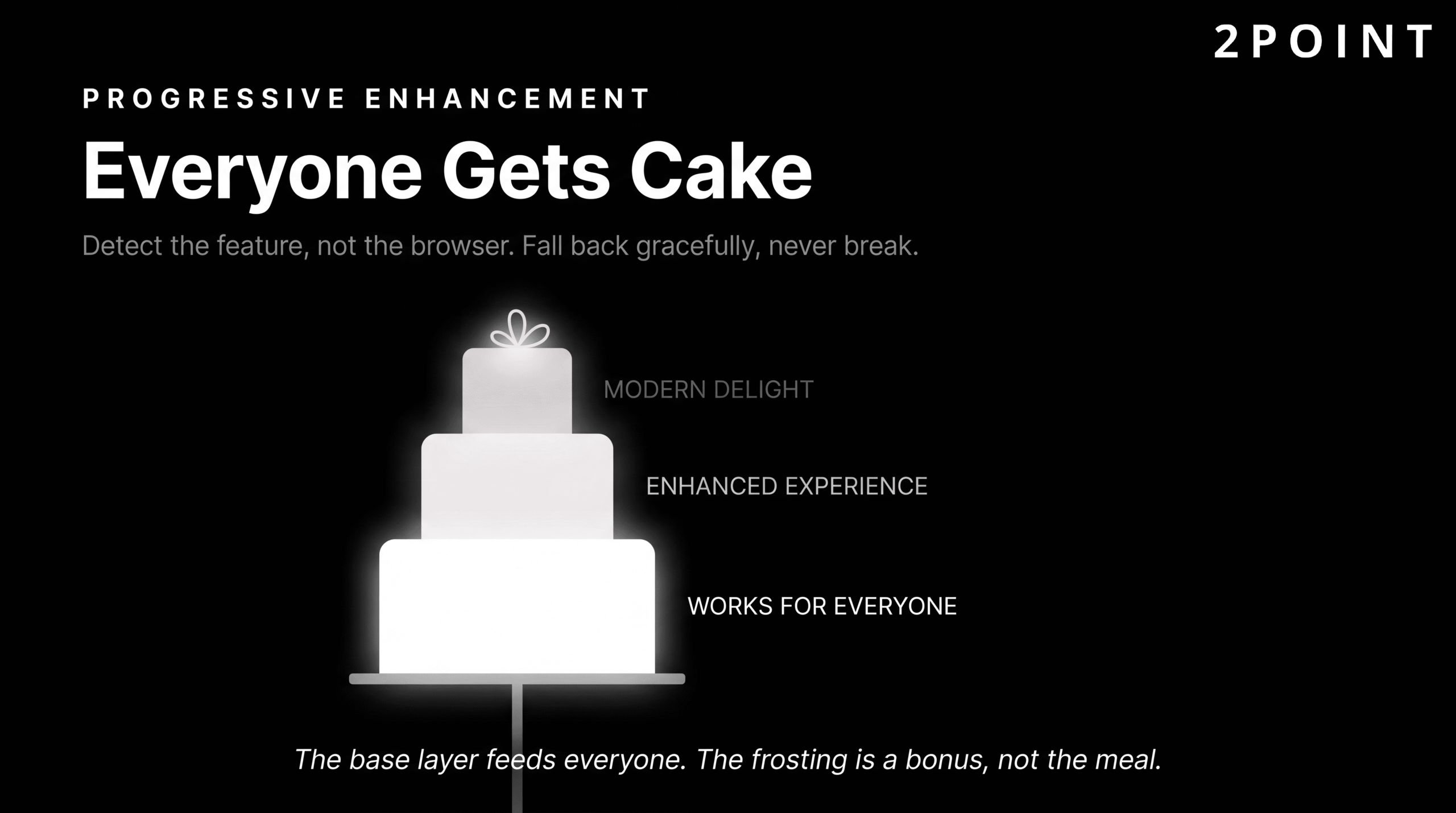
This philosophy directly addresses one of the most persistent tensions in modern web design: the desire to use cutting-edge features against the reality that a significant portion of any site's audience may be using older browsers, slower devices, or assistive technologies that do not support those features. Graceful degradation is the complementary concept, describing how a site or feature should behave when something goes wrong or a capability is absent: not crashing or displaying a broken state, but falling back to a simpler but still functional alternative.
Feature detection through tools like Modernizr, or the native CSS @supports at-rule, allows developers to check whether a specific browser capability is available before attempting to use it. This is preferable to browser detection because it tests for the actual capability rather than making assumptions based on browser identity. A browser that is three versions behind on one feature may be current on another, and browser detection logic becomes unmanageable as the number of browsers, versions, and devices in use grows. Progressive enhancement built on feature detection produces sites that work everywhere and shine on modern platforms: the ideal combination for any organization that cares about both innovation and inclusivity. The philosophy also reinforces the best website design practices for user engagement by ensuring that no user is left with a broken or degraded experience simply because their technology differs from the designer's assumptions.
Building Websites That Work: Purpose Over Perfection
The most important insight that emerges from a thorough examination of modern website design is that the discipline is not fundamentally about technology or trends. It is about intention. Every principle, every best practice, every technical standard discussed in this guide exists in service of the same underlying goal: creating experiences that serve real human beings effectively, efficiently, and respectfully.
The six themes worth carrying forward from this guide are:
- Foundation First: User-centered design, mobile-first approach, accessibility, and performance are non-negotiable foundations. They are not optional enhancements to be added when budget allows. They are the conditions under which good design becomes possible.
- Trends as Tools: The 2026 landscape offers powerful and genuinely exciting tools including AI integration, 3D experiences, bold typography, and immersive animation. Each is worth evaluating seriously. None should be adopted simply because it is current.
- Balance and Intention: Modern web design navigates genuine tensions: AI efficiency alongside human creativity, visual richness alongside performance, experimental design alongside usability, and trend adoption alongside timeless principles. Navigating these tensions well requires clarity of purpose at every decision point.
- Business Impact: Effective website design directly affects the bottom line through conversion rates, user trust, search rankings, and competitive positioning. The evidence for this is quantitative, replicable, and growing. Design investment is business investment.
- Continuous Evolution: Website design is not a one-time project. It is an iterative process requiring ongoing testing, refinement, and adaptation as user expectations, technology, and business needs evolve. The launch is the beginning of the work, not the end.
- The Human Element: Despite 72% of designers now incorporating AI into their workflows, the most successful websites maintain human intention. They feel purposeful, trustworthy, and genuinely helpful because a human being made deliberate choices to serve another human being well.
The work that stands out in 2026 is not necessarily the most trend-forward or the most technically advanced. It is the work designed with clear purpose, executed with technical excellence, and refined through real user feedback. Start with strong foundations, adopt trends strategically, test relentlessly, and never lose sight of the humans using what you build. Teams looking for a partner to bring this level of intention and expertise to their web presence will find that 2POINT approaches every project with exactly this combination of strategic clarity and technical rigor.
Frequently Asked Questions About Website Design
What is website design and what does it include?
Website design is the strategic process of planning and creating the visual, functional, and structural elements of a website to serve user needs and achieve business goals. It encompasses visual design, user experience (UX), user interface (UI) design, information architecture, and performance optimization working together as a unified discipline.
How much does professional website design cost?
Website design costs vary widely based on scope, complexity, and whether you work with a freelancer, agency, or use a DIY platform. A simple business website typically ranges from $2,000 to $15,000, while complex e-commerce or custom web applications can cost $25,000 to $150,000 or more. Ongoing maintenance, hosting, and optimization represent additional recurring costs beyond the initial build.
What is the difference between website design and web development?
Website design focuses on the visual and experiential aspects of a site: layout, color, typography, user interface, and user experience. Web development focuses on the technical implementation: writing the code that makes the design functional in a browser. In practice, modern web projects require close collaboration between both disciplines, and many professionals have meaningful skills in both areas.
What is responsive web design and why does it matter?
Responsive web design is an approach that creates a single website whose layout automatically adapts to the screen size and orientation of any device, from mobile phones to desktop monitors. It matters because over 60% of web traffic comes from mobile devices, and Google uses mobile-friendliness as a ranking factor in search results. A non-responsive site delivers a poor experience to the majority of users and ranks lower in search engines.
How does website design affect SEO?
Website design affects SEO through multiple factors including page load speed (a direct ranking signal), mobile-friendliness (required for Google's mobile-first index), Core Web Vitals scores (factored into page experience rankings), heading structure (used by crawlers to understand content hierarchy), and accessibility (semantic HTML improves both accessibility and crawlability). Poor design choices in any of these areas can suppress search visibility regardless of content quality.
What is user-centered design and how is it different from regular design?
User-centered design (UCD) is a philosophy and process that places user needs, behaviors, and feedback at the center of every design decision, validated through ongoing research and testing with real users. Regular (assumption-based) design relies on the designer's or stakeholder's beliefs about what users want. UCD consistently produces better usability outcomes because it is grounded in evidence rather than assumption.
What are Core Web Vitals and how do they relate to website design?
Core Web Vitals are three metrics Google uses to measure real-world page experience: Largest Contentful Paint (LCP) measures loading speed, First Input Delay or Interaction to Next Paint (INP) measures interactivity, and Cumulative Layout Shift (CLS) measures visual stability. Design decisions directly influence all three: image sizes and loading strategy affect LCP, JavaScript-heavy interactions affect INP, and elements that shift the layout during loading affect CLS.
Custom website design vs. website templates: which is better?
Custom website design is built specifically for your business goals, brand identity, and user needs, offering complete flexibility but higher cost and longer timelines. Templates provide a faster, more affordable starting point with less flexibility and a higher risk of your site looking similar to competitors. The right choice depends on your budget, timeline, competitive differentiation needs, and the complexity of your user experience requirements.
What are the most important website design trends for 2026?
The most impactful 2026 website design trends include AI-assisted interfaces and intelligent chatbots, immersive 3D experiences powered by WebGL, bold expressive typography with variable fonts, scroll-triggered narrative animations, glassmorphism-influenced visual depth, and a divergence between saturated dopamine-design palettes and earthy nature-inspired aesthetics. The most important filter for any trend is whether it serves your users and your business goals, not whether it is currently fashionable.
How long does it take to design a website?
A simple informational website typically takes four to eight weeks from kickoff to launch. A more complex business website with custom functionality, content strategy, and thorough testing typically takes eight to sixteen weeks. Large-scale e-commerce platforms or web applications can take six months to a year or more. Timeline is heavily influenced by how quickly stakeholders can provide content, feedback, and approvals during the process.
What is website accessibility and is it legally required?
Website accessibility means designing and building websites that can be used by people with a range of disabilities, including visual, auditory, motor, and cognitive differences, following standards like the Web Content Accessibility Guidelines (WCAG). Legal requirements vary by country and organization type, but accessibility lawsuits have increased significantly in the United States, the European Union has the European Accessibility Act in force, and public sector organizations in many countries are legally required to meet accessibility standards.
How do I know if my website design is working effectively?
An effective website design can be measured through a combination of quantitative metrics including conversion rate, bounce rate, time on page, Core Web Vitals scores, and search ranking positions, alongside qualitative insights from user testing, session recordings, heatmaps, and direct user feedback. Regular A/B testing of key pages and components, combined with periodic accessibility audits and performance monitoring, provides the ongoing signal needed to continuously improve design effectiveness.
