FOLLOW US

Last update: May 13, 2026 Reading time: 40 Minutes
UI/UX design shapes every digital interaction we have, from mobile apps to enterprise software. Understanding how these disciplines work together is essential for building products that users love and businesses value.
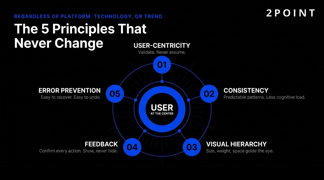
Despite rapid technological evolution, foundational UI/UX principles remain constant. These time-tested guidelines ensure digital products serve users effectively regardless of platform, technology, or design trend.
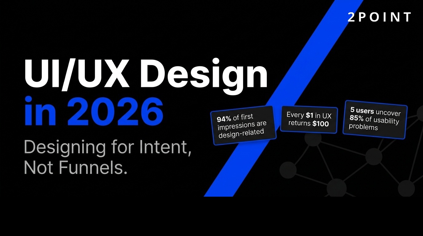
User-centricity means prioritizing real user needs over assumptions or business preferences. This principle requires designers to validate ideas through direct user feedback rather than relying on intuition. Research from Nielsen Norman Group demonstrates that testing with just five users uncovers 85% of usability problems, making small-scale testing remarkably effective.
The Uber case study illustrates this principle powerfully. Eight user interviews revealed an insight that shaped a major feature: riders wanted to favorite specific drivers, not just rate them. This discovery came from listening to what users actually needed rather than what the product team assumed. The “favorite driver” feature became a differentiator because it addressed a real, validated user desire.
Distinguishing between what users ask for and what they actually need requires skill and experience. Users often request specific solutions when the underlying problem differs from their proposed fix. Effective UX design identifies the root problem through observation and questioning. Testing assumptions before large-scale rollouts prevents costly mistakes and ensures resources focus on features that genuinely improve user experience.
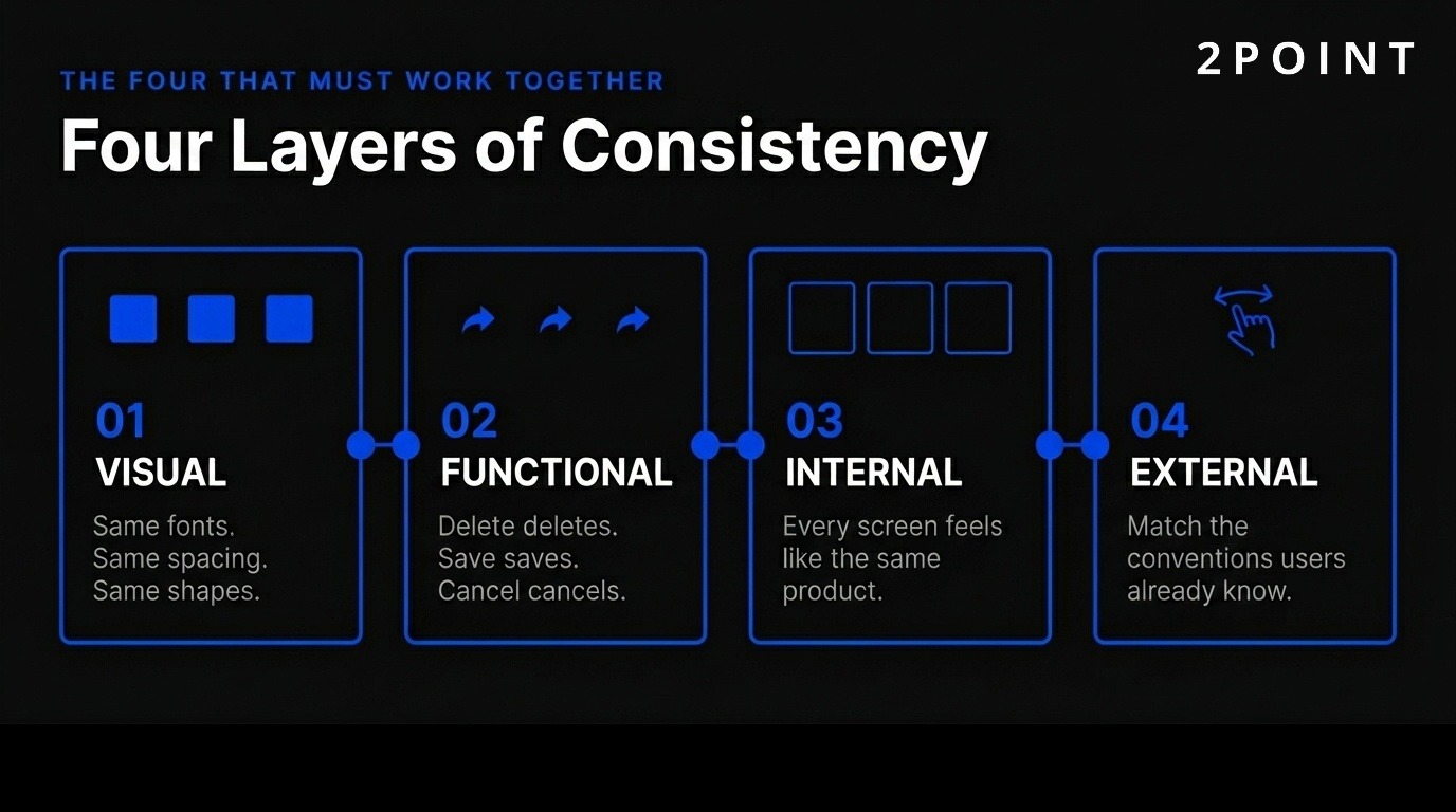
Consistency reduces cognitive load by establishing predictable patterns users can learn once and apply throughout a product. Four types of consistency work together to create coherent experiences: visual, functional, internal, and external.
Visual consistency maintains uniform fonts, colors, and spacing throughout a product. When buttons share the same corner radius and color palette, users instantly recognize interactive elements without conscious thought. Functional consistency ensures interactions behave predictably—delete always deletes, save always saves, cancel always exits without changes. This predictability builds user confidence and reduces errors.
Internal consistency refers to coherence within your own product. All screens and workflows should feel like parts of the same system. External consistency matches conventions users already know from other platforms. For example, iOS users expect that swiping right returns to the previous screen. Fighting these established patterns creates unnecessary friction and forces users to relearn basic interactions for no benefit.
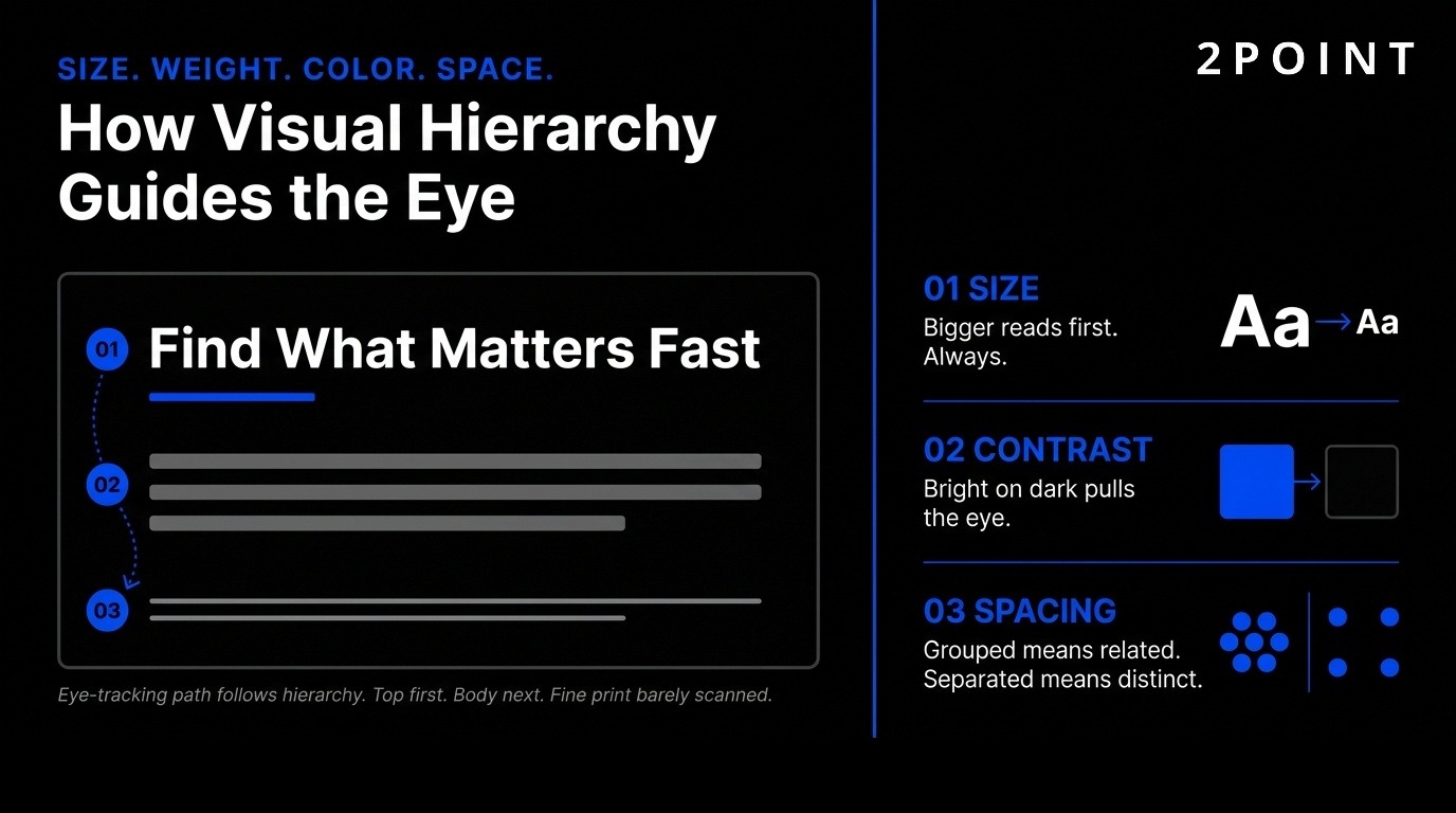
Visual hierarchy guides user attention through strategic use of size, weight, color, and spacing. Large, bold fonts emphasize important information like headlines and calls-to-action. Contrasting colors direct users to key elements—bright buttons stand out against neutral backgrounds. Strategic spacing shows relationships between UI elements, with related items grouped closely and unrelated items separated.
The familiarity principle recognizes that users feel comfortable with what they already know. Keeping navigation, buttons, and workflows aligned with user expectations reduces learning time and frustration. Progressive disclosure reveals functionality gradually, one task at a time, preventing overwhelm. Users see only what they need for their current goal, with advanced features available but not intrusive.
Information architecture organizes content logically so users find what they need quickly. Clear labels, intuitive categories, and shallow navigation hierarchies help users build accurate mental models of how a product works. When structure matches user expectations, navigation becomes intuitive rather than puzzling.
Users must know system status through appropriate, timely feedback. Immediate visual or auditory cues confirm interactions—buttons change color when pressed, loading spinners indicate progress, success messages confirm completed actions. Without feedback, users wonder whether their action registered and may click repeatedly, creating errors.
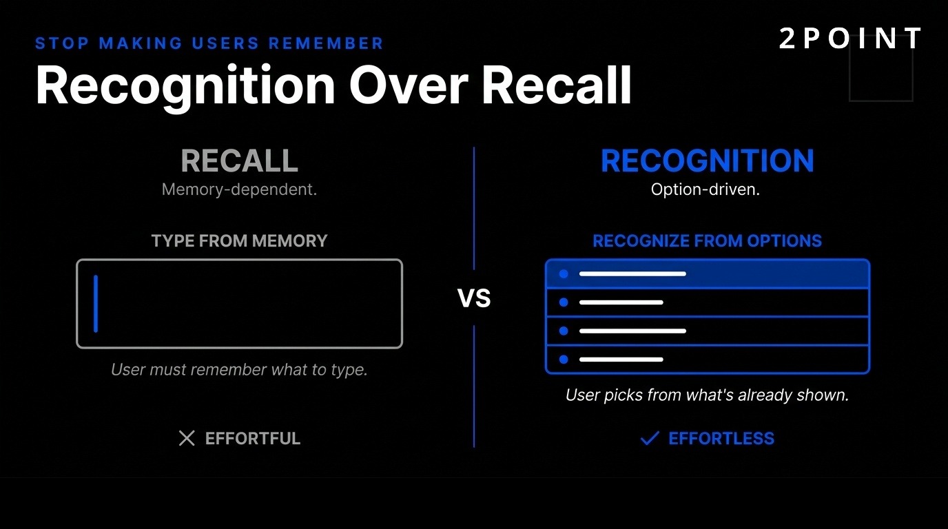
Recognition over recall means letting users recognize options rather than remembering them. Showing a list of previously ordered items beats asking users to type product names from memory. Contextual help appears when users need it instead of requiring them to memorize long tutorials. Tooltips, inline instructions, and just-in-time guidance support users at the moment of need.
Error prevention through clearly marked “emergency exits” helps users recover from mistakes. Undo functions, confirmation dialogs before destructive actions, and obvious ways to cancel operations reduce anxiety and encourage exploration. Predictable interactions create trust in both product and brand. Flexibility accommodates novice and expert users through shortcuts, multiple pathways to complete tasks, and progressive disclosure of advanced features.
Artificial intelligence has transformed UI/UX design workflows, capabilities, and outputs. Rather than replacing designers, AI amplifies human expertise and enables new interaction paradigms that were impossible with traditional design tools.
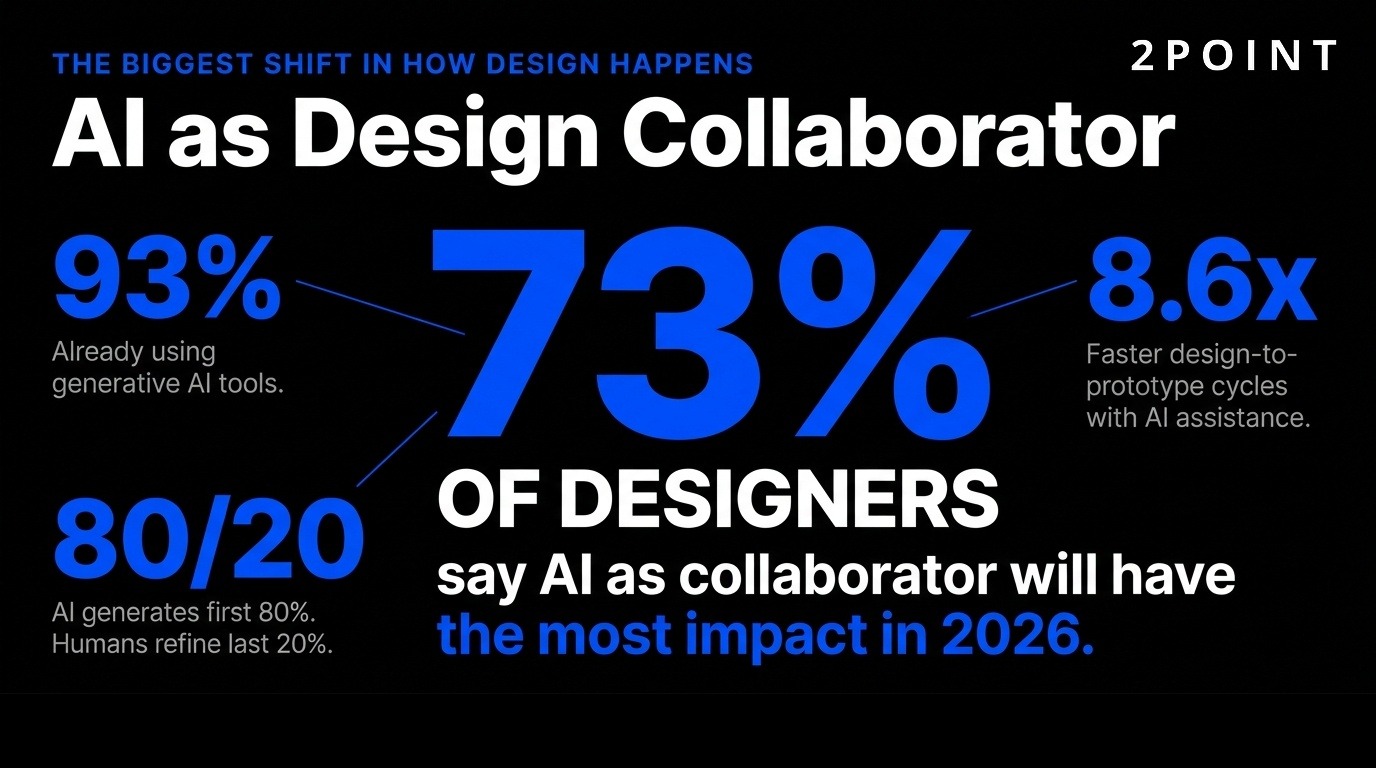
73% of designers say AI as design collaborator will have the most impact in 2026, with 93% already implementing generative AI tools like ChatGPT and Midjourney. This represents a fundamental shift in how design work happens. Generative UI (GenUI) rebuilds interfaces in real-time based on user intent rather than presenting static, pre-designed screens.
UXPin Forge exemplifies this approach by generating interactive layouts from production React components. Teams report 8.6x faster design-to-prototype cycles because AI generates the first 80% of layout work while humans refine the last 20%. The output is production-ready JSX code, not generic pixels that developers must recreate from scratch. This eliminates the traditional design-to-development handoff bottleneck.
AI handles repetitive layout decisions, component selection, and basic responsive behaviors automatically. Designers focus on high-level strategy, brand expression, and solving complex user problems that require human judgment. This collaboration model leverages AI’s speed and pattern recognition while preserving the creativity and empathy that make experiences genuinely valuable.
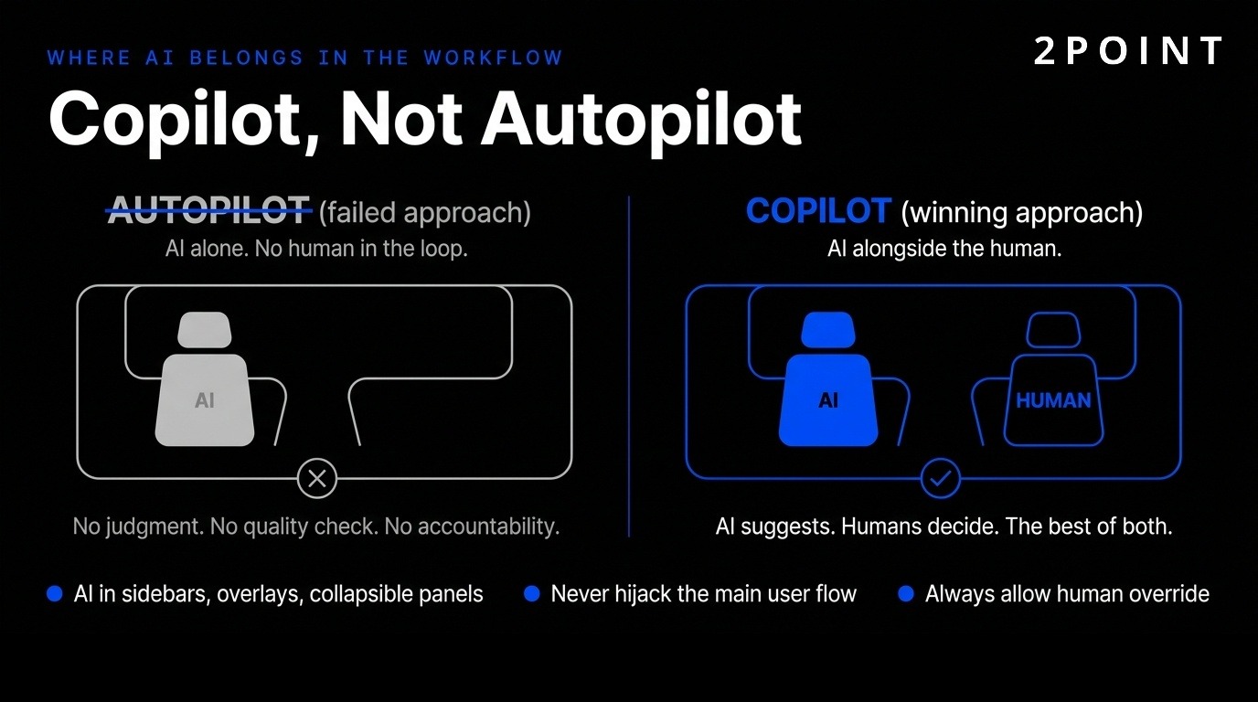
The shift from AI as all-knowing autopilot to thoughtful copilot changes how AI appears in interfaces. AI belongs in sidebars, overlays, and collapsible panels—not hijacking the main user flow. This approach augments context rather than replacing human control and judgment.
54% of designers report clients wanting AI features without clear use cases, revealing the gap between AI trends and actual stakeholder needs. This pressure pushes teams toward “AI theater”—adding AI for marketing purposes rather than solving real user problems. The design challenge involves identifying where AI genuinely improves outcomes versus where it adds complexity without value.
58% believe AI design assistants will have the biggest impact on their work, but human direction, curation, and verification remain essential. AI suggests options, automates tedious tasks, and scales personalization, but humans define goals, evaluate quality, and maintain brand coherence. The most successful implementations treat AI as a powerful tool that requires skilled operators rather than a magic solution requiring no expertise.
Agentic AI works on your behalf in the background to complete tasks over time. 60% of designers believe AI agents taking actions for users will have major impact—the second-highest rated trend after AI as design collaborator. This represents a fundamental shift in interaction models from immediate tasks to delegated outcomes.
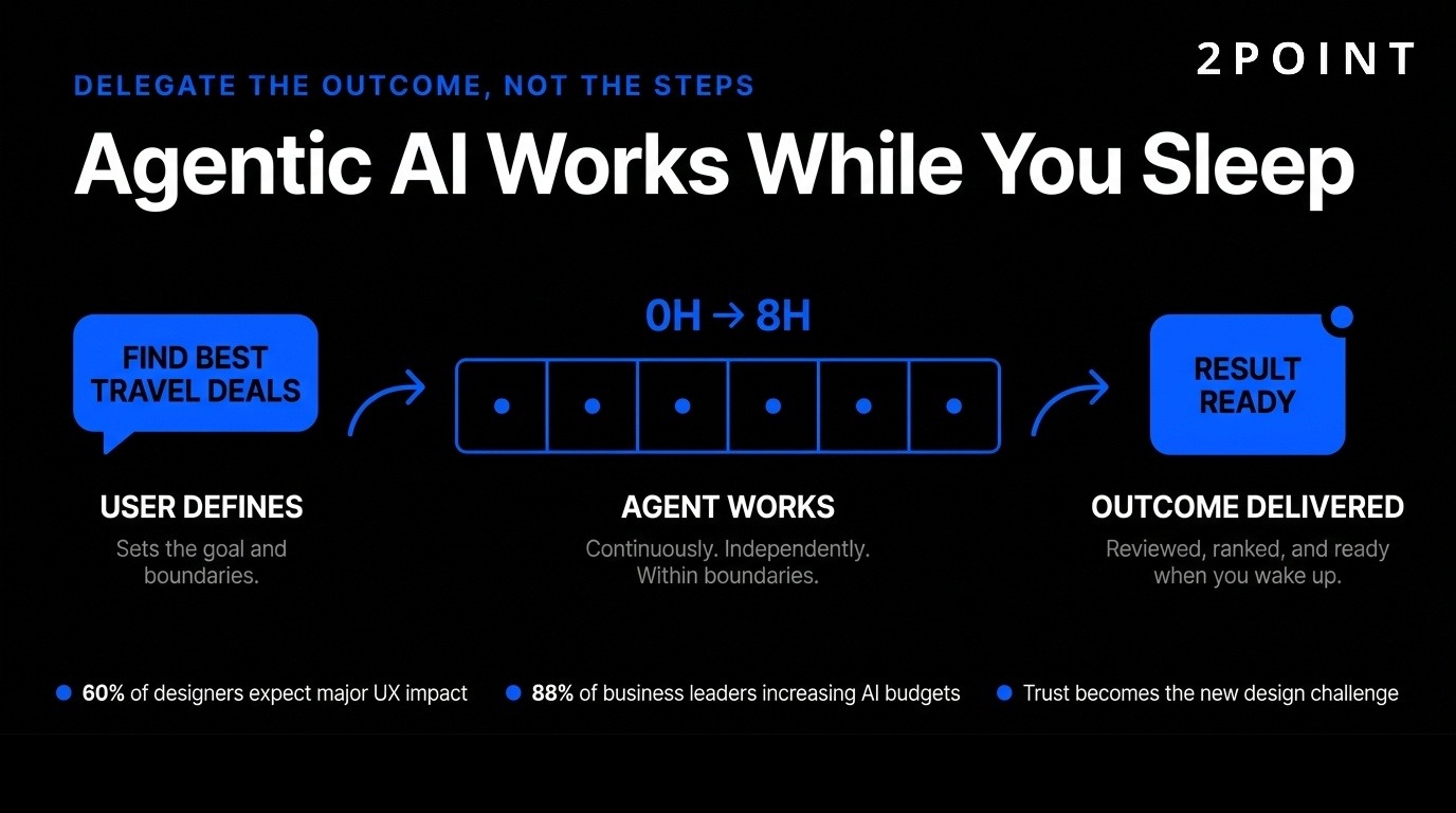
Examples include “find me the best travel deals while I sleep” or “monitor these metrics and alert me only if something unusual happens.” AI agents act independently within boundaries users define, working continuously rather than requiring constant interaction. 88% of business leaders plan to increase AI budgets for agentic capabilities, making this a strategic priority across organizations.
This changes UX from designing every interaction to designing delegation frameworks. Users need to understand what agents can do, set appropriate boundaries, monitor progress, and intervene when necessary. Trust becomes paramount—users must feel confident agents act in their interest and can be overridden if they make mistakes.
Trust is the major design problem for AI experiences in 2026. Users often feel uncertain about what an AI system did or why, creating anxiety and reducing adoption. Building confidence requires transparency, control, consistency, and support when the system fails.
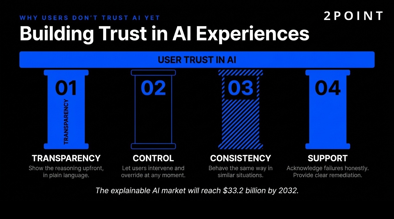
Products that display reasoning upfront in accessible language help users understand AI decisions. Allowing user intervention when AI makes mistakes maintains a sense of control. Consistency in how AI behaves across similar situations makes outcomes predictable. Support systems that acknowledge when AI fails and provide clear remediation paths build trust through honesty rather than false promises of perfection.
The explainable AI market is expected to reach $33.2 billion by 2032, reflecting growing recognition that people won’t trust systems they can’t understand. This creates opportunities for designers who can translate complex AI logic into clear mental models, visualizations, and interaction patterns that make AI behavior comprehensible without requiring technical expertise.
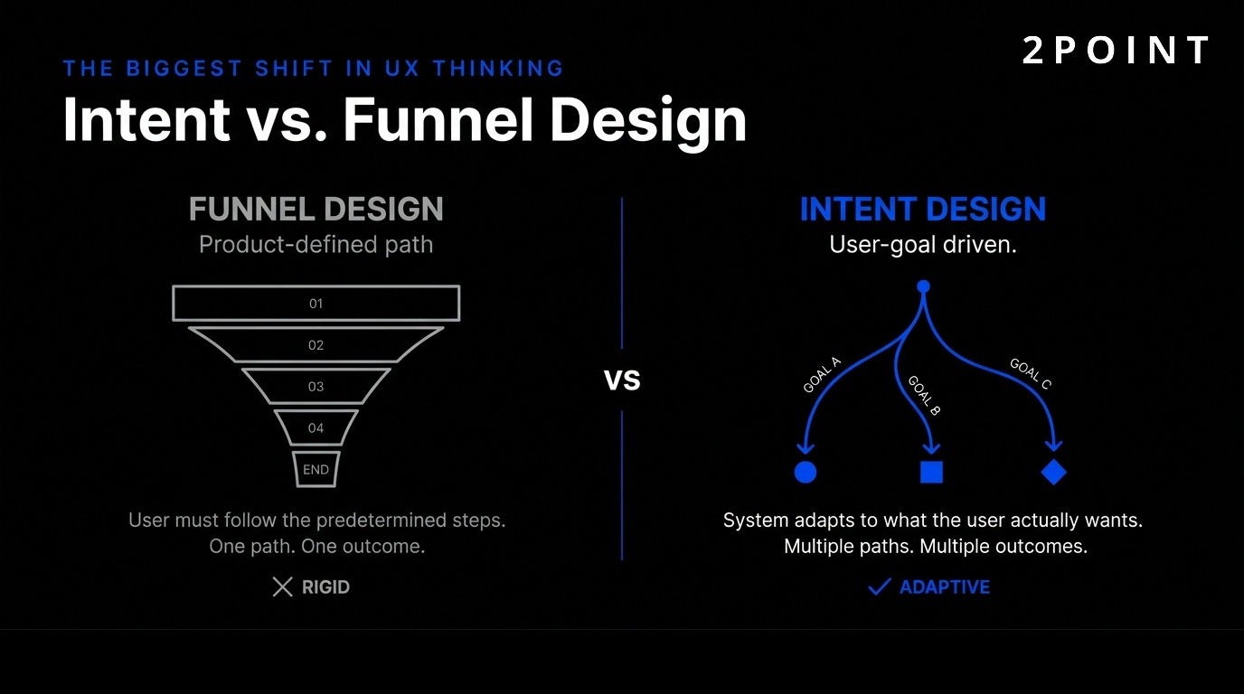
Traditional UI/UX design optimized for product-defined funnels—predetermined paths users should follow to complete business-desired actions. Intent-based design flips this model, creating experiences that recognize, respect, and respond to actual user goals regardless of whether they match business funnels.
Intent-based design represents a major transformation from designing what products want users to do toward creating experiences that focus on user’s true objectives. This approach doesn’t assume users want what features exist or what systems predict—it responds to the actual intent users demonstrate through behavior, context, and explicit statements.
This marks an extraordinary shift from designing interfaces to designing outcomes. Generative systems follow patterns, predictions, and signals rather than pre-built screens. Instead of designing every funnel step, designers create conditions systems use to decide what experience serves each user’s current goal. This requires understanding user intent models, context signals, and outcome metrics rather than just completion rates.
Intent-based design challenges fundamental assumptions about control. Products give up prescriptive flows in exchange for flexible systems that adapt. This works when AI can accurately interpret intent and when designers trust that serving user goals ultimately serves business goals better than forcing users down predetermined paths.
Interfaces now adapt transparency, depth, and visual treatment based on user context. An app’s “vibe” changes based on user mode—minimal design for productivity hours shifts to neon gradients for Friday night relaxation. This adaptation happens automatically without requiring users to manually switch themes or modes.
Ambient personalization involves subtle customization users don’t consciously notice but subconsciously appreciate. Background elements and layout adjust automatically. A homepage color palette shifts based on time of day, creating energizing tones in morning and calming hues at night. Content recommendations adapt as users engage, showing different options based on what they’ve previously selected, how quickly they made decisions, and what they ignored.
This level of adaptation requires sophisticated context detection—time, location, device, recent behavior, historical patterns, and explicit preferences all inform what experience users receive. The challenge involves balancing personalization with consistency, ensuring users can still predict how core functions work even as surface details adapt.
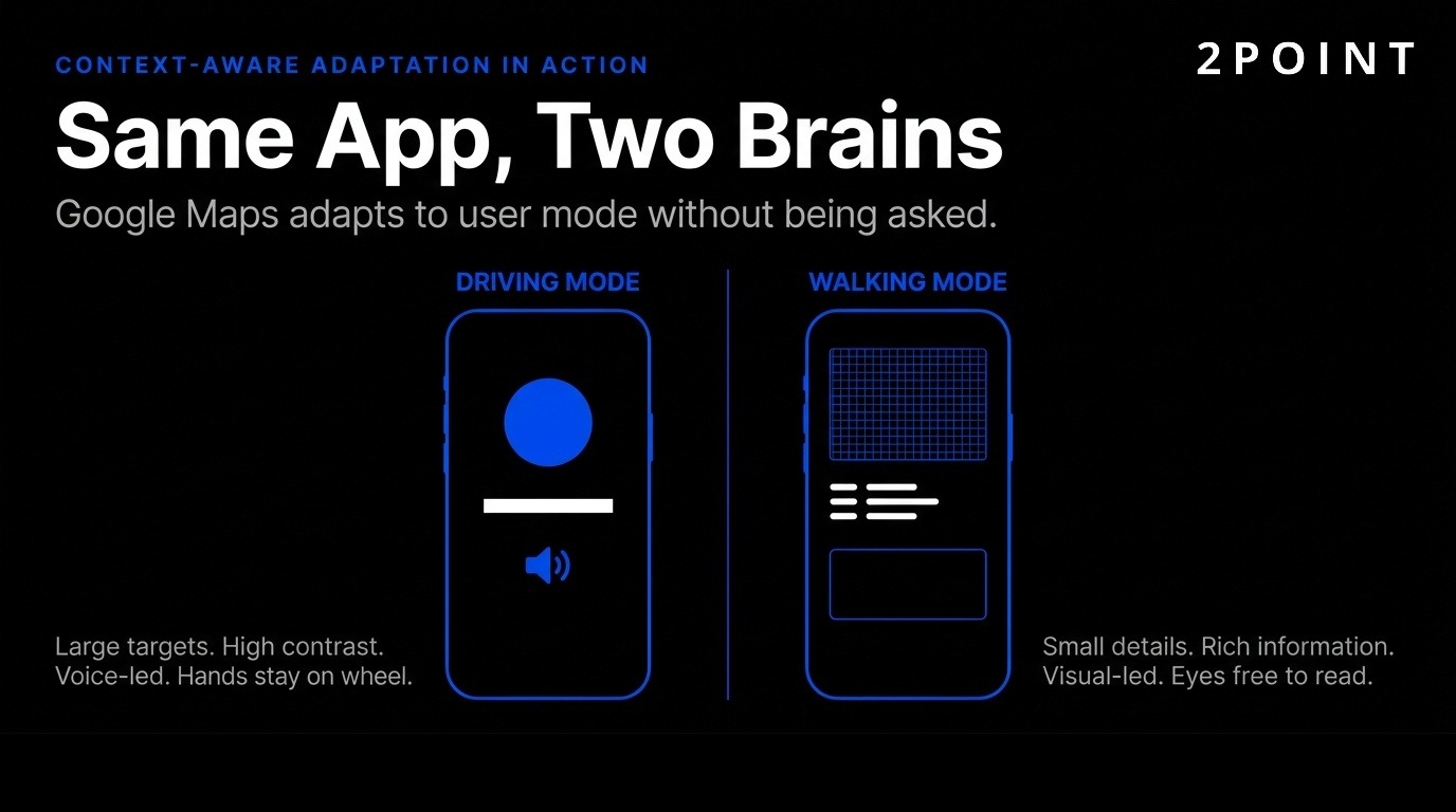
Google Maps driving mode demonstrates intent-based design principles clearly. Large touch targets, high-contrast visuals, and voice guidance optimize for hands-free operation and safety. Walking mode provides detailed visual information and allows closer interaction since users can hold devices and focus on screens. The experience adapts to user context rather than presenting one-size-fits-all design.
E-commerce applications adapt product displays based on browsing intent signals. Users quickly scrolling receive attention-grabbing images and prices. Users reading descriptions carefully see expanded information and comparison tools. Checkout experiences compress or expand based on whether users demonstrate urgency or careful consideration.
SaaS platforms adjust dashboard complexity based on user expertise level. New users see guided workflows and limited options to prevent overwhelm. Expert users access advanced features and shortcuts immediately. Enterprise software makes context-sensitive tools available based on current task—project managers see team resources while individual contributors see their assigned work. This eliminates cluttered interfaces packed with features most users never need.
Users no longer interact through single input methods. Modern UI/UX design orchestrates typing, tapping, speaking, and gesture into seamless experiences that feel like conversations rather than navigational maps.
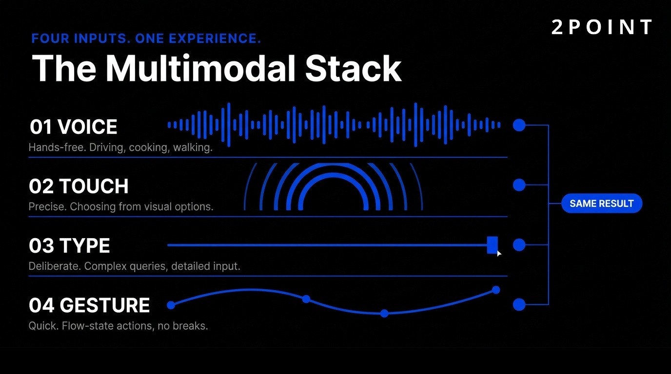
55% of households will own smart speakers by 2026, making Voice User Interfaces (VUIs) a must-learn skill for designers. Voice represents just one modality in increasingly blended interaction models. Users start tasks on voice assistants, continue on mobile apps, and finish on desktop—each interface picks up where the last left off.
Moving away from clicking toward eye movements, hand pinches, and voice commands creates new design challenges. Each interaction method suits different contexts. Voice works hands-free while driving. Touch provides precision when selecting from options. Gestures enable quick actions without breaking flow. Successful designs make all methods available and switch between them gracefully based on user preference and context.
The complexity involves ensuring consistency across modalities while optimizing each for its strengths. A command spoken, typed, or gestured should produce the same result. But the path to that result may differ—voice interfaces might ask clarifying questions while visual interfaces show options to select. Designers must think beyond single-screen flows toward omnichannel journeys where mode-switching is effortless.
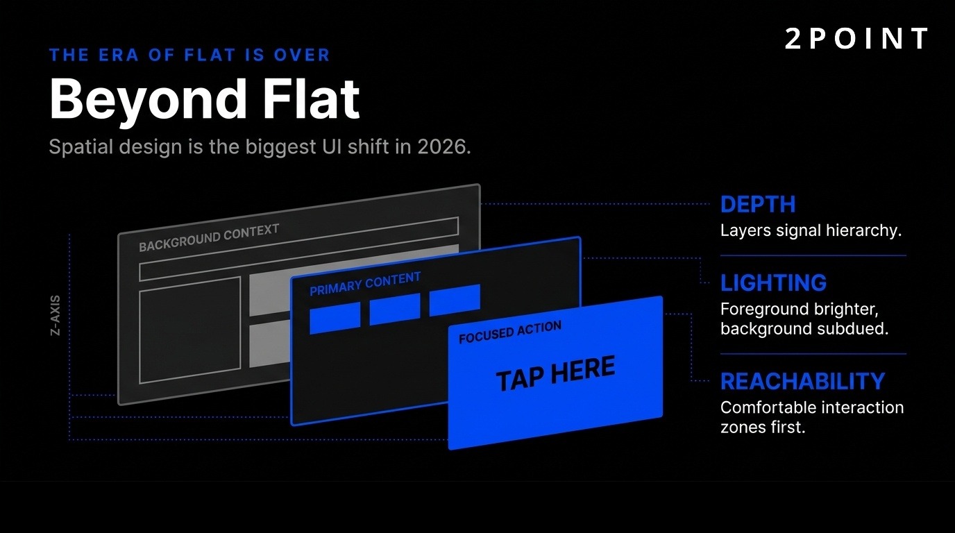
The era of flat 2D designs has ended. Widespread use of mixed-reality headsets and AR tools makes digital elements three-dimensional, creating out-of-screen experiences. Spatial UI/UX represents the biggest UI design trend in 2026, requiring designers to think about depth, lighting, and physical space—not just pixels.
AR enables evaluating designs in the real world rather than just on screens. Placing 3D models in physical spaces identifies problems early—furniture that looked perfect on a monitor appears too large in an actual room. Spatial interfaces reveal issues with depth perception, reachability, and comfort that flat prototypes never show.
The design challenge involves making AR easy to use, reliable, and practical for everyday tasks. Early AR experiences impressed but required too much effort for regular use. Successful spatial design in 2026 focuses on utility over novelty—solving real problems like visualizing furniture placement, providing hands-free instructions, or enabling remote collaboration as if team members occupied the same physical space.
Growth of AR devices and VisionOS-style interactions creates a blended era of multiple simultaneous input methods. Design challenges include depth perception, spatial awareness, and comfort during extended use. Unlike 2D screens with established conventions, spatial interfaces require new patterns that balance immersion with usability.
Practical applications extend beyond gaming into training, retail, and collaboration. Medical students practice procedures on 3D anatomical models. Retail customers visualize products in their homes before purchasing. Remote teams collaborate around virtual whiteboards visible to all participants. These applications succeed when they leverage spatial capabilities without adding unnecessary complexity.
UI design considerations for non-screen contexts include readable text at various distances, comfortable interaction zones that don’t require awkward arm positions, and graceful degradation when environmental factors interfere with tracking. Accessibility implications require alternative input methods since spatial gestures exclude users with certain mobility limitations.
Visual design evolves continuously, but 2026 trends share common themes: functional rather than decorative approaches, bold expressions that capture attention, and sophisticated motion that guides rather than distracts.
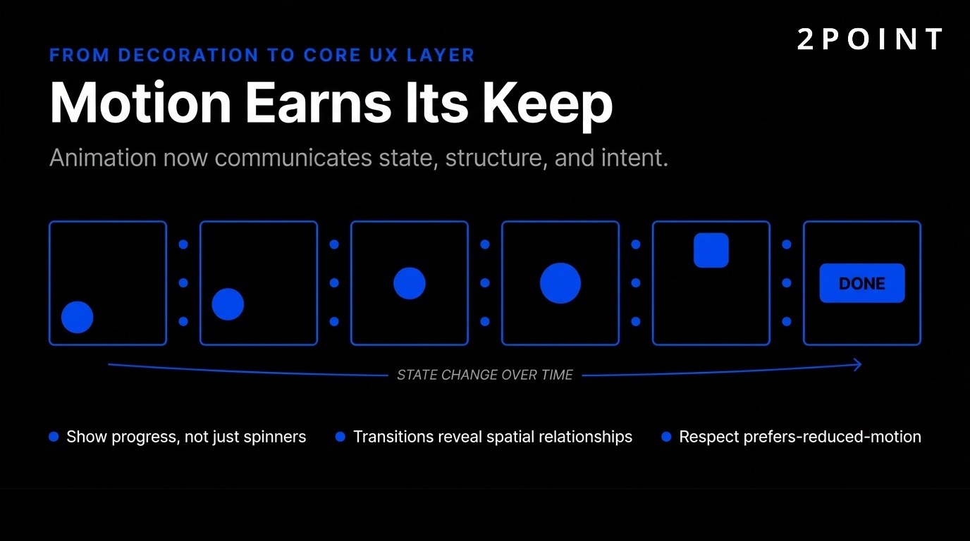
Motion earns its keep by guiding users, not just flashing for attention. Animation communicates state, structure, and system intent. Thoughtful animation is making a comeback as a UX design trend after years of minimalist static interfaces. 23% of designers expect micro-interactions and motion to have major impact, with 50% already adding micro-interactions and animations to current work.
This represents maturation from decoration to core UX layer. Loading animations show progress rather than leaving users uncertain. Transitions reveal spatial relationships between screens. Subtle hover effects confirm interactive elements. These functional animations improve usability measurably rather than serving purely aesthetic purposes.
Reduced motion preferences and accessibility support remain critical. Motion controls give users ways to say “stop” when animation causes discomfort or distraction. Respecting prefers-reduced-motion settings ensures animations enhance rather than impair experience. The best motion design works for users who want it while gracefully degrading for those who don’t.
Bento Grids organize content in sleek, rounded rectangular cards perfect for short attention spans. This major UX/UI design trend in 2026 creates modular layouts with blocks of different sizes and shapes, similar to Japanese bento lunchbox organization.
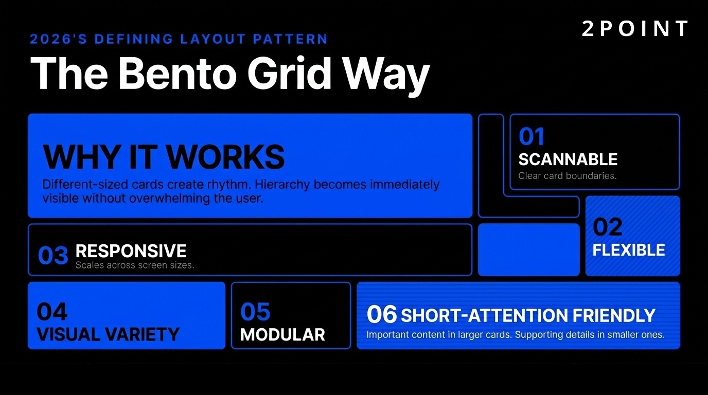
These grids help visually organize large amounts of information without overwhelming users. Different card sizes create dynamic rhythm on the page, with important content in larger cards and supporting information in smaller ones. Users scan efficiently because content boundaries are clear and hierarchy is immediately visible.
The balance between structure and visual interest makes bento grids versatile across industries. News sites use them to feature stories with varying prominence. Dashboards organize metrics and controls without cluttered layouts. Modern web design increasingly adopts this approach because it scales gracefully across screen sizes while maintaining visual coherence.
Color is turning up the volume in 2026. Bright, saturated palettes are making a comeback, fueled by Y2K nostalgia, retro patterns, and “dopamine design.” Neon gradients, high-contrast pairings, and playful hues replace minimal or muted tones that dominated previous years.
Digital Texture represents another distinctive trend—buttons that look like jelly, chrome, or clay. When pressed, they deform and bounce back, providing tactile feedback in digital interfaces. This skeuomorphic revival differs from earlier attempts by focusing on feel rather than photorealism. The goal involves creating satisfying interactions that users enjoy repeating.
Bold color choices serve functional purposes beyond aesthetics. High contrast improves accessibility for users with visual impairments. Distinctive color coding helps users navigate complex interfaces by associating colors with specific functions or content types. Gradients create depth and guide attention toward important elements. The key involves using bold colors purposefully rather than arbitrarily.
Glassmorphism returns in 2026 with translucent, frosted-glass aesthetics that elevate designs. This creates a sense of depth and layering that works particularly well with adaptive and contextual interfaces. Background content remains partially visible through frosted overlays, maintaining context while focusing attention on foreground elements.
Balance with readability and accessibility requires careful implementation. Insufficient contrast between glass elements and backgrounds makes text illegible. Performance considerations matter because too many transparency effects slow loading and drain battery life. Implementation with Figma WebGL simulation tools helps designers preview performance impact before development.
Best practices for glassmorphism include ensuring sufficient contrast for text readability, limiting effects to hero sections or key UI elements rather than entire interfaces, and testing across various backgrounds since glass effects appear differently depending on what shows through them. When executed well, glassmorphism creates sophisticated, modern interfaces that feel premium without appearing heavy.
Enterprise and SaaS applications face unique challenges—complex workflows, diverse user skill levels, and requirements for scale and governance. Best practices in this space emphasize systems over one-off designs.
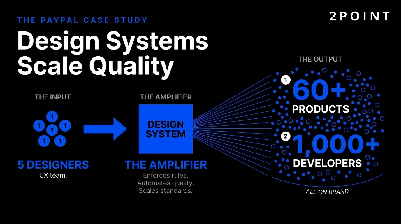
Design systems have evolved from style guides to enforceable platforms. Modern systems don’t just document—they enforce rules, including for AI-generated output. UXPin exemplifies this approach by allowing teams to define brand rules that the system enforces automatically.
Approved color palettes, spacing scales, and component usage patterns ensure on-brand layouts from the start. Designers can’t accidentally use off-brand colors or inconsistent spacing because the system prevents it. This governance approach scales design quality across large organizations.
PayPal’s case illustrates the power of this approach: a 5-person UX team supports over 60 products and 1,000+ developers. This scale is only possible because their design system acts as an automated quality gate. Developers build interfaces using system components that inherently comply with design standards, eliminating most design review needs and maintaining consistency across the entire product portfolio.
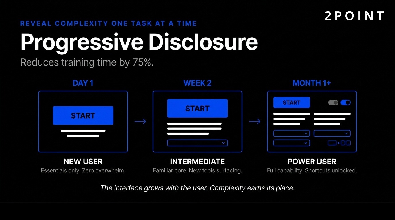
Progressive disclosure allows users to gradually learn full functionality one task at a time. Jacob Nielsen’s progressive disclosure design practice reveals information in manageable layers, solving the dilemma between robust functionality and intuitive interfaces.
Contextual intelligence predicts needs based on role, behavior, and current task. Enterprise applications benefit most from this approach because they typically offer extensive capabilities that would overwhelm users if presented simultaneously. New users see simplified workflows with only essential options. As they gain expertise, advanced features gradually appear.
This reduces cognitive load for complex software. Training time decreases by 75% with intuitive interfaces that reveal complexity gradually rather than all at once. Users gain confidence by mastering basic functions before encountering advanced features, leading to higher adoption rates and reduced support costs.
Accessibility is an essential principle in UI design, ensuring digital products are inclusive and usable by individuals with disabilities. Color contrast, font size, keyboard navigation, and screen reader compatibility represent foundational accessibility requirements.
Features designed for disabilities help everyone. High-contrast text aids users with visual impairments but also improves readability in bright sunlight. Keyboard navigation is critical for accessibility yet power users love it for efficiency. Accessible design equals extreme usability—removing barriers for some improves experience for all.
Running automated audits with tools like WAVE and Axe catches many issues early. Testing with actual screen readers reveals problems automation misses. Building accessibility into initial design costs far less than retrofitting later. Organizations increasingly recognize accessibility as competitive advantage—inclusive products reach wider audiences while demonstrating social responsibility that builds brand value.
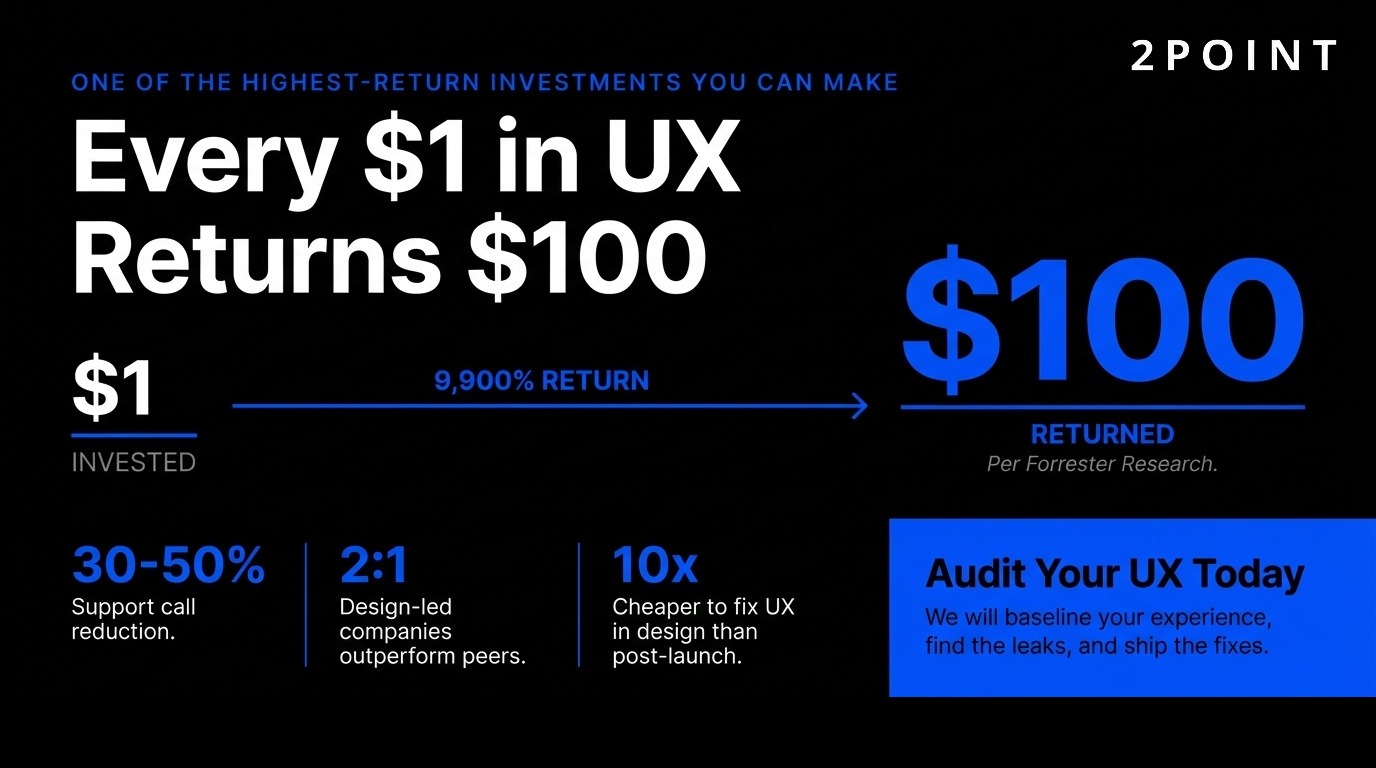
Every dollar invested in UX returns up to $100, according to Forrester Research—a 9,900% ROI that makes UX among the highest-return investments organizations can make. Fixing UX issues after development costs 10 times more than addressing them during design, emphasizing the value of getting things right early.
Support calls drop 30-50% after UX improvements. IBM decreased support costs by $10 million through interface optimization. McKinsey research shows design-led companies outperformed industry benchmarks 2:1 over five years. These concrete business outcomes demonstrate UX impact beyond user satisfaction.
94% of first impressions relate to UI/UX design, making it critical for user acquisition and retention. Measurable metrics include task completion rates, user satisfaction scores, error rates, conversion rates, and retention. Tracking these KPIs before and after UX changes quantifies impact. The most successful organizations tie UX metrics directly to business outcomes, demonstrating how better experiences drive revenue, reduce costs, and increase customer lifetime value.
Modern UI/UX design relies on sophisticated tool ecosystems that support collaboration, testing, and seamless handoff to development. These tools have evolved from simple mockup creators to comprehensive platforms that integrate across the entire product development lifecycle.
58% of designers believe AI design assistants like Figma AI will have the biggest impact on their work. Figma offers prototyping tools and plugins that simulate interactive elements, enabling realistic testing without writing code. UXPin Forge generates production-ready JSX from prompts, screenshots, or URLs, dramatically accelerating the design-to-development process.
Component libraries and design system management ensure consistency across large product portfolios. Collaboration features support distributed teams working simultaneously on the same files. Version control tracks changes and enables rollback when experiments fail. Handoff to development includes automatically generated specifications, exportable assets, and code snippets that reduce translation errors.
Integration with development workflows through plugins and APIs keeps design and code synchronized. When developers update components, design files automatically reflect changes. This bidirectional sync prevents drift between designed experiences and implemented products, a common problem in traditional workflows where design and code evolve independently.
Nielsen Norman Group research confirms that five users uncover 85% of usability problems, making small-scale testing remarkably efficient. Conducting testing by watching how people use interfaces reveals issues designers miss because they understand products too deeply to see them with fresh eyes.
Regular testing catches problems early when fixes cost less. Focus group testing works well for brand-new UI/UX designs when little precedent exists. Behavioral analytics tools like Mouseflow provide session replay, heatmaps, and feedback surveys that show how real users interact with live products. These quantitative insights complement qualitative testing.
Iterative testing throughout development ensures continuous refinement based on feedback and data analysis. Even post-launch, ongoing testing affirms desired outcomes and identifies new improvement opportunities. The most effective teams build testing into regular workflows rather than treating it as a one-time gate before launch.
Invest in research when validating core assumptions, facing critical UX decisions, or seeing problems in metrics. Eight interviews (as in the Uber example) can uncover major insights without requiring massive research programs. Limited resources mean prioritizing research for highest-impact areas.
User research uncovers familiar terminology and mental models that inform intuitive designs. Understanding how users think about problems guides solutions that align with their expectations. Balance speed with validation—early research prevents expensive later fixes, but excessive upfront research delays learning from real user behavior.
Continuous discovery involves regular, lightweight research integrated into ongoing work rather than large projects blocking progress. Research democratization spreads research skills across teams, enabling designers, product managers, and developers to gather insights directly. This approach scales research capacity without proportionally increasing specialized research staff.
The UI/UX field faces significant transitions as technologies mature, business environments evolve, and expectations for designer capabilities expand. Understanding these challenges helps professionals adapt and thrive.
UX fundamentals won’t change, but stakes are higher. Teams are leaner with stronger scrutiny on business impact. UX faced layoffs, hiring freezes, and AI hype that questioned whether designers remain necessary. The field now stabilizes, but differentiation and demonstrating business value are vital.
UI remains important but is becoming less of a differentiator as design systems and component libraries commoditize visual design. The value of UX work moves beyond visual interfaces toward strategic thinking, research capabilities, and connecting user needs with business objectives. Designers must demonstrate impact through metrics, case studies, and clear business outcomes.
The role of a UX designer expands beyond traditional boundaries into product strategy, marketing optimization, and cross-functional leadership. Technical skills matter more as designers collaborate directly with engineers and work with AI tools that require understanding of underlying systems. Successful designers balance craft excellence with business acumen and technical literacy.
Belief that AI creates production-ready UIs will fade as limitations become more apparent. Need for more humans in the loop increases despite AI capabilities improving. AI technologies will incrementally enhance capabilities, potentially reaching watershed moments for user-research activities, but won’t replace human judgment.
Human direction, curation, and verification remain essential. AI serves as a tool that amplifies human expertise rather than replacing it. 54% of clients want AI without clear use cases, representing the biggest stakeholder gap. This pressure creates tension between adding AI for marketing purposes versus solving real problems.
The most valuable designers will master AI tools while maintaining strong fundamentals that AI can’t replicate—empathy, strategic thinking, understanding of business context, and ability to synthesize insights from complex human behaviors. AI handles execution speed and pattern recognition; humans provide direction, quality judgment, and creative problem-solving that connects user needs with business goals.
Tension exists between adopting cutting-edge trends and maintaining usability for broad audiences. Spatial interfaces, multimodal interactions, and AI-driven experiences offer exciting possibilities but risk excluding users who lack access to latest devices or prefer traditional approaches. Mobile-first indexing and responsive website design remain critical even as new interaction paradigms emerge.
Progressive enhancement provides a solution—core functionality works universally while advanced features enhance experience for capable devices and willing users. This ensures innovation doesn’t come at the cost of accessibility. Testing across diverse devices, network conditions, and user capabilities prevents designing only for ideal scenarios.
Organizations must resist chasing every trend while remaining aware of meaningful shifts. Not every product needs spatial UI or AI agents. Focus on solving user problems rather than showcasing technology. Innovation serves users when it removes friction, enables new capabilities, or significantly improves existing experiences. Otherwise, proven approaches often work better.
Sustainability in digital design addresses both environmental impact and long-term viability of design decisions. Heavy websites with unnecessary animations and large media files consume energy and exclude users with limited bandwidth. Efficient code, optimized images, and thoughtfully designed landing pages reduce environmental footprint while improving performance.
Ethical design considerations include privacy, manipulation, addictive patterns, and accessibility. Dark patterns that trick users into unwanted actions damage trust and face increasing regulatory scrutiny. Designers carry responsibility for consequences of their choices. Building ethical guardrails into design processes prevents harmful patterns from reaching production.
The future of UI/UX design involves balancing innovation with responsibility—creating experiences that serve users genuinely rather than exploiting psychological vulnerabilities. This requires organizational commitment beyond individual designers since business models often incentivize manipulative patterns. Designers who articulate ethical concerns in business terms influence organizational direction toward sustainable, responsible practices that build long-term user trust and brand value.
Moving from understanding UI/UX principles to implementing them effectively requires structured approaches that organizations can adopt and scale. These strategies balance ideal practices with real-world constraints.
Effective UI/UX begins with understanding users deeply. Conduct initial research through interviews, surveys, and observation before designing solutions. Even limited research—eight quality interviews can surface major insights—provides more value than designing based on assumptions. Document user goals, pain points, contexts, and mental models.
Create personas representing key user types but avoid treating them as rigid stereotypes. Use personas as thinking tools that remind teams who they’re designing for. Map user journeys showing how people interact with products across touchpoints. Identify moments of friction, confusion, or delight. These maps guide prioritization by revealing highest-impact improvement opportunities.
Validate assumptions through prototype testing before full development. Build lightweight prototypes that simulate key interactions without requiring production-quality code. Test with target users, observing where they struggle, what they expect, and what confuses them. Iterate based on feedback, treating early designs as questions to answer rather than solutions to defend.
Expert web design firms invest in design systems early, recognizing that systematic approaches scale better than one-off solutions. Start with foundational elements—color palettes, typography scales, spacing systems, and core components. Document not just what components look like but when and how to use them.
Involve developers in design system creation to ensure components are buildable and maintainable. Design systems fail when designers create specifications developers can’t implement efficiently. Collaborative creation produces practical systems that both disciplines adopt enthusiastically. Build in code when possible rather than treating design systems as purely visual documentation.
Maintain design systems actively as living resources rather than static documents. Assign ownership and governance processes for proposing, reviewing, and adding components. Version changes carefully, providing migration paths when updating core elements. Treat design systems as products with their own roadmaps, users (your team), and success metrics (adoption rates, consistency across products).
Continuous improvement requires feedback loops at multiple timescales. Real-time analytics show immediate user behavior—bounce rates, click patterns, conversion funnels. Review these regularly to identify sudden changes or gradual trends. Automated alerts flag anomalies requiring investigation.
Regular user testing provides qualitative insights quantitative data misses. Schedule monthly testing sessions rather than waiting for major releases. Small, frequent testing catches issues early and keeps teams connected to user reality. Include support team in design reviews since they hear user frustration firsthand.
Retrospectives after releases or major features help teams learn from successes and failures. What worked well? What would you do differently? Which assumptions proved wrong? Documenting these lessons prevents repeating mistakes and spreads knowledge across teams. Professional web design organizations build these feedback mechanisms into standard workflows rather than treating them as optional nice-to-haves.
UI/UX design succeeds when integrated with product management, engineering, marketing, and business strategy. Involve designers early in product planning rather than handing them requirements to visualize. Designers contribute unique perspectives on feasibility, user value, and alternative approaches that product managers might miss.
Work alongside developers throughout implementation rather than handing off complete designs and disappearing. Be available for questions, make tradeoff decisions together when perfect implementations aren’t feasible, and understand technical constraints that shape what’s possible. This partnership produces better outcomes than adversarial relationships where designers complain developers “ruined” their vision.
Connect with marketing to understand positioning, messaging, and target audiences. Marketing insights inform design decisions about tone, complexity, and feature emphasis. Align with business strategy to ensure design work supports organizational goals rather than pursuing aesthetically pleasing solutions that don’t drive meaningful outcomes. This strategic alignment elevates designers from service providers executing others’ visions to strategic partners shaping product direction.
While core principles apply universally, specific contexts require specialized knowledge and approaches. Understanding these applications helps designers navigate domain-specific challenges effectively.
Mobile-first design starts with constraints of small screens and touch interaction, then progressively enhances for larger displays. This approach ensures core functionality works universally rather than building desktop experiences that barely function on mobile. Touch targets must be large enough for finger interaction, with sufficient spacing to prevent accidental taps.
Mobile-first UX design considers context—mobile users often multitask, experience interrupted attention, or face poor connectivity. Design for these realities through autosave, offline functionality, and streamlined flows that reduce steps. Test on actual devices across network conditions rather than only on high-end simulators with perfect connectivity.
Responsive design adapts layouts across screen sizes while maintaining usability. Use flexible grids, scalable images, and CSS media queries that adjust presentation based on viewport dimensions. Consider not just screen size but also input method, typical usage context, and user goals that may differ across devices. Tablet users might browse longer while mobile users seek quick answers.
Conversion-focused design optimizes specific user actions—signups, purchases, downloads—without sacrificing user experience. Clear value propositions explain benefits immediately. Strategic placement of calls-to-action guides users toward conversion points. Remove friction from conversion paths by minimizing form fields, offering guest checkout, and reducing steps.
A/B testing validates design decisions through data. Test headlines, button colors, page layouts, and pricing presentations to identify what drives conversions. Statistical significance requires sufficient traffic—don’t end tests prematurely or you’ll act on noise rather than signal. Focus testing on high-traffic pages and major decisions rather than minutiae.
Balance conversion optimization with user trust. Aggressive tactics like fake urgency, hidden costs, or difficult cancellation damage long-term relationships for short-term gains. Ethical conversion design makes taking action easy while providing clear information that lets users make informed decisions. This builds sustainable businesses rather than extracting maximum immediate value.
Inclusive design goes beyond legal accessibility compliance to truly serving diverse users. Consider cognitive, sensory, motor, and situational limitations. Neuro-inclusive design accommodates how different brains process information—some users prefer linear flows while others want to explore freely. Provide multiple pathways to accommodate different thinking styles.
Design for cognitive accessibility through clear language, consistent patterns, and avoiding reliance on memory. Users shouldn’t need to remember information from previous screens. Provide context and reminders throughout workflows. Use plain language rather than jargon, explaining unfamiliar concepts without condescension.
Test with diverse users including those with disabilities. Lived experience reveals problems designers without disabilities never notice. Finding researchers and consultants with disability expertise brings valuable perspectives into design processes. Budget for specialized testing as standard practice rather than afterthought. Organizations increasingly recognize that designing for edge cases improves experiences for mainstream users too.
Website redesign requires careful planning to avoid losing SEO value, breaking user workflows, or alienating existing customers. Audit current site thoroughly—what works well that should be preserved? What causes problems that redesign should fix? Involve users in identifying pain points rather than assuming you know what needs changing.
Maintain URL structure when possible or implement proper redirects when not. Test new designs extensively before launch, including with existing users who know current site well. Their feedback reveals breaking changes you might miss. Phased rollouts reduce risk by exposing only a portion of users initially, allowing quick fixes before full deployment.
Measure before and after redesign to validate improvements. Track key metrics like task completion, time on site, conversion rates, and support requests. Sometimes redesigns that look better perform worse if they disrupt familiar patterns. Data-driven decisions prevent doubling down on changes that hurt rather than help user experience. The goal involves improving outcomes, not just updating aesthetics.
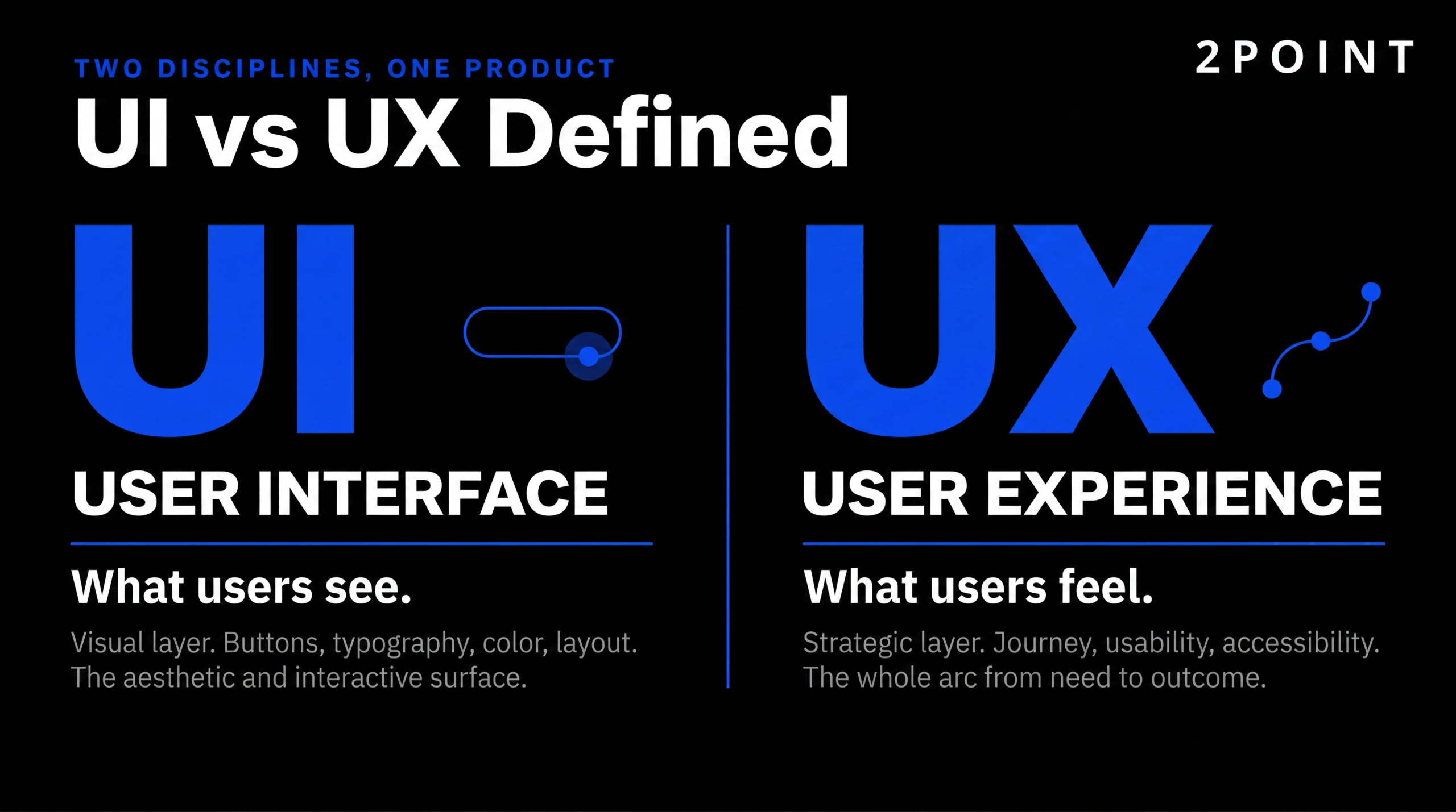
UI design focuses on visual and interactive elements users see and touch, including buttons, typography, colors, and layouts. UX design addresses the complete end-to-end journey, prioritizing usability, accessibility, and how effectively users achieve their goals. UI implements the visual framework while UX research establishes the foundation through understanding user needs.
UI/UX design costs vary widely based on project scope, complexity, and provider expertise. Simple projects may cost $5,000-15,000, while comprehensive enterprise design systems cost $50,000-200,000+. However, every dollar invested in UX returns up to $100 according to Forrester Research, making it among the highest-ROI investments organizations can make.
Basic UI/UX improvements are possible for those willing to learn fundamentals, test with users, and iterate based on feedback. However, professional designers bring expertise in research methods, accessibility standards, design systems, and proven patterns that accelerate results and avoid costly mistakes. For business-critical applications, professional design expertise typically justifies the investment through better outcomes.
Timeline depends on project scope. A single landing page might take 1-2 weeks, a mobile app 6-12 weeks, and a comprehensive enterprise system 3-6 months or longer. Research, testing, and iteration add time but prevent expensive mistakes. Rushing design to meet arbitrary deadlines often creates technical debt requiring costly fixes later.
Figma dominates for interface design and prototyping due to collaboration features and extensive plugin ecosystem. Sketch remains popular among some teams, particularly for Mac-specific workflows. Adobe XD serves designers already in Adobe ecosystem. UXPin Forge generates production code. Research tools include UserTesting, Lookback, and Maze for remote research; Mouseflow and Hotjar for analytics; and Miro or FigJam for workshops and mapping.
Track task completion rates, time to complete key tasks, error rates, user satisfaction scores, and conversion rates. Compare before and after design changes to quantify improvement. Qualitative feedback through user interviews and support tickets reveals problems metrics alone might miss. Business metrics like reduced support costs, increased retention, and higher lifetime value demonstrate UX impact on organizational goals.
Designing based on assumptions without validating with real users represents the most common and costly mistake. Designers often create solutions that make sense to them but confuse actual users. Testing with even five users uncovers 85% of usability problems according to Nielsen Norman Group research. Skipping validation wastes resources building wrong solutions and requires expensive fixes later.
AI accelerates design processes through generative layouts, automated component creation, and intelligent suggestions, with 93% of designers already implementing AI tools. However, AI serves as collaborator rather than replacement—it generates first 80% of designs while humans refine the last 20%. The most impactful application involves AI working in background on users’ behalf to complete delegated tasks over time, with 60% of designers believing this will significantly impact user experiences.
No—adopt trends only when they solve real user problems or significantly improve experience. Glassmorphism, bold gradients, and spatial interfaces work brilliantly in appropriate contexts but add unnecessary complexity elsewhere. Focus on timeless principles like consistency, hierarchy, and user-centricity rather than chasing every trend. Test whether trendy elements actually improve metrics before committing to them across entire products.
UI/UX design is moving toward intent-based, adaptive systems that respond to user goals rather than forcing predetermined funnels. Multimodal interactions combining voice, touch, and gesture will become standard. Spatial and 3D interfaces will expand beyond gaming into practical everyday applications. AI will augment designer capabilities while increasing demand for human judgment, strategic thinking, and ethical guardrails. The fundamentals won’t change, but the tools, context, and business expectations will continue evolving rapidly.
Enterprise design prioritizes efficiency, comprehensive functionality, and accommodation of expert users who interact with systems daily. Progressive disclosure and contextual intelligence help manage complexity without overwhelming users. Consumer design emphasizes immediate comprehension, emotional engagement, and graceful handling of infrequent users who won’t invest time learning complex systems. Both require excellent usability, but enterprise tolerates more complexity when it serves power users while consumer products ruthlessly simplify.
Both are essential and interdependent—beautiful UI can’t salvage fundamentally broken UX, while excellent UX suffers if UI implementation is confusing or unattractive. UX provides the foundation by ensuring products solve real problems through intuitive workflows. UI makes those solutions discoverable, understandable, and pleasant to use. 94% of first impressions relate to UI/UX design, demonstrating that both visual appeal and functional effectiveness matter for success.
UI/UX design is the combined practice of designing both the visual interface (UI) and the overall user experience (UX) of a digital product.
UI design covers the look and feel of every screen, including buttons, typography, colors, and layouts. UX design covers the complete end-to-end journey, prioritizing usability, accessibility, and goal achievement across every touchpoint.
UI design focuses on the visual and interactive elements users see on screen, while UX design focuses on the complete experience users have with the product from start to finish.
UI is concerned with buttons, typography, colors, and layouts. UX is concerned with research, information architecture, usability, and how easily users accomplish their goals across every touchpoint.
A UI/UX designer researches users, designs interfaces, builds prototypes, and tests experiences to make digital products easy, useful, and enjoyable to use.
Their work spans user research and interviews, information architecture, wireframing, visual design, prototyping in tools like Figma, and usability testing. They translate business goals and user needs into screens developers can build.
The core UI/UX design principles are user-centricity, consistency, clear visual hierarchy, feedback and error prevention, accessibility, and progressive disclosure.
Consistency works on four levels: visual, functional, internal, and external. Together these principles reduce cognitive load, build trust, and let users accomplish goals without thinking about the interface itself.
The UX design process typically follows five stages: research, define, ideate, prototype, and test.
Designers start by researching real users and defining the problem, then ideate solutions, build prototypes, and test them with users. Nielsen Norman Group research confirms that testing with just five users uncovers 85% of usability problems.
Every dollar invested in UX returns up to 100 dollars, a 9,900% ROI according to Forrester Research.
Fixing UX issues after development costs 10 times more than addressing them during design. Support calls drop 30 to 50% after UX improvements (IBM saved 10 million dollars through interface optimization), and McKinsey found design-led companies outperformed industry benchmarks 2 to 1 over five years.
No, UI/UX design does not require coding, though understanding how code works helps designers collaborate more effectively with developers.
Most UI/UX work happens in design tools like Figma rather than a code editor. Basic familiarity with HTML, CSS, and how components behave makes handoffs smoother and helps designers produce work that is realistic to build.
No, AI is augmenting UI/UX designers rather than replacing them, acting as a copilot for tasks like layout generation, content drafting, and prototype creation.
73% of designers say AI as a design collaborator will have the most impact in 2026, and 93% are already using generative tools like ChatGPT and Midjourney. AI handles the first 80% of layout work while humans direct strategy, refine quality, and own brand decisions.
The most common UI/UX design tools in 2026 are Figma, UXPin, and AI-assisted platforms like UXPin Forge, supported by user testing tools like Mouseflow, Maze, and Lyssna.
58% of designers believe AI design assistants like Figma AI will have the biggest impact on their work. UXPin Forge generates production-ready JSX code from prompts, screenshots, or URLs, cutting design-to-prototype time by 8.6x.
Accessibility is important in UI/UX design because it ensures digital products are usable by people with disabilities and improves the experience for every user.
Foundational accessibility requirements include sufficient color contrast, readable font sizes, full keyboard navigation, and screen reader compatibility. Features built for disabilities help everyone: high-contrast text aids users with visual impairments and improves readability in bright sunlight.
Most beginners can learn the fundamentals of UI/UX design in three to six months of focused study, but reaching a hireable, portfolio-ready level typically takes 6 to 12 months.
Speed depends on how much time you can dedicate weekly, whether you take a structured course or self-teach, and how quickly you build real case studies. Mastery, including research methods, design systems, and advanced prototyping, develops over years of practice on real projects.
The biggest UI/UX design trends for 2026 are AI as a design collaborator, intent-based design, multimodal and voice interfaces, spatial 3D design, bento grid layouts, and functional motion design.
55% of households will own smart speakers by 2026, making voice a must-design-for surface, and 23% of designers expect micro-interactions and motion to have major impact this year. Spatial UI is the single biggest UI trend as AR and VisionOS-style devices move designers from 2D screens to depth, lighting, and physical space.

© 2POINT, INC 2026
(c) 2POINT, INC 2026

 let’s connect

