

 let’s connect


What Is Website Design and Why Does It Matter?
Website design is the strategic process of creating the visual layout, user interface, and interactive elements of a website to deliver an optimal user experience while achieving measurable business goals. It covers visual aesthetics, navigation structure, content hierarchy, responsive functionality, and performance optimization. Understanding what it does and why it matters is essential before investing time or money into any design effort.
- Website design combines visual creativity with technical structure to guide users toward specific actions.
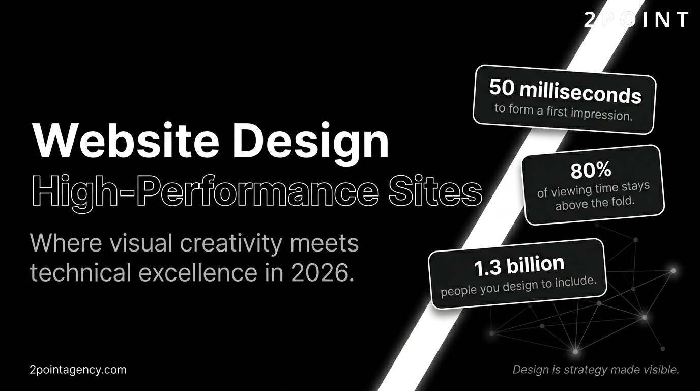
- Effective design builds immediate trust: users form first impressions in as little as 50 milliseconds.
- Good design directly increases conversion rates, reduces bounce rates, and improves search rankings.
- Responsive design ensures your site works seamlessly across all devices and screen sizes.
- Accessibility standards make websites usable for everyone, including people with disabilities.
- Performance optimization keeps pages fast, which impacts both user satisfaction and SEO.
- In 2026, design integrates AI personalization, advanced CSS, and immersive 3D experiences.
- Strategic design connects every visual decision back to a defined business outcome.
Effective website design matters because it directly shapes user trust, engagement, and conversion rates. Research consistently shows that users make snap judgments about credibility within the first fraction of a second of landing on a page. Good design builds brand credibility, improves search engine rankings, enhances accessibility, and creates seamless experiences across all devices.
In 2026, website design has evolved well beyond pure aesthetics to integrate performance optimization, AI-powered personalization, accessibility standards, and strategic UX principles. The most successful websites balance visual creativity with technical excellence, user-centered research, and clear business objectives. The sections below walk through every major dimension of modern web design in practical detail.
Core Design Principles Every Website Needs
Successful website design practices rest on foundational principles that transcend trends, platform changes, and shifting aesthetics. These principles create consistency, usability, and trust regardless of the industry you operate in or the visual direction you choose. Before worrying about color palettes or animation libraries, getting these fundamentals right is what separates websites that convert from websites that confuse.
Foundational principles also provide a decision-making framework. When two design directions compete, these principles act as a tiebreaker. They keep teams aligned, prevent scope creep, and ensure that every design decision serves the user first and the brand second. The four principles below apply universally whether you are designing a portfolio, an ecommerce store, a SaaS platform, or a corporate website.
Simplicity and Clarity in Design
Simplicity in website design does not mean stripping a site down to nothing. It means removing every element that does not serve a clear purpose. According to UI/UX design principles research, every additional element on a page competes for cognitive attention. The more elements present, the harder the brain works to decide what matters. Simplified design reduces cognitive load and accelerates decision-making, which is exactly what you want when guiding users toward a conversion.
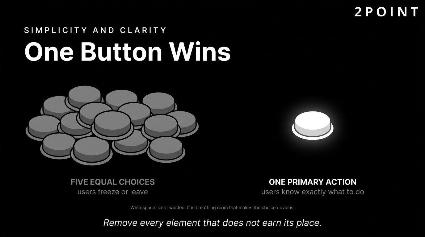
The "one primary button" approach illustrates this well. When a page contains a single, prominent call to action, users know exactly what they are expected to do next. When a page contains five competing buttons of equal visual weight, users often freeze or leave. This principle of reducing choice paralysis is one of the most practically impactful tools in a designer's kit.
Whitespace is a critical component of simplified design. Often called "negative space," whitespace is not empty space wasted. It is breathing room that allows elements to communicate more clearly. According to Wix's web design best practices guide, generous whitespace improves readability, reduces eye strain, and signals a premium, trustworthy brand. Navigation simplification also plays a role. When menus contain fewer, more meaningful options, users complete tasks faster and with less frustration. A well-simplified navigation structure reduces drop-offs and keeps users moving purposefully through your content.
One widely cited finding from Nielsen Norman Group research notes that users spend approximately 80% of their viewing time above the fold, meaning the content visible before scrolling. This reinforces the importance of placing your most critical value proposition, primary call to action, and key trust signals in that prime real estate. Simplicity in that above-fold zone is especially powerful.
Visual Consistency and Brand Identity
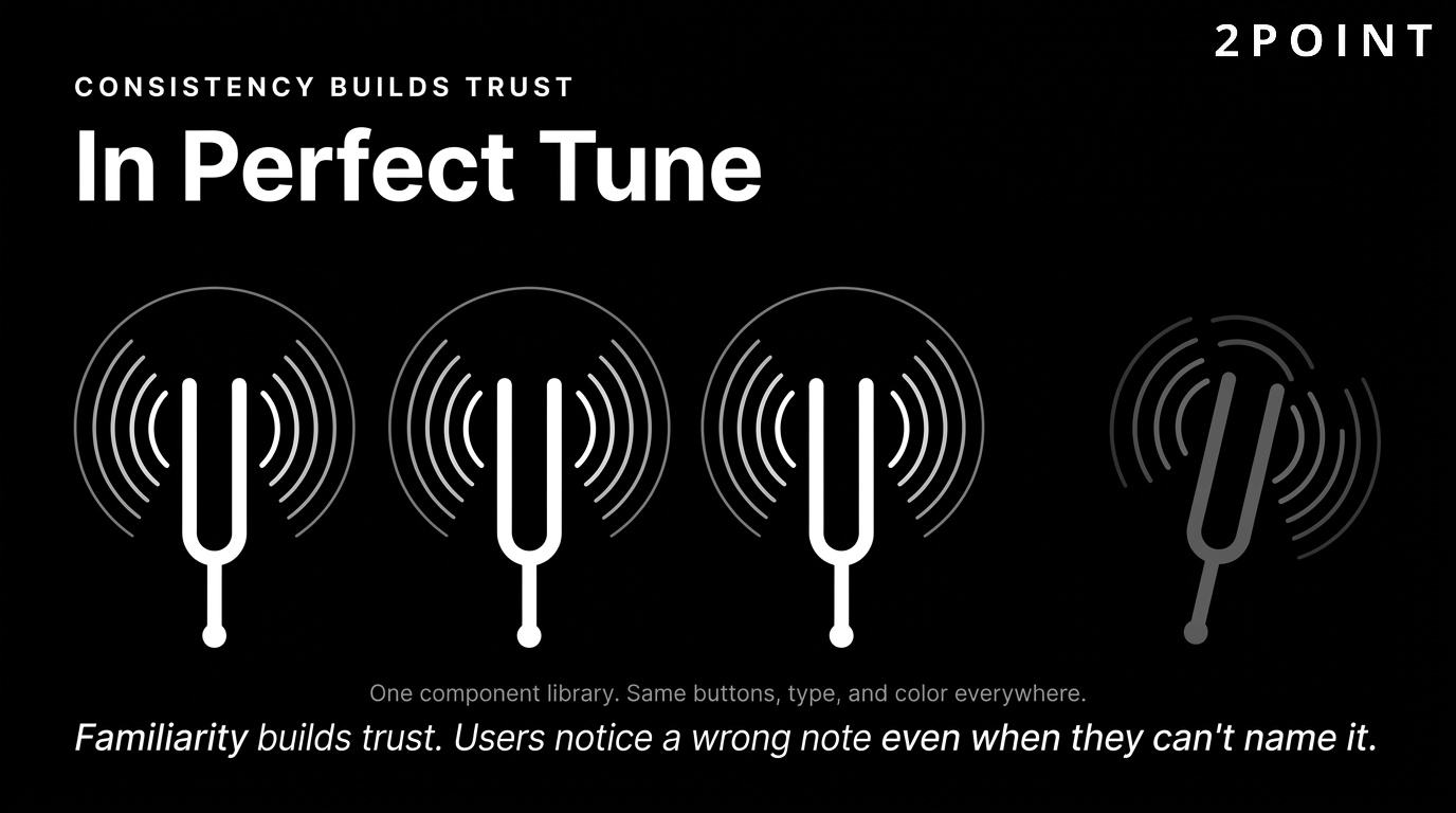
Consistency builds familiarity, and familiarity builds trust. When a visitor encounters the same color palette, typography, button styles, and imagery across every page of your website, their brain encodes a coherent picture of your brand. Inconsistent design, by contrast, creates confusion and raises subtle red flags about professionalism and reliability.
A unified color scheme is the most visible dimension of brand consistency. Colors carry emotional associations and, when used repeatedly across your site, begin to own a piece of mental real estate in the user's mind. Typography matters just as much. Using the same one or two typefaces throughout a site creates visual harmony and ensures readability across different section types. UX design principles research highlights that users notice typographic inconsistency even when they cannot name it explicitly. The discomfort it creates is real, even if subconscious.
Design systems are the professional solution to maintaining consistency at scale. A design system is a collection of reusable components, guided by clear standards, that teams use to build products. When every button, card, form field, and icon is drawn from the same component library, visual consistency is built into the process rather than enforced through manual review. For growing organizations, a design system is one of the most valuable investments available because it keeps the experience cohesive as the team and product expand.
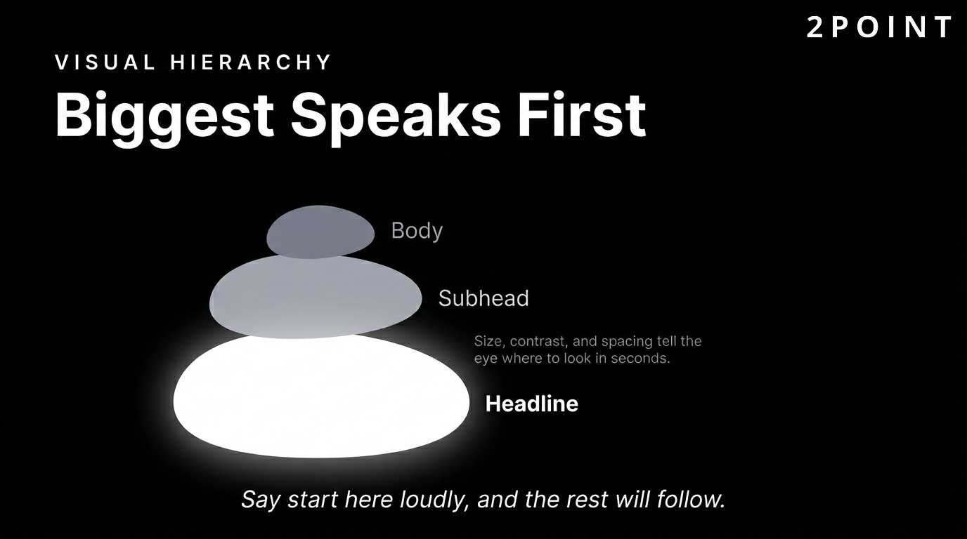
Clear Visual Hierarchy and Content Structure
Visual hierarchy refers to the arrangement of design elements in a way that guides the viewer's eye from the most important information to the least important. This hierarchy is built through size, color, contrast, positioning, and spacing. A large, bold headline communicates "start here." A smaller subheadline says "here is the detail." A muted body text block says "read this if you want more." This layered communication happens instantly and intuitively.
Understanding how users read web pages improves hierarchy decisions significantly. Research into reading patterns has identified two dominant behaviors: the F-pattern, where users scan horizontally across the top and then down the left side, and the Z-pattern, where eyes move diagonally across the page. Designing with these patterns in mind means placing critical content, headlines, and calls to action in positions that naturally capture attention.
The hero section sits at the apex of your visual hierarchy. It is the first full section a visitor sees, and it needs to answer a single question within seconds: "Am I in the right place?" A strong hero section includes a clear value proposition headline, a supporting subheadline, and a primary call to action. Every element beneath it should deepen the story and guide the user further down the page. Scannability matters throughout: short paragraphs, bold subheadings, and bullet points allow users to extract value even when they do not read every word.
User Feedback and Interactive Elements
One of the most psychologically important principles in website design is the idea that user actions deserve immediate, clear feedback. When someone clicks a button, hovers over a link, submits a form, or triggers any interactive element, the interface should respond in a way that confirms the action was received. This principle of feedback reduces uncertainty and creates the feeling of a responsive, respectful experience.
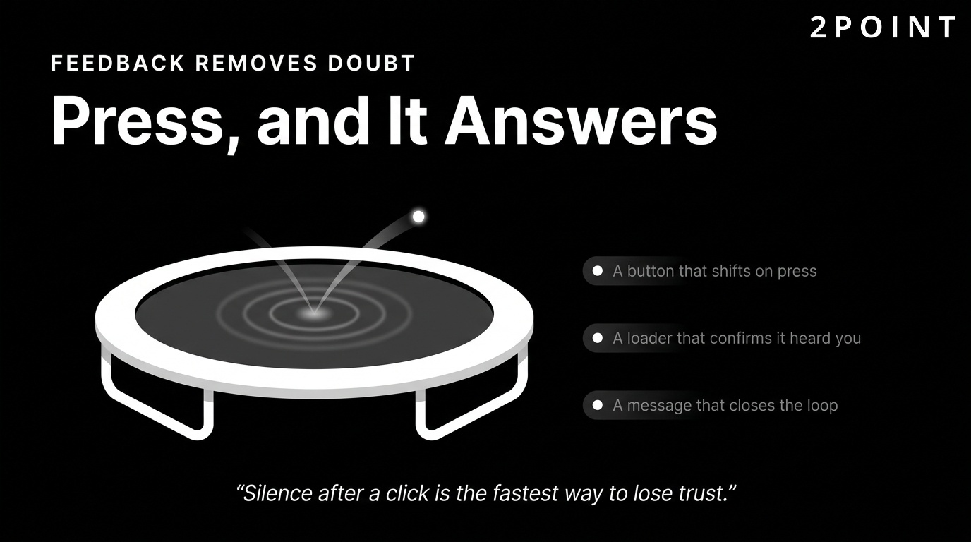
Effective feedback mechanisms include hover state changes on buttons and links, loading indicators during form submissions, success or error messages after form completions, and micro-animations that animate transitions between states. Microsoft's UX design principles documentation emphasizes that feedback should be immediate, informative, and proportional to the action. A heavy animation for a simple button click feels disproportionate and slows things down. A subtle color shift or brief ripple effect is appropriate and satisfying.
The absence of feedback is the most common interactive design mistake. When users click a button and nothing visibly changes, they click again, wonder if the first click registered, and grow frustrated. This friction compounds quickly on ecommerce sites, sign-up flows, and contact forms. Well-implemented feedback loops are invisible when they work correctly and painfully obvious when they do not. Building them thoughtfully into every interactive element is a non-negotiable component of professional website design.
User Experience Fundamentals That Drive Results
User experience (UX) is the strategic layer beneath visual design. It is the invisible architecture that determines whether users succeed or fail in accomplishing their goals on your website. A site can be visually stunning and still fail completely if its underlying experience structure is confusing, inaccessible, or inefficient. Improving user experience is where design investment delivers the most measurable business returns.
Understanding UX requires shifting from a creator mindset to a user mindset. Designers naturally know their product well. Users arrive with varying levels of familiarity, different intentions, different devices, and different emotional states. Great UX design accounts for all of this. It removes barriers, anticipates confusion, and creates clear pathways to action for users who are ready to engage and graceful recovery options for users who get lost.
User-Centered Design and Research
User-centered design (UCD) is a design philosophy that places the needs, behaviors, and goals of end users at the center of every design decision. It sounds obvious, but in practice most design processes default to stakeholder preferences, designer instincts, or competitive imitation rather than actual user research. User-centered design corrects this by grounding decisions in evidence gathered directly from the people who will use the product.
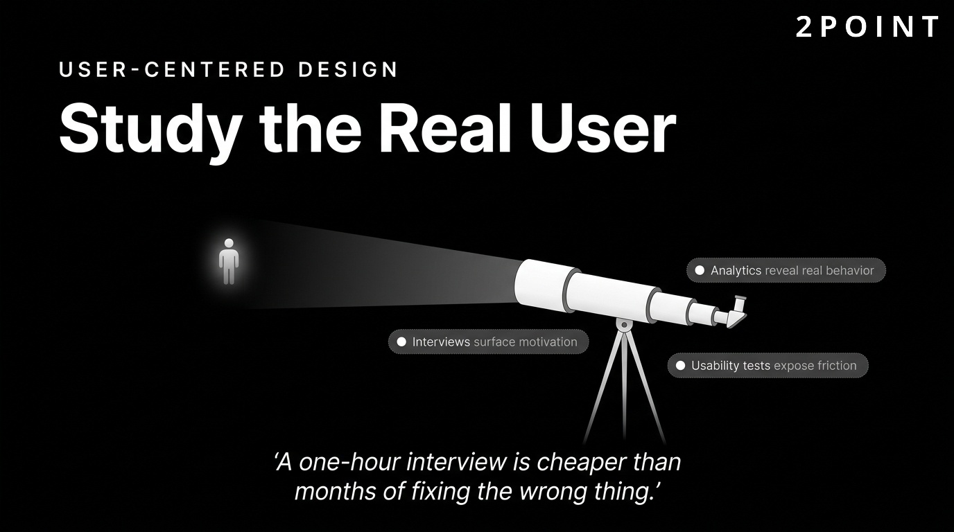
The research methods available to web designers include user interviews, survey-based feedback, behavioral analytics, eye-tracking studies, and remote usability tests. Each method answers different questions. Interviews surface motivations and mental models. Analytics reveal what users actually do versus what they say they do. Usability tests expose friction points that neither the designer nor the stakeholder would have anticipated. Together, they build a complete picture of who your users are and what they need.
Persona development translates raw research into actionable design targets. A persona is a fictional representation of a key user segment built from real data. It includes demographics, goals, frustrations, and behavioral tendencies. When design decisions arise, referring back to a persona grounds the conversation in user reality rather than abstract preference. User journey mapping extends this by plotting the full sequence of interactions a user takes from initial awareness through to completed goal. Both tools help teams identify gaps, redundancies, and opportunities in the current experience.
The most practical argument for investing in UX research is the cost of not doing it. Research consistently shows that fixing a usability problem after a product launches costs exponentially more than identifying and solving it during the design phase. A one-hour user interview that surfaces a critical navigation issue is worth far more than months of post-launch troubleshooting and lost conversions.
Usability and Efficiency in Navigation
Usability, at its core, is the measure of how efficiently and satisfyingly users can complete their intended tasks on your website. A site is usable when users can find what they need quickly, complete actions without confusion, and recover from mistakes without frustration. UX research demonstrates that usability is not a luxury feature reserved for large budgets. It is the baseline expectation every visitor brings to every interaction.
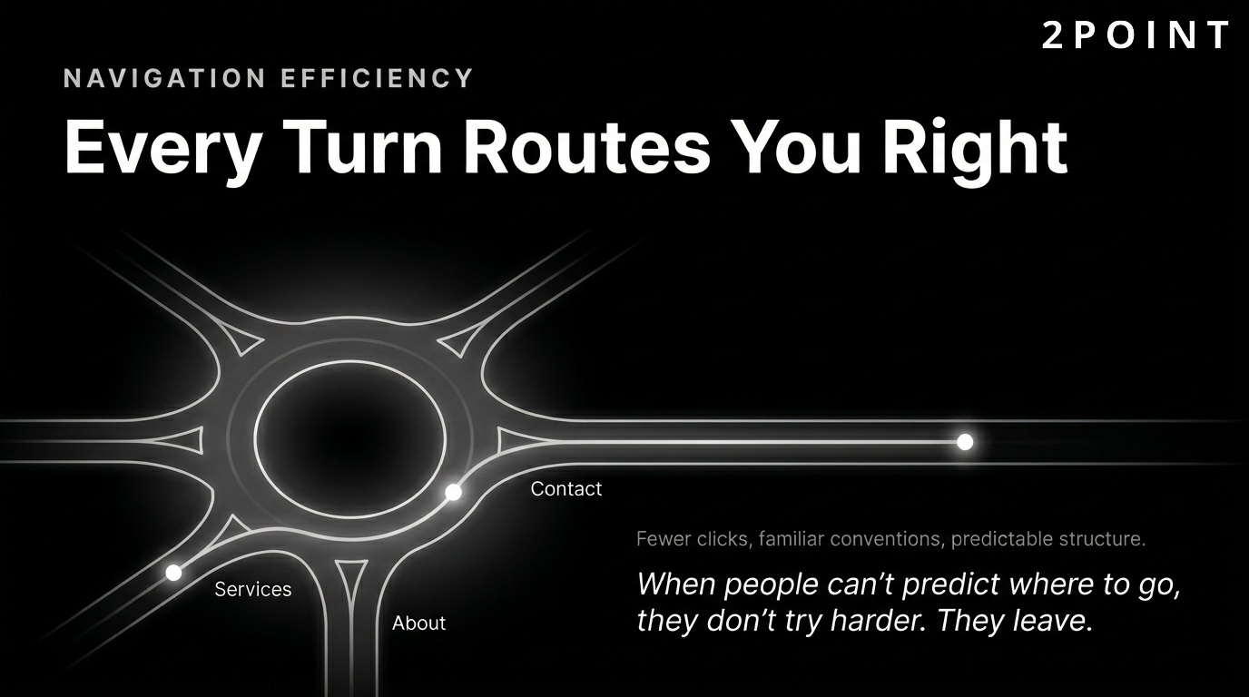
Navigation efficiency is one of the most impactful usability dimensions. Every additional click between a user and their goal is an opportunity for them to disengage. Streamlining navigation paths, reducing menu depth, and eliminating redundant steps all improve task completion rates. Familiarity also matters. Users have learned conventions from thousands of websites. They expect the logo to link home, the navigation to sit at the top, and contact information to appear in the header or footer. Deviating from established conventions forces users to learn your system rather than use it.
Information architecture (IA) is the structural discipline that organizes your content into logical categories and hierarchies. Good IA means users can predict where to find things before they look. Bad IA means users wander, click back repeatedly, and eventually leave. Building IA from user research rather than internal organizational logic is one of the highest-leverage UX improvements available. Internal search functionality reinforces IA by giving users a direct route to content when browsing fails. A well-configured search with autocomplete and relevant results keeps users on-site when navigation alone is insufficient.
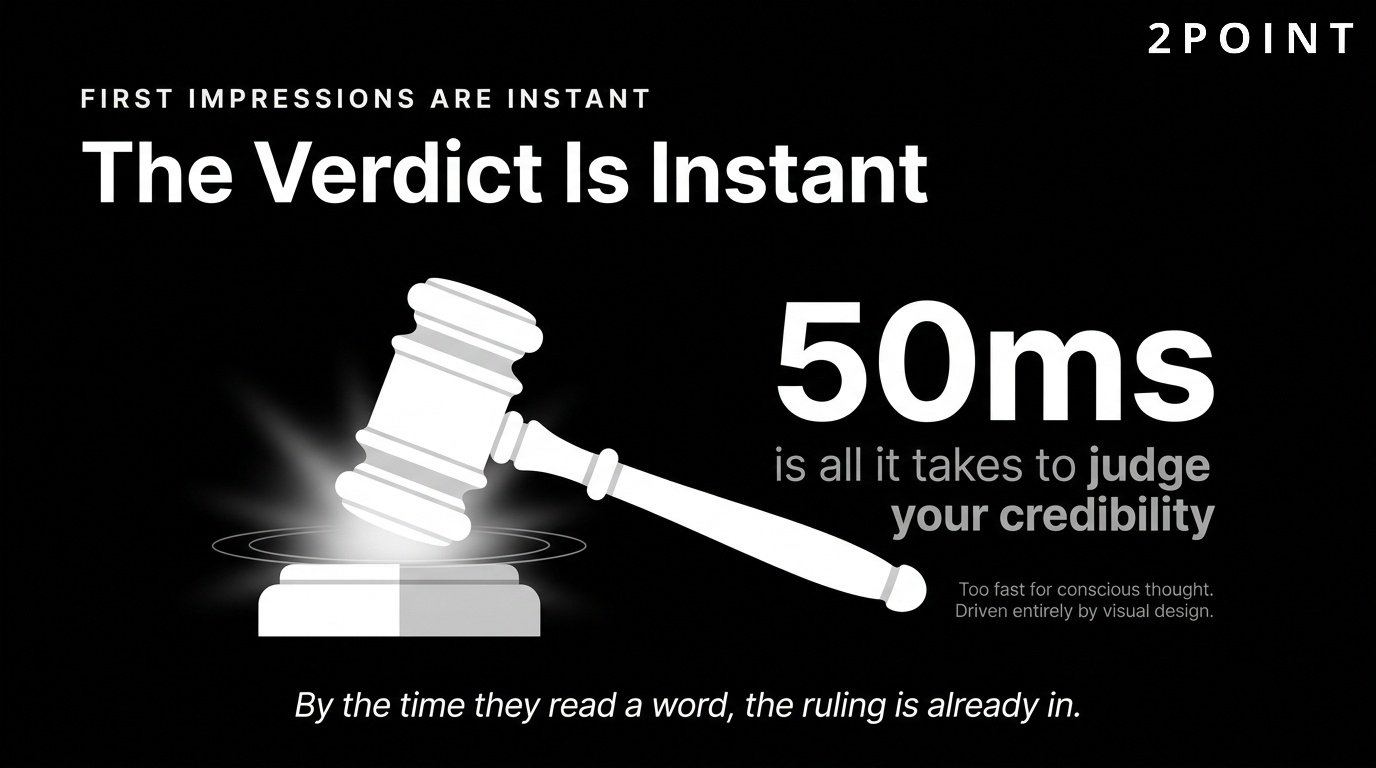
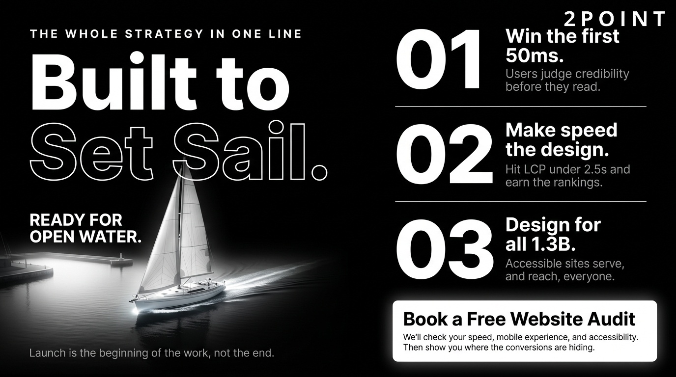
The time pressure matters too. Research shows that users form opinions about websites in as little as 50 milliseconds, a timeframe too short for conscious evaluation. These snap judgments are driven entirely by visual design and perceived structure. If the navigation appears logical and the layout feels familiar in that first glance, users continue. If it feels complex or confusing, many leave before they give the content a chance.
Accessibility and Inclusive Design
Web accessibility is the practice of designing websites that can be used by people of all abilities, including those with visual, auditory, motor, and cognitive disabilities. It is both a legal obligation in many jurisdictions and an ethical standard for any organization that wants to genuinely serve all potential visitors. The Web Content Accessibility Guidelines (WCAG), maintained by the W3C, provide the global standard for accessibility compliance. WCAG 2.1 and 2.2 define three compliance levels: A (minimum), AA (standard target), and AAA (enhanced).
Practical accessibility features include keyboard navigation support for users who cannot use a mouse, screen reader compatibility through proper semantic HTML and ARIA labels, meaningful alt text on all images, sufficient color contrast between text and background, scalable font sizes, and captions for video content. Each of these features addresses a real barrier that would otherwise exclude a segment of your audience entirely.
Cognitive accessibility deserves special attention as it is often overlooked. Designing for cognitive accessibility means using plain language, clear structure, consistent patterns, and avoiding time pressures. It benefits users with cognitive disabilities, learning differences, and attention difficulties, but it also benefits everyone. Plain language is simply better communication. Clear structure aids comprehension for all users regardless of ability. The principle that accessibility improvements raise the floor for everyone is one of the strongest arguments for treating it as a core design value rather than a compliance checkbox.
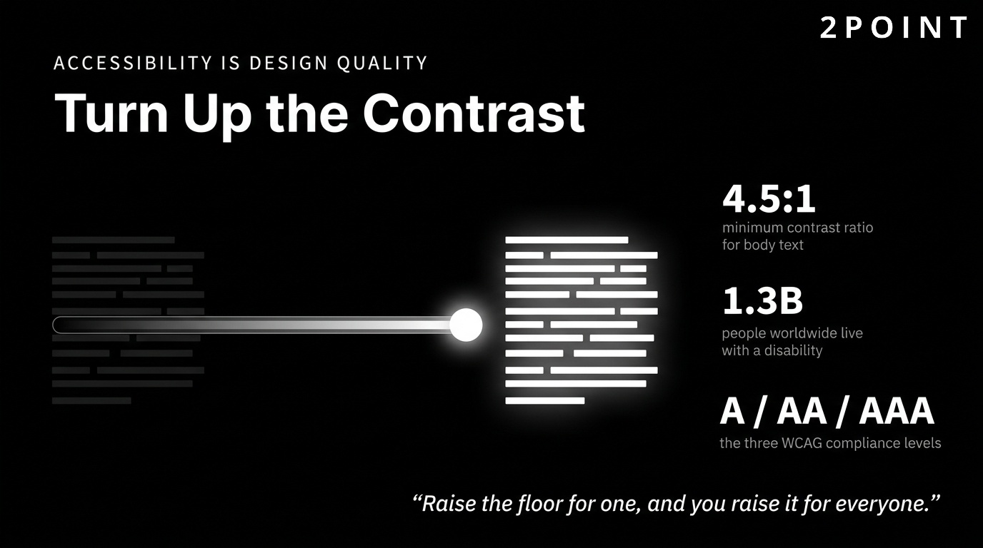
Beyond ethics and compliance, accessible design also expands your addressable audience. Approximately 1.3 billion people worldwide live with some form of disability. Designing inclusively means your website serves this population rather than excluding it. In competitive markets, that difference in reach is meaningful.
Testing and Continuous Improvement
No website design is complete at launch. The design process is iterative by nature, and the most valuable improvements come from observing real users interacting with real pages under real conditions. Usability testing, A/B testing, and behavioral analytics are the primary tools for generating post-launch insights.
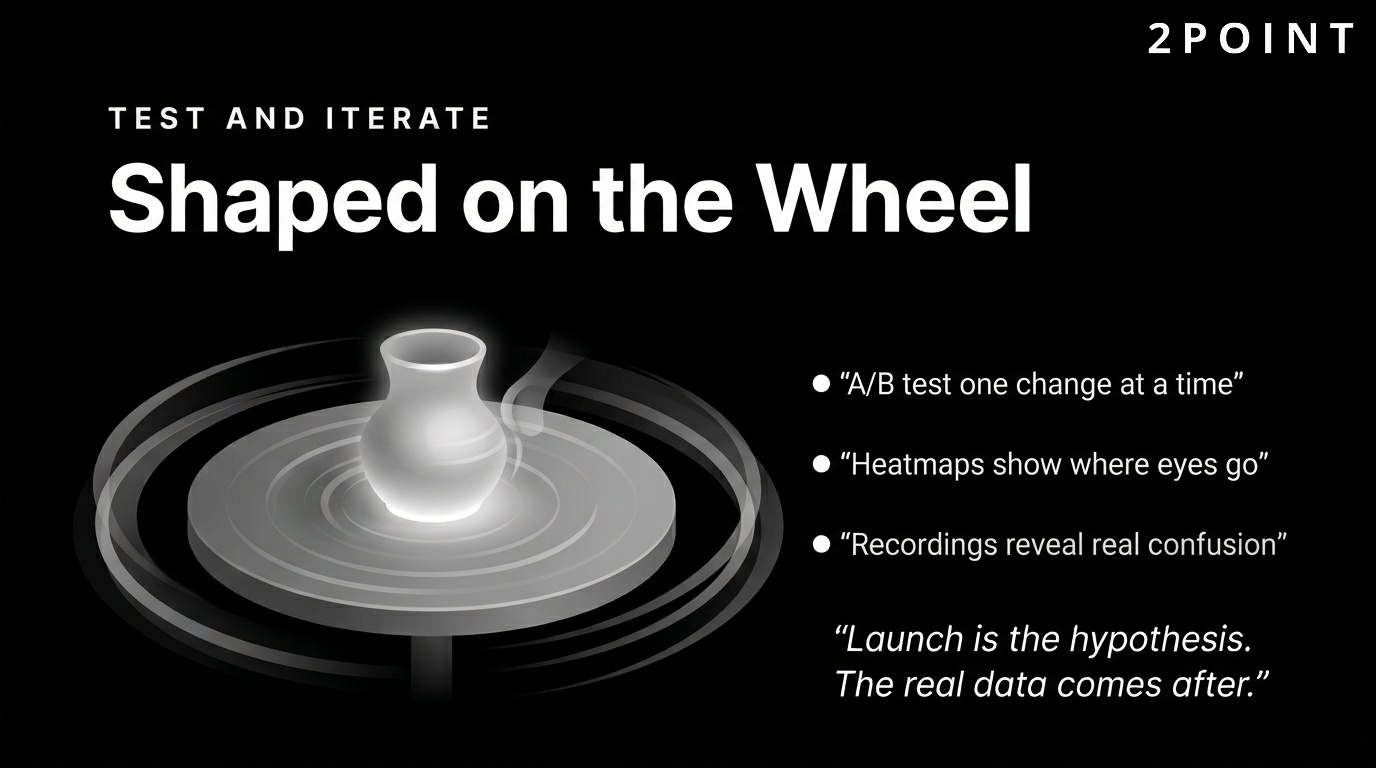
A/B testing involves presenting two versions of a page element, such as a headline, CTA button, or form layout, to different user segments and measuring which version performs better against a defined metric. Heatmaps show where users click, scroll, and hover, revealing which elements attract attention and which go unnoticed. Session recordings capture full user journeys through your site, making it possible to watch real confusion happen in real time. Together, these tools transform intuition into evidence.
The most important cultural shift for design teams is moving from launch-and-leave to test-and-iterate. Every launch is a hypothesis. The real data comes after. Building feedback loops into your design process means that each iteration makes the site measurably better. Over time, this compounding improvement creates a significant competitive advantage over sites that were designed once and never revisited.
Responsive and Mobile-First Design Strategies
Multi-device compatibility is not optional in 2026. Mobile traffic has represented the majority of global web browsing for several years, and user expectations for seamless cross-device experiences have never been higher. Investing in mobile-friendly web design is no longer a differentiator. It is the price of entry for any website that wants to compete for organic traffic, user engagement, and conversions in the current environment.
The shift to mobile-first thinking also has downstream benefits for desktop design. When you start with the smallest, most constrained canvas and scale up, you are forced to prioritize ruthlessly. Only the most important content and functionality survives the mobile design pass. That discipline produces cleaner, more focused experiences across all screen sizes.
The Mobile-First Design Approach
Mobile-first design is a philosophy that begins the design process with the smallest screen size and progressively enhances the experience for larger screens. This contrasts with the traditional approach of designing for desktop first and then attempting to compress the experience into a mobile layout. The mobile-first approach is now the industry standard because it produces better results across all devices, not just mobile.
The philosophical core of mobile-first design is the principle that constraints drive clarity. A 375px wide screen simply cannot accommodate a cluttered interface. Designing for that constraint forces decisions about what truly matters: what is the primary message? What is the most important action? What content can be removed or accessed through a secondary path? These constraints also improve the desktop version because the discipline they impose carries through the entire design process.
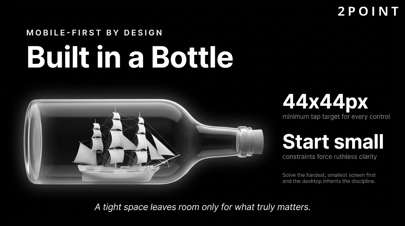
Touch-friendly interfaces are a critical component of mobile design that carries usability implications beyond smartphones. Touch targets should be at minimum 44 by 44 pixels to prevent misclicks. Gesture-based navigation, such as swipe interactions and pull-to-refresh, needs to be implemented predictably and accompanied by visual cues. Thumb-zone optimization considers the physical reality of how people hold their phones: the natural thumb reach creates a "safe zone" in the center of the screen and less accessible zones at the top corners. Placing primary actions within comfortable thumb reach reduces physical strain and improves conversion rates. These ergonomic considerations reflect a maturation of mobile design from purely visual adaptation toward genuine behavioral understanding.
Responsive Design Technical Implementation
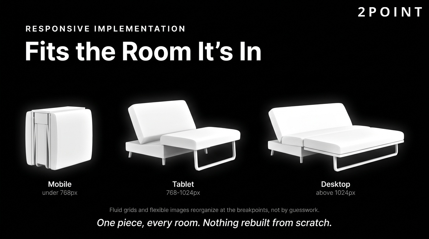
Responsive design is the technical implementation that makes mobile-first design work across an infinite variety of screen sizes. It relies on fluid grids, flexible images, and CSS media queries to create layouts that adapt to any viewport. A fluid grid uses relative units such as percentages rather than fixed pixels, allowing columns and containers to resize proportionally as the screen dimensions change.
CSS media queries are the conditional rules that apply different styles at specific viewport widths called breakpoints. Standard breakpoints typically target common device categories: mobile (under 768px), tablet (768px to 1024px), and desktop (above 1024px). However, the modern approach moves away from device-category breakpoints toward content-driven breakpoints, setting new rules wherever the layout actually starts to break rather than at arbitrary device thresholds. Responsive images are implemented using the srcset attribute, which allows the browser to select the most appropriately sized image file for the current viewport, reducing unnecessary data transfer and improving load times.
Testing responsive designs requires more than resizing a browser window. Real devices have unique rendering engines, touch behaviors, and performance characteristics that browser developer tools cannot fully replicate. A design that looks perfect in Chrome's device emulation may have tap target issues on an actual Android device or font rendering quirks on iOS Safari. Building a testing routine that includes real devices across the major platforms catches these issues before users encounter them.
Cross-Device Content Strategy
Responsive design handles layout adaptation, but content strategy handles the harder question of what to show and when. Not every piece of content that belongs on a desktop page deserves equal prominence on mobile. Content prioritization for smaller screens requires deciding which elements are essential to the mobile user's goals and which can be accessed through secondary navigation or progressive disclosure patterns.
Progressive disclosure is the technique of hiding secondary content behind expandable sections, drawers, or secondary navigation until the user explicitly requests it. On mobile, this technique keeps pages uncluttered while preserving access to supporting information. Hamburger menus, accordion sections, and "read more" toggles are all implementations of this principle. The challenge is knowing where to draw the line. Hiding too much creates a frustrating experience where users cannot find things. Showing too much creates cognitive overload. The right balance comes from user research into what mobile visitors actually need.
Performance Considerations for Mobile
Mobile network conditions introduce performance challenges that do not exist on desktop. Even in 2026, users frequently browse on 4G connections with variable signal strength, in environments where latency is unpredictable. Mobile performance optimization requires designing with network limitations in mind from the very beginning of the design process.
Lazy loading defers the loading of images and other non-critical resources until the user scrolls close to them. This reduces initial page weight and accelerates the time to first visible content. Progressive rendering techniques allow the page to display a usable layout while additional content loads in the background, creating the perception of speed even when total load time is relatively long. The relationship between mobile performance and conversions is well-documented: every second of additional load time on a mobile page increases the probability of abandonment. For ecommerce sites, this correlation translates directly into lost revenue.
Performance Optimization and Technical Excellence
Performance is a design priority, not just a technical concern. Every visual decision made during the design process has performance implications. Heavy images, complex animations, multiple typefaces, and third-party scripts all add weight that users must download before they can interact with your site. Website optimization bridges the gap between aesthetic ambition and technical reality, ensuring that beautiful sites are also fast sites.
The business case for performance investment is compelling. Faster sites rank higher in search results, retain more visitors, and convert at higher rates. The relationship between page speed and user behavior is not linear: each incremental second of load time produces a disproportionate increase in abandonment. Getting performance right is one of the highest-ROI activities in the entire digital marketing toolkit.
Core Web Vitals and User Experience
Core Web Vitals are a set of performance metrics defined by Google that measure real-world user experience on the web. The three primary metrics are Largest Contentful Paint (LCP), which measures loading performance; Interaction to Next Paint (INP, which replaced First Input Delay), which measures interactivity; and Cumulative Layout Shift (CLS), which measures visual stability. These metrics directly influence Google search rankings, making them both a UX priority and an SEO priority simultaneously.
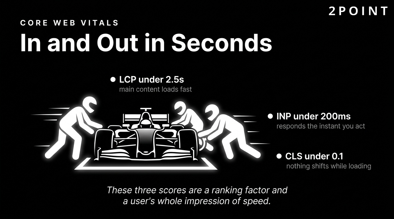
LCP measures how long it takes for the largest visible content element, typically a hero image or headline, to render. A good LCP score is under 2.5 seconds. INP measures the responsiveness of the page to user interactions such as clicks and keyboard input. A good INP score is under 200 milliseconds. CLS measures how much the layout shifts unexpectedly during loading, which happens when images without defined dimensions push content around as they load. A good CLS score is under 0.1. Each of these metrics translates directly into a user perception: fast, responsive, stable.
Performance budgets formalize the constraint: a maximum total page weight, a maximum number of HTTP requests, or a maximum acceptable LCP score. When designers know they are working within a performance budget, they make different decisions. They choose lighter image formats, fewer decorative animations, and system fonts over custom typefaces. These constraints do not necessarily produce worse-looking sites. Often, they produce cleaner, more focused designs that perform better in every sense of the word.
Design Decisions That Impact Performance
Image optimization is the single most impactful performance lever available to most websites. Images typically account for the largest share of page weight, and reducing that weight without visible quality degradation is entirely achievable through modern formats and tooling. WebP and AVIF formats deliver equivalent visual quality to JPEG at significantly smaller file sizes. Serving images at the exact dimensions displayed, rather than scaling them down in the browser, eliminates unnecessary data transfer.
Video implementation requires careful consideration. Autoplay video with audio is a user experience violation that most users find disruptive. Autoplay video without audio can be effective for hero sections when it adds genuine visual value, but it must be optimized for performance: compressed, served from a CDN, and replaced with a static image fallback on slow connections. Font loading strategies also carry significant performance implications. Custom web fonts require additional HTTP requests and can block text rendering. Using system font stacks or limiting custom fonts to one or two faces with efficient loading attributes reduces this cost considerably.
Animations and transitions are among the most common sources of unintended performance degradation. CSS-based animations that use the transform and opacity properties are hardware-accelerated and have minimal performance cost. JavaScript-based animations that manipulate layout properties such as width, height, or margin force the browser to recalculate the entire layout on every frame, a process called reflow that can make animations visually choppy on lower-powered devices. Choosing the right animation approach is a design decision with direct performance consequences.
Balancing Visual Richness with Speed
The tension between aesthetic ambition and technical performance is one of the defining creative challenges of modern website design. Progressive enhancement offers a practical resolution: build a fast, functional experience as the baseline and layer additional visual richness on top for users whose devices and connections can support it. This ensures that every user gets a good experience, even if the visual details vary.
The critical rendering path is the sequence of steps a browser takes to convert HTML, CSS, and JavaScript into pixels on screen. Optimizing this path means minimizing render-blocking resources, inlining critical CSS, and deferring non-essential scripts. Preloading anticipates resources the browser will need and fetches them early. Prefetching loads likely next-page resources during idle time, making subsequent navigations feel instantaneous. Content delivery networks (CDNs) distribute your static assets across servers located geographically close to users worldwide, reducing latency for every visitor regardless of their location.
Performance as Competitive Advantage
In competitive markets, a performance advantage compounds across every dimension of digital success. Faster sites rank higher, attract more organic traffic, retain more visitors, and convert at higher rates. Each of these effects reinforces the others. A performance improvement that increases organic rankings drives more traffic. More traffic provides more data for optimization. Better conversion rates improve ROI on all marketing spend.
User expectations in 2026 are calibrated against the fastest experiences on the web. When users regularly experience near-instantaneous loads from the platforms they use most, a three-second load time on your site feels slow even if it was acceptable five years ago. Meeting these expectations is table stakes. Exceeding them creates a tangible perceptual advantage that reflects positively on your brand.
Current Visual Web Design Trends for 2026
Visual trends in web design are not arbitrary style choices. They reflect evolving user expectations, advancing technical capabilities, and shifting cultural aesthetics. Adopting a trend strategically means asking whether it serves your users and amplifies your brand. Adopting it blindly means risking a site that feels current for six months and dated for the next five years. The trends discussed below are notable in 2026 because they represent meaningful shifts in how designers are solving real user experience challenges.
The key to trend adoption is selectivity. No single brand should implement every contemporary trend simultaneously. The result would be a chaotic, incoherent experience. Instead, identify which trends align with your brand personality, serve your audience's expectations, and can be implemented without compromising performance or accessibility. That selective approach produces sites that feel current without sacrificing timeless usability.
Bold Color and Dopamine Design
The dopamine design movement represents a significant departure from the muted, greyscale minimalism that dominated the early 2020s. This trend draws on Y2K nostalgia, with saturated palettes, neon gradients, and high-contrast color combinations that create immediate visual energy and emotional stimulation. The name comes from the idea that exposure to vibrant, joyful colors triggers a dopamine response in the viewer.
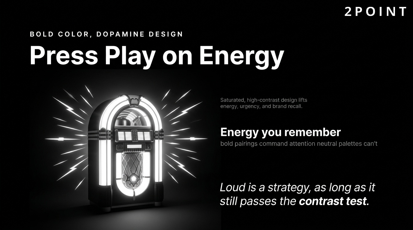
The strategic case for bold color goes beyond aesthetics. Color psychology research supports the idea that saturated, warm colors increase perceived energy, urgency, and excitement. For brands in entertainment, fashion, food, consumer products, and creative industries, a bold color approach can amplify emotional engagement and brand recall in ways that neutral palettes simply cannot. High-contrast pairings, such as electric yellow on deep navy or lime green on black, command immediate attention and create visual moments that users remember.
Accessibility considerations are critical when working with bold colors. High saturation alone does not guarantee sufficient contrast for users with low vision or color blindness. Every color combination used for text and interface elements must meet WCAG AA contrast ratios, which require a minimum 4.5:1 ratio for normal text. The good news is that many bold, high-contrast palettes actually perform better on accessibility metrics than the subtle grey-on-white color schemes they are replacing. Bold design and accessible design are not in conflict when implemented thoughtfully.
Broken Grids and Experimental Layouts
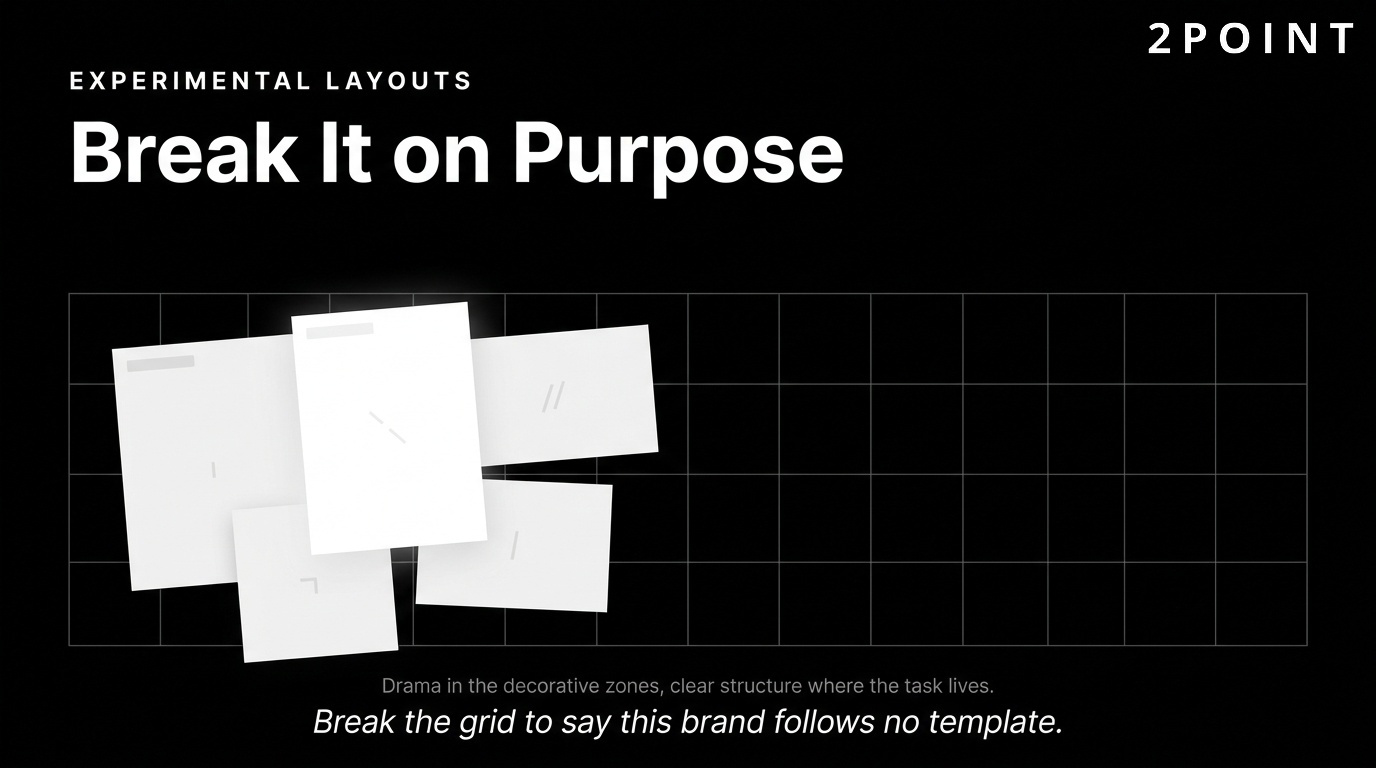
A broken grid layout deliberately violates the standard column-based structure that has governed web design for decades. Elements overlap, extend beyond their containers, rotate slightly off-axis, or occupy unexpected positions in the composition. The strategic purpose is to convey intentionality and uniqueness, signaling that this brand is not following a template. When executed well, a broken grid creates the visual tension and dynamism of editorial print design within a digital medium.
The brands that benefit most from experimental layouts are those for which distinctiveness is itself a key brand value: creative agencies, luxury fashion houses, cultural institutions, independent artists, and experimental consumer brands. For these brands, a conventional grid would actually undermine the brand message by communicating conformity in a space where individuality is the product.
The risk of broken grid design is that usability suffers when creativity overwhelms function. Navigation, calls to action, and key information must remain immediately accessible regardless of how experimental the visual treatment becomes. The best broken grid sites achieve their visual drama in decorative zones while maintaining clear, usable structure in functional zones. This hybrid approach allows for visual excitement without sacrificing the task-completion efficiency that every user requires. Technical implementation of complex layouts in 2026 is significantly more accessible than it was previously, thanks to advances in CSS Grid and Flexbox that allow precise placement of elements without JavaScript manipulation.
3D Elements and Immersive Experiences
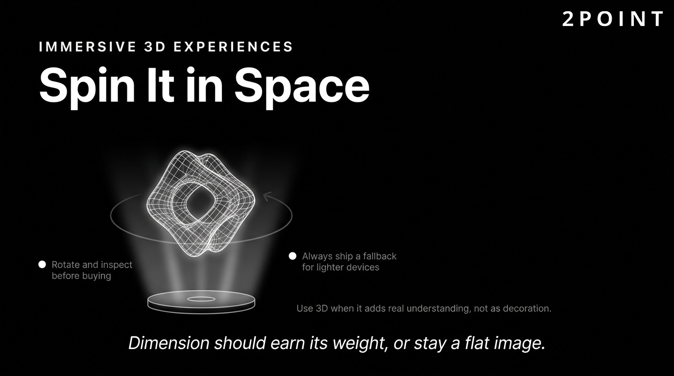
Three-dimensional design elements have moved from novelty to strategic tool as WebGL performance has improved and 3D rendering libraries have matured. Interactive 3D product visualization allows ecommerce brands to give users a tactile understanding of products they cannot physically touch: rotating a shoe to see every angle, exploring the interior of a piece of furniture, or customizing a product's color and material in real time before purchasing.
Scroll-triggered 3D animations create dramatic storytelling experiences where the page transforms as the user scrolls, drawing them through a narrative with cinematic energy. These experiences are particularly effective for brand storytelling and product launches where creating an emotional impression matters as much as conveying information. AR preview features, where users can place a virtual product in their real physical space using their device's camera, are becoming increasingly accessible through web-based AR frameworks without requiring app installation.
Performance implications of 3D elements are significant and must be managed carefully. WebGL rendering is GPU-intensive and can cause performance issues on lower-powered devices. Fallback experiences for devices that cannot handle 3D rendering are essential. Accessibility considerations for 3D interfaces include providing static alternatives for users who experience motion sensitivity or are using assistive technologies that cannot interact with WebGL content. The principle that 3D should add genuine informational or emotional value, rather than serving as decoration, keeps these decisions grounded in user benefit.
Resonant Stark Design and Minimalism
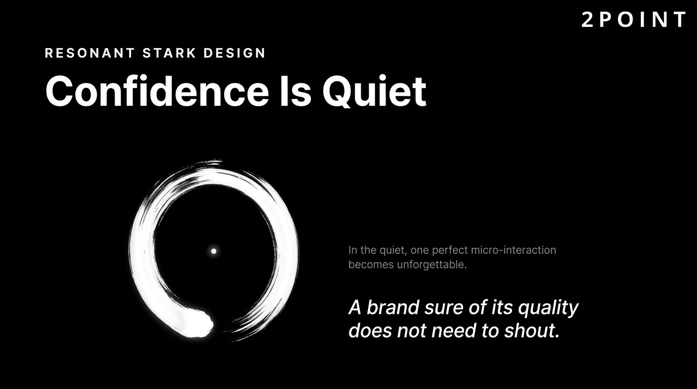
At the opposite aesthetic pole from dopamine design sits the resonant stark movement: ultra-minimal layouts with generous whitespace, ultra-thin typography, restrained color usage, and precise, intentional placement of every element. This aesthetic communicates confidence and exclusivity. The implication is that a brand so assured in its quality does not need to shout. It simply presents, trusts the work to speak, and lets the silence amplify the message.
Micro-interactions are the heartbeat of stark design. In the absence of visual clutter, each small interactive moment carries more weight. A subtle cursor transformation, a delayed fade-in on scroll, or a perfectly timed hover state becomes a memorable moment precisely because the surrounding space is so quiet. These details communicate craft and attention without adding visual complexity. The emotional dimension of well-executed stark design is powerful: it creates a sense of calm, focus, and elevated taste that resonates with luxury, technology, and professional services audiences.
How SEO-Driven Design Improves Search Rankings
Design and SEO are inseparable disciplines. Every visual and structural decision made during the design process has implications for discoverability, rankings, and organic traffic. The relationship between website design and search performance is bidirectional: good design improves SEO signals, and SEO requirements shape good design decisions. Teams that treat these as separate workstreams leave significant performance gains on the table.
The connection between design and search has deepened as Google has incorporated user experience signals more explicitly into its ranking systems. A site that looks great but loads slowly, has confusing navigation, and frustrates users will increasingly struggle to rank regardless of how well-optimized its content is. UX and SEO are now the same conversation.
How Design Impacts Search Rankings
The relationship between UX signals and search rankings operates through several mechanisms. Core Web Vitals, as described earlier, are direct ranking factors. But the indirect effects are equally powerful. Dwell time, which is the length of time a user spends on your site after clicking from search results, signals to Google that your content satisfied the search intent. A well-designed page that engages users increases dwell time. A poorly designed page that confuses or frustrates users increases bounce rate and reduces dwell time, both of which are negative quality signals.
Mobile-friendliness is a confirmed ranking factor. Since Google shifted to mobile-first indexing, the mobile version of your site is the primary version Google evaluates for ranking purposes. A site with an excellent desktop experience but a broken mobile experience is penalized in rankings regardless of its content quality. Technical SEO elements that designers directly control include heading structure, image optimization, page loading speed, internal linking logic, and site architecture. These are not after-the-fact technical adjustments. They are design decisions made during the build process.
Site architecture, the hierarchical structure of pages and how they link to each other, affects both crawlability and link equity distribution. A flat architecture, where every important page is reachable within three clicks from the homepage, is both more usable and more SEO-friendly than a deeply nested structure that buries valuable content. Designing with crawlability in mind means making sure search engine bots can find and index your most important content as easily as users can.
Content Hierarchy and Semantic Structure
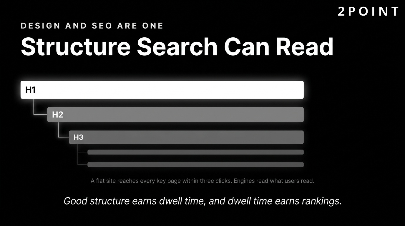
Semantic HTML is the practice of using HTML elements for their intended meaning rather than for their visual appearance. An h1 element marks the primary heading of a page. An h2 marks a major section. A nav element marks navigation. A main element marks the primary content area. Proper semantic structure benefits SEO because search engine crawlers use these signals to understand the content hierarchy and relative importance of information on the page.
Heading hierarchy (H1 through H6) should follow a logical nested structure where each level represents a subdivision of the level above it. A page should have one H1 that contains the primary keyword. H2s divide the main sections. H3s subdivide those sections further. Using headings for visual styling purposes, such as making text larger by wrapping it in an H1 tag rather than CSS, breaks semantic structure and confuses both screen readers and search engines. Schema markup and structured data are additional semantic layers that help search engines understand the nature of your content and can earn rich results in search, including star ratings, FAQs, product prices, and event dates.
Image and Media SEO Best Practices
Images present one of the most consistently underutilized SEO opportunities on most websites. Image file naming is a simple but effective signal. A file named blue-running-shoes-womens-size-8.webp tells search engines more about the image than IMG_4291.jpg. Alt text serves both accessibility and SEO purposes by describing the image content to screen readers and providing keyword-relevant context to search crawlers. Alt text should describe what the image shows, not keyword-stuff, and should be relevant to the surrounding content.
Image format choices affect both performance and SEO. WebP format provides superior compression compared to JPEG and PNG at comparable visual quality. AVIF format offers even greater compression but has slightly lower browser support in 2026. Serving images in next-generation formats improves Core Web Vitals scores, which in turn benefits search rankings. Responsive images served at appropriate sizes through the srcset attribute prevent unnecessarily large images from loading on small screens, a common source of avoidable page weight.
Video content creates SEO opportunities that are frequently missed. Embedding videos with descriptive titles, full transcripts, and structured data markup allows search engines to understand and index the video content. Transcripts also create substantial text content that can rank for additional keywords while serving accessibility needs for users who are deaf or hard of hearing. The practice of enhancing website content for SEO through thoughtful media handling is one area where design and content strategy must work in close coordination.
Voice Search and Conversational Design
Voice search has grown substantially as smart speaker adoption, mobile voice assistants, and hands-free device usage have expanded. Voice queries are structurally different from typed queries: they tend to be longer, phrased as complete questions, and conversational in tone. Designing content for voice search means anticipating these question-format queries and structuring content to answer them concisely and directly.
Featured snippets, the answer boxes that appear at the top of some search result pages, are the primary mechanism through which voice assistants return answers. Structuring content with clear question-and-answer formatting, concise definition boxes, and numbered step-by-step instructions increases the probability of earning featured snippet positions. This benefits both traditional text search and voice search simultaneously. The design implication is that content structure, not just the content itself, is a strategic asset that should be planned deliberately from the beginning of the design process.
AI Integration and Emerging Technologies in Web Design
Artificial intelligence has moved from a speculative future in website design to an operational present. In 2026, AI tools assist with layout generation, copy optimization, image creation, A/B testing automation, and real-time personalization. The key framing for understanding AI in design is that it enhances human creativity rather than replacing it. UX design that incorporates AI tools thoughtfully produces better outcomes faster. UX design that applies AI without human judgment produces mediocre experiences at high speed.
The most successful teams treat AI as a capable collaborator: one that handles repetitive or pattern-based tasks, generates options for human evaluation, and surfaces data insights that inform better decisions. The creative vision, strategic direction, and quality judgment remain human responsibilities. This division of labor amplifies what both humans and AI do best.
AI-Assisted Design Tools and Workflows
The 2026 landscape of AI design tools includes generative layout assistants, AI-powered image editing and creation, automated accessibility auditing, intelligent component suggestion systems, and copy variation generators. These tools compress the time required to move from a design brief to explorable concepts, allowing design teams to evaluate more options before committing to a direction.
AI-powered A/B testing goes beyond simple two-variant testing by running multivariate experiments across many elements simultaneously and using machine learning to identify winning combinations faster than traditional statistical methods. AI-driven analytics platforms surface anomalies and patterns in user behavior that human analysts might miss, such as identifying that a particular user segment consistently exits from a specific page at a specific scroll depth and correlating that with a design element. The limitation of AI tools in design is their inability to exercise contextual judgment about brand appropriateness, cultural sensitivity, and emotional resonance. These dimensions require human expertise.
Personalization and Dynamic Content
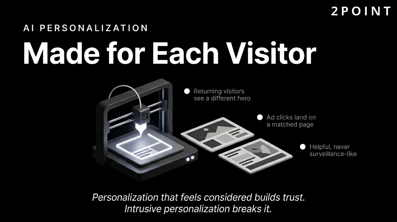
AI-driven personalization delivers different content, layouts, and experiences to different users based on behavioral data, demographic signals, location, device type, and engagement history. Behavioral targeting allows a returning user who has viewed multiple product pages but not purchased to see a different hero section than a first-time visitor. A user arriving from a paid search ad can see a landing page tailored to the specific query that brought them there.
Dynamic content delivery based on user segments creates experiences that feel relevant and considered rather than generic and mass-produced. In ecommerce, personalized product recommendations generated by collaborative filtering algorithms have been shown to increase average order values and repeat purchase rates significantly. In SaaS, adaptive onboarding flows that respond to a new user's stated role and goals reduce time-to-value and improve activation rates.
Privacy considerations are central to ethical personalization. Users are increasingly aware of and concerned about how their data is used. Transparent data practices, clear opt-in mechanisms, and GDPR-compliant data handling are not just legal requirements. They are trust signals. Personalization that feels helpful and relevant builds engagement. Personalization that feels surveillance-like or intrusive damages trust and drives users away. The design challenge is creating personalized experiences that feel intuitive rather than invasive.
Advanced CSS and Interactive Technologies
The capabilities of CSS in 2026 have expanded dramatically, enabling interactions and layouts that previously required JavaScript or external libraries. CSS subgrid allows nested elements to align precisely to the parent grid, solving layout challenges that were previously complex to implement. Container queries enable components to respond to the size of their containing element rather than the viewport, making truly modular, context-aware components possible for the first time. Scroll-based animations implemented through pure CSS create smooth, performant storytelling effects without JavaScript overhead.
The View Transitions API enables seamless, animated transitions between pages in multi-page applications, creating an app-like navigation experience in standard web documents. Progressive Web Apps (PWAs) continue to blur the line between web and native app experiences: they can work offline through service workers, receive push notifications, and be installed on a device home screen. When to use cutting-edge technology depends on audience and context. If your users are on modern devices and browsers, progressive enhancement with advanced CSS and PWA capabilities can deliver genuinely differentiated experiences. If your audience includes a significant share of older devices or browsers, maintaining a robust fallback baseline is essential.
Maintaining Human Connection in AI-Enhanced Design
A notable tension has emerged in the design world as AI-generated content and automated experiences have become more prevalent. Users increasingly value authenticity, warmth, and personality in web experiences precisely because so much of the digital landscape is becoming formulaic and automated. Brands that design for human connection by using genuine photography, imperfect hand-drawn elements, personal founder stories, and distinctive tonal voices stand out against a backdrop of algorithmically optimized sameness.
The design implication is that not every rough edge needs to be smoothed. Not every layout needs to follow the optimal conversion-rate-tested template. Character and distinctiveness in design communicate that a real human made considered choices. Transparency about AI usage also matters: users who discover that a supposedly personalized experience is entirely machine-generated without disclosure feel deceived. Honest communication about how technology is used to serve users, rather than to maximize engagement metrics, builds the kind of long-term trust that algorithms cannot manufacture.
Business Impact and Strategic Design Implementation
Every design decision either supports or undermines business outcomes. The gap between a website that looks good and a website that performs commercially often comes down to how deliberately design was connected to measurable goals from the start. Website design impact on business performance is substantial and well-documented, yet many organizations still treat design as a discretionary aesthetic investment rather than a strategic business function.
Framing design within an ROI framework changes how it is resourced, prioritized, and evaluated. When design decisions are connected to conversion rates, customer retention, average session duration, and revenue per visitor, the investment case becomes clear and the success criteria become measurable. This section connects the design principles discussed throughout this article to the business outcomes they drive.
Building Trust and Brand Credibility
Trust is the prerequisite for every commercial interaction online. Before a visitor will share their email address, enter payment details, or engage with your sales team, they must trust that you are a legitimate, competent, and reliable organization. Visual design is the primary vehicle for communicating trustworthiness before a user reads a single word of content.
Visual indicators of legitimacy include professional photography, polished typography, consistent branding, well-written copy free of errors, clearly displayed contact information, visible security indicators like SSL certificates, and industry-specific trust signals such as certifications, awards, or client logos. An outdated design undermines trust even when the underlying business is excellent. If your site looks like it was built a decade ago and never touched since, visitors reasonably question whether the business is still active, invested, and capable of delivering modern solutions.
Industry-specific design expectations matter significantly. A financial services firm that uses playful, casual design aesthetics creates cognitive dissonance in visitors who expect a tone of seriousness and professionalism. A creative agency with a corporate, conservative design suggests a lack of creative capability. Meeting and thoughtfully exceeding the design expectations of your specific industry is the baseline for credibility. Good website design for one industry may look entirely different from good design for another, but the shared foundation of consistency, professionalism, and clarity applies universally.
Conversion Optimization Through Design
Conversion rate optimization (CRO) and website design are most powerful when treated as a unified discipline. Design elements that drive conversions include call-to-action buttons with clear, benefit-oriented copy; forms with minimal required fields and clear error handling; checkout flows that reduce friction at every step; and social proof elements like testimonials, review counts, and client logos positioned at the moment of decision.
Psychological principles of influence are embedded in high-converting designs. Scarcity and urgency cues, such as "Only 3 left in stock" or "Offer expires in 24 hours," increase purchase intent when used authentically. Social proof, showing that others have made the same decision, reduces the perceived risk of action. Clarity about what happens next after a button is clicked reduces hesitation. Each of these principles translates into specific design and copy choices that can be tested, measured, and optimized. Friction removal is equally important: every unnecessary field in a form, every required account creation before checkout, and every confusing label is a point of abandonment that design can eliminate.
The role of website landing pages in conversion optimization deserves specific attention. Dedicated landing pages built for specific campaigns, audiences, or traffic sources consistently outperform general-purpose pages because they maintain message match between the ad or link the user clicked and the content they arrive at. Designing landing pages with a single, clear objective and removing all navigation elements that could pull users away from that objective is a proven conversion improvement strategy.
Design Systems and Scalability
As organizations grow, maintaining design consistency across an expanding website becomes increasingly challenging without a systematic approach. A design system is the answer: a shared library of reusable components, documented design tokens, usage guidelines, and interaction patterns that the entire team draws from. Design systems dramatically reduce the time required to design and build new pages because teams are assembling pre-built, pre-approved components rather than creating from scratch.
The efficiency gains are substantial. A page that would take a designer two days to create from scratch takes a few hours when built from a component library. More importantly, the result is automatically consistent with the rest of the site because it uses the same atoms of color, typography, spacing, and interaction. For ecommerce sites, SaaS platforms, and large editorial sites that add new content and features regularly, a design system is not a nice-to-have. It is the infrastructure that makes sustainable growth possible. The decision between building a custom design system versus adopting an established framework depends on team size, budget, and the degree of visual differentiation required.
Measuring Design Success
Design success is measurable, and defining the right key performance indicators (KPIs) before a redesign begins ensures accountability and informs future iterations. Quantitative KPIs include conversion rate, bounce rate, average session duration, pages per session, Core Web Vitals scores, and revenue per visitor. Each of these metrics reflects a different dimension of design performance. Qualitative measures complement the numbers: user satisfaction scores, usability test findings, customer support ticket themes, and Net Promoter Score all reveal dimensions of the experience that raw analytics cannot capture.
The timeline for seeing design ROI varies by metric. Performance improvements appear in analytics within days of deployment. Conversion rate improvements from CRO testing take several weeks to reach statistical significance. Brand credibility and SEO improvements operate on longer timescales of months. Setting realistic expectations about these timelines prevents premature conclusions and ensures that sufficient time is given for each type of improvement to manifest in measurable outcomes. The tools for measuring design effectiveness include Google Analytics 4, Google Search Console, Hotjar, Crazy Egg, VWO, and Optimizely, each offering complementary lenses on user behavior and design performance.
Building Websites That Perform and Convert
Website design in 2026 is a multidimensional discipline that integrates visual creativity, technical precision, user psychology, business strategy, and continuous measurement. The most successful websites are not the prettiest or the most technically sophisticated. They are the ones that most clearly understand their users, communicate their value proposition most efficiently, and remove every obstacle between user intent and desired action.
The themes explored throughout this guide reinforce a single overarching principle: design is strategy made visible. Every color choice, typography decision, navigation structure, and performance investment either advances or undermines your business objectives. Treating design as an aesthetic exercise disconnected from analytics and user research is the most common and most costly mistake organizations make. Treating it as the strategic core of your digital presence produces compounding returns across SEO, conversion, retention, and brand value.
The evolution from purely aesthetic design to holistic business tools reflects the maturation of the web as a commercial medium. Early web design was largely about presence: having a site at all was differentiating. Today, excellence in optimizing website design for engagement is the baseline for competitive participation. The organizations pulling ahead are those that treat their websites as living products: constantly tested, continuously improved, and deeply informed by real user data.
The practical next steps for any organization looking to improve their website design are straightforward. Begin with an audit of your current site against the principles in this guide: assess performance metrics against Core Web Vitals benchmarks, evaluate mobile experience across real devices, review accessibility against WCAG AA standards, and run at least one usability test with target users. Prioritize improvements by their combination of impact and effort, focusing first on performance and usability fixes before moving to visual refinements. Test every significant change before and after to build an evidence base. Iterate continuously.
The human element in increasingly technical design deserves a final word. As AI tools become more powerful, automation more pervasive, and personalization more sophisticated, the sites that build lasting relationships with users will be those that feel genuinely human behind the technology. A user-friendly website is not just a technically efficient one. It is one that communicates care, respect, and genuine understanding of the people it serves. That quality cannot be automated. It is a design choice. At 2POINT, the conviction that design should serve real people with real goals informs every project, ensuring that technical ambition and human warmth work together rather than competing.
Frequently Asked Questions About Website Design
What is website design and what does it include?
Website design is the process of planning and creating the visual layout, structure, and interactive elements of a website to deliver a useful experience while achieving business goals. It includes visual aesthetics, navigation architecture, responsive functionality, content hierarchy, performance optimization, and accessibility standards. Modern website design integrates both creative and technical disciplines to serve users across all devices.
How long does it take to design a website?
A simple brochure website typically takes 4 to 8 weeks from initial brief to launch. A complex ecommerce site or custom web application may take 3 to 6 months or longer depending on the number of pages, integrations, and design rounds required. Timeline depends heavily on how quickly stakeholders provide feedback and approve designs at each stage.
What is the difference between web design and web development?
Web design focuses on the visual appearance, user interface, and user experience of a website, determining what users see and how they interact with it. Web development is the technical implementation that turns design files into functional code using HTML, CSS, JavaScript, and backend languages. Most professional websites require both disciplines working in close collaboration.
Does website design affect SEO?
Yes, website design directly affects SEO through multiple mechanisms including page load speed, mobile-friendliness, Core Web Vitals scores, site architecture, heading structure, image optimization, and dwell time. Google incorporates user experience signals as ranking factors, meaning a well-designed, fast-loading, mobile-responsive site has a structural advantage over a poorly designed competitor. Design and SEO should be planned together from the start of any project.
What is responsive website design?
Responsive website design is a technical and design approach that makes a website's layout automatically adapt to any screen size, from mobile phones to large desktop monitors. It uses fluid grids, flexible images, and CSS media queries to ensure a consistent, usable experience across all devices. Google uses the mobile version of a responsive site as its primary version for ranking and indexing.
What is the difference between UX design and UI design?
UX design (user experience design) focuses on the overall feel and functionality of the product, including user research, information architecture, task flows, and usability. UI design (user interface design) focuses on the visual and interactive elements users directly see and touch, including buttons, typography, color, and layout. Both disciplines are essential and interdependent: good UX without good UI results in functional but unattractive experiences, while good UI without good UX results in beautiful but frustrating ones.
How much does professional website design cost?
Professional website design costs vary widely based on scope, complexity, and the expertise of the team involved. A basic small business site designed by a freelancer typically ranges from $2,000 to $10,000. A mid-sized business site with custom functionality ranges from $10,000 to $50,000. Enterprise-level sites with complex integrations and custom design systems can cost $100,000 or more. Ongoing maintenance, hosting, and optimization add to long-term costs.
What makes a website design good versus bad?
Good website design is clear, fast, accessible, consistent, and aligned with user goals and business objectives. Bad website design creates confusion through poor navigation, loads slowly, fails on mobile devices, uses inconsistent branding, and places aesthetic priorities above user needs. The clearest test of design quality is whether real users can accomplish their goals efficiently and with minimal frustration.
What are Core Web Vitals and why do they matter for website design?
Core Web Vitals are three performance metrics defined by Google: Largest Contentful Paint (LCP), which measures loading speed; Interaction to Next Paint (INP), which measures responsiveness; and Cumulative Layout Shift (CLS), which measures visual stability. They matter for website design because Google uses them as ranking factors and because they directly measure user experience quality. Design decisions around images, animations, fonts, and layout directly determine these scores.
Should I design my website mobile-first?
Yes, designing mobile-first is the recommended approach for any new website in 2026. Mobile devices account for the majority of global web traffic, and Google indexes the mobile version of sites for ranking purposes. Starting with the mobile experience forces design clarity and content prioritization that improves the quality of the desktop experience as well. Mobile-first design produces better results across all screen sizes compared to designing desktop-first and adapting downward.
What is the role of accessibility in website design?
Accessibility in website design means creating sites that can be used by people with a full range of abilities, including those with visual, auditory, motor, and cognitive disabilities. It is both an ethical responsibility and, in many jurisdictions, a legal requirement under standards like WCAG 2.1 AA. Accessible design improves the experience for all users and expands the total audience a site can serve.
How do I know if my website design needs to be updated?
Signs that a website design needs updating include declining organic traffic, high bounce rates, low conversion rates, poor Core Web Vitals scores, a design that looks visibly dated compared to competitors, absence of mobile responsiveness, and failure to meet current accessibility standards. Conducting a structured audit against these criteria every 12 to 24 months helps identify when incremental improvements are insufficient and a more substantial redesign is warranted.
